
I accept RentHop's
Terms of Use and
Privacy Policy

Login / Register
Save searches and listings, create email alerts, and see rent averages by neighborhood
— Or sign in with Google —
Please enter your info below
As a modern, real estate driven startup, RentHop understands how much people care to live in a neighborhood with like-minded individuals. That's much easier said than done, but what if you could find out the political views of your San Francisco neighbors before you're riding an Uber Pool with them? Well our data scientists crunched the numbers from FEC.gov on the SF area’s campaign contributions, so you can do that!
Find your zip code, choose your candidates, and explore the city and suburbs.
To create the map, we picked up where we left off with the nationwide data we prepared for our Trump Map here. We took the FEC’s disclosure reports detailing individual contributions to candidates. The data from the most recent national filing on February 20, 2016 contained a smidgen over 1.17 million documented contributions, totaling nearly $300 million for all candidates’ campaigns nationwide. To make this data more usable, we cleaned it up a bit first, grouping together line items from people with the same name, from the same zip code and with the same occupation, effectively removing duplicated entries for the same person. It is important to note that individuals giving less than $200 during the election cycle are not required to disclose their personal information, but some will do it voluntarily. Although this stipulation affects the data for each candidate differently, it is not intrinsically biased and we feel the data is still statistically relevant for comparing them to one another.
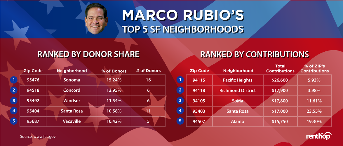
With the resulting data, we set out to see where the donors are in SF and whom they support. Candidates like Jeb Bush and Ben Carson collected significant amounts of money, but have since dropped out, so they have been grouped together with the rest of the former candidates. At the moment we've left Rubio's data in to show where he stood, and emphasize the gap that currently exists in GOP support. The interactive pie chart will always show candidates proportionate to each other, whether showing all or just your selected candidates.
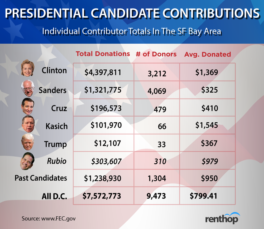
Hillary Clinton holds a massive lead in donations versus the other candidates thanks to a lot of large donors. Some very notable large donors were Sean Parker and his wife Alexandra. The Parkers gave Clinton $2,700 each back in December. What's funny though, is that they each received refunds of $2,600 in June of last year, when they must have forseen current events. Mark Zuckerberg also showed up in the data as having recived a refund from the Rubio campaign, but we didn't see a donation to anyone else. I guess they all knew a futile cause when they saw one.
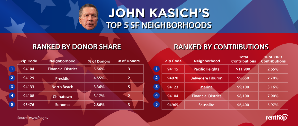
Clinton's collecting big everywhere though, with an average amount received of $1,369; people are on average utilizing over 50% of the $2,700 maximum that they’s allowed to give to a candidate. Only John Kasich is collecting more per individual, clocking in at $1,545 on average, but from only 66 donors that really want him to win.
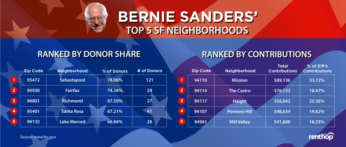
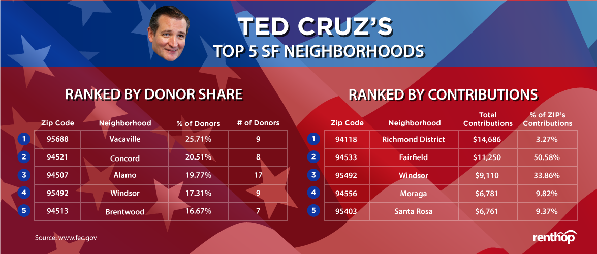
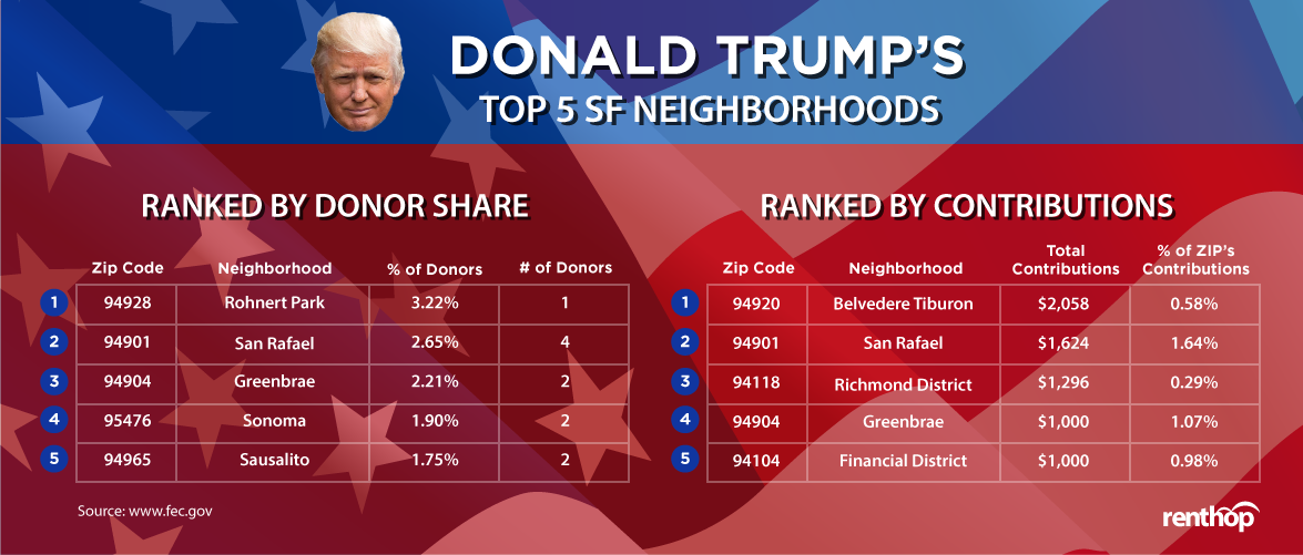
Bernie Sanders is at the opposite side of the spectrum in that regard, receiving just $325 per donor gives him the lowest average, but his 4,069 donors is more than all the remaining candidates combined. Seemingly the GOP's only chance at fending off Trump, Ted Cruz isn't a winner here in SF. Granted, California is a primarily democratic state, and he’s got a massive lead over Donald Trump in both donor count and amount raised.
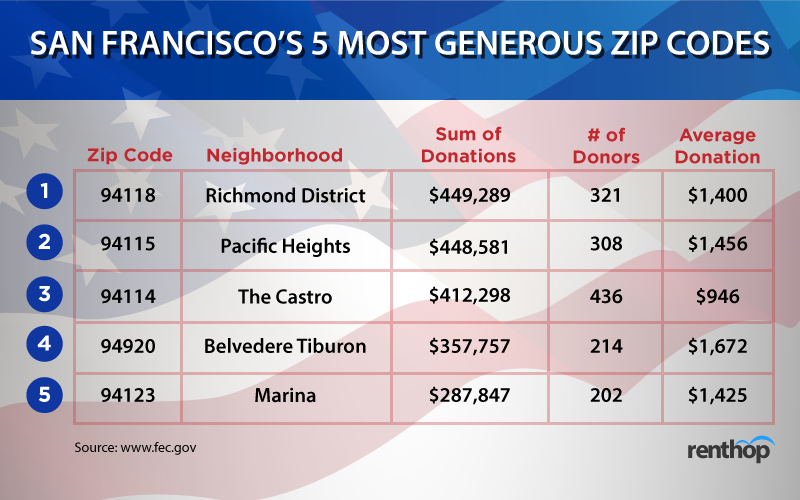
The most generous donors seem to live in the northernmost parts of SF, as well as the very north in Belvedere Tiburon.
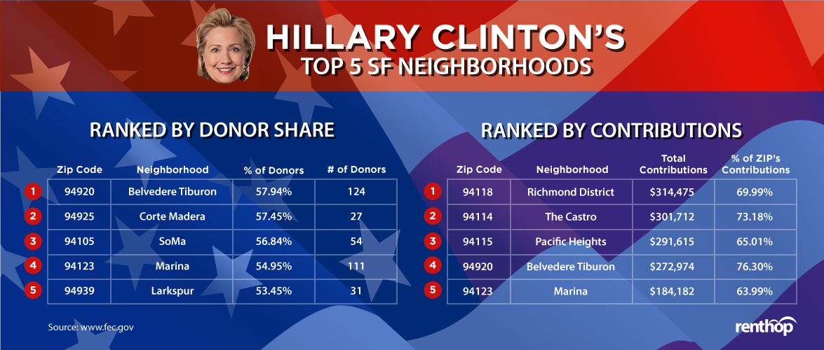
We analyzed where each has the strongest show of support based on percentage of donors choosing them and total dollars collected there. When tablutaing our data, we looked at the zip codes that make up Alameda, Contra Costa, Marin, Napa, San Francisco, San Mateo, Santa Clara, Solano, and Sonoma Counties. These 154 zip codes had a median donor count of 39, which we chose to use as the lower boundary when calculating which neighborhoods were “TOP” for each candidate. This prevented us from coming back with a list of zipcodes where a candidate had a 100% share of the just one or two donors there.
If you’re in the market for a new apartment, or were just influenced to move because of this study, be sure to check out the extensive selection of San Francisco apartments for rent.
RentHop, it’s like apartment hunting.. but smarter.


