Lack of Construction Driving High Rents Across the U.S.
The U.S. economy has been growing at a steady pace, with GDP going up and the unemployment rate falling to 4.1 percent, lowest since January 2007. However, even as headline inflation increased by only 12 percent nationally between 2010 and 2016, the rent and housing subcomponent has increased by over 24 percent. In many major cities, the supply of new housing simply has not kept pace with population and job growth. In fact, the lack of new construction has been cited as one of the many reasons for affordability crises in major cities such as New York, Boston, and Miami, not to mention San Francisco. To examine the impact that housing supply has had on rent growth, we looked at building permits, population, and rent growth between 2010 and 2016 for the top 30 counties in the country. In addition, we took a deeper look at Los Angeles, which has some of the cleanest building permit data.
We found that:
- The cities with the fastest growing population relative to building permits (between 2010 and 2016) are Sacramento, San Antonio, Riverside, and Fairfax (Washington Metro). California is particularly underbuilt, with Sacramento, Riverside, San Jose, and San Francisco all in the upper 50th percentile supply tightness (in the top 30 counties).
- Each additional person per permit results in roughly a 1.2 percent increase in median county rent over a six-year period (though the relationship is far from perfect (and will be impacted by other economic factors).
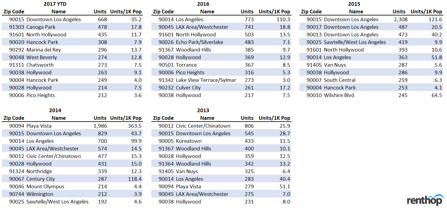
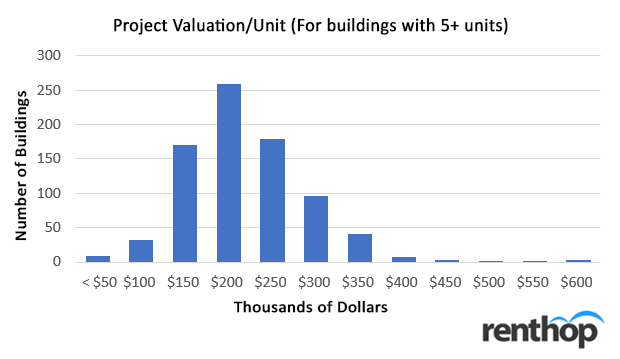
- In our deeper dive into Los Angeles, we found that most of the residential inventory built since 2013 was in the Downtown Los Angeles area. The median cost for each multi-family unit was on the higher end, being in the $150 to $200 thousand range.
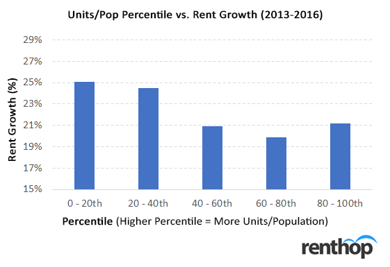
- We also found a relationship between units built (scaled by level of population) and rental price growth. Zip-codes where the lowest number of units were built (lowest 20th percentile) experienced rent growths of roughly 4 percent higher than zip-codes with the highest number of units built (top 20th percentile) from 2013 to 2016.
To determine if supply is meeting demand, we at RentHop looked at census population growth (Census and American Community Survey) and HUD building permit data between 2010 and 2016. We defined the level of “housing tightness” in a county as the ratio of population growth to building permits (pop/permit). If population in a county is growing significantly faster than the supply of new housing, we expect the mismatch to put upward pressure on rents.
Of course, the pop/permit ratio is not the only way of assessing housing tightness. One of the most popular metrics is the job growth per permit ratio. However, while that ratio is a strong predictor of rent growth over longer period of time (10+ years), it seems to be much weaker over a shorter six-year timeframe. The 08-09 recession distorted the job growth data during the early phases of the recovery in 2010. Certain counties experienced significantly higher unemployment spikes (and hence, much larger job growth throughout the 2010 to 2016 period). However, this job growth does not really reflect the labor slack (or housing slack) in the area.
To better understand housing tightness, we first looked at population per permit across the largest 30 counties (and their corresponding cities) in the US and ranked them.
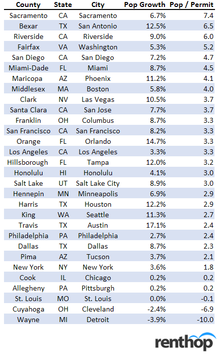
Between 2010 and 2016, the counties (and their respective cities) with the highest pop/permit ratios are Sacramento, San Antonio, Riverside, and Fairfax (Washington Metro). Sacramento is especially underbuilt, with over 7.4 people per building permit. Construction in San Antonio, Riverside, and Washington have also not kept pace relative to population, with pop/permit ratios of 6.5, 6.0, 5.2 respectively. Cities in California seem particularly tight in general. While California (the most populous state) has six counties in the largest 30 national counties, all of them are in the top 50th percentile in pop/permit. This might not be very surprising, since California has often been associated with NIMBY behavior.
On the other end of the spectrum, we found that many counties have somewhat kept pace with their rapid population growth. Even though Houston, Seattle, and Austin logged double-digit population growths since 2010, they have kept their pop/permit ratios below 3 (though still higher than the national average of roughly 2.6 people per household). Among the top 30 counties, Wayne County (Detroit) is the only county experiencing a negative population growth from 2010 to 2016.
What is the impact of this tightness on rent? To explore this, we compared the pop/permit level to the growth in rents.
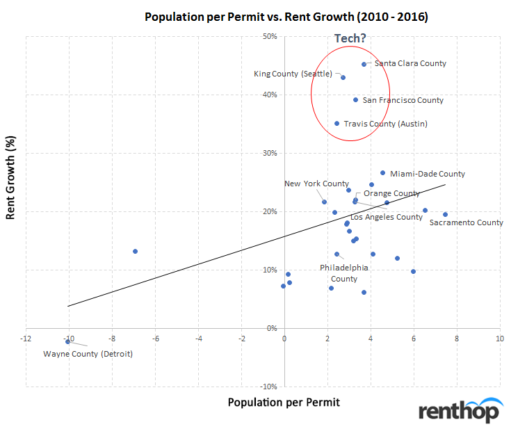
We found that on average, each additional pop/permit resulted in roughly a 1.2 percent increase (off of a 15.8 percent baseline growth) over the 6-year period. While 1.2 percent might not seem like a lot, it can make a huge difference in especially tight areas. Sacramento (with a pop/permit ratio of 7.4) had nearly 20 percent rent-growth versus Wayne county (Detroit) which experienced negative rent growth.
Unsurprisingly, we found that the relationship between pop/permit and housing tightness is not perfect (at least among the top 30 counties). On top of simple population-based supply and demand, other economic factors significantly impact rental prices. These include local income changes/economic growth, accessibility of the central business districts, availability of public transit/commute difficulty, etc. For example, we noticed massive rent growth in areas like San Jose, Seattle, San Francisco, and Austin (even though pop/permit is not huge). These are likely more related to the booming tech industry than simply housing supply in those areas. This is not to say that residential housing is not tight in these areas. New construction can certainly relieve some of the pressures on bludgeoning rent growth.
***
Beyond Census/HUD level data, many cities now release highly granular building permit data. In particular, the City of Los Angeles has provided building permit data since 2013. The data includes not only permits for new buildings, but also data for upgrades and alterations, such as electrical, plumbing, etc. In addition to details about units, zip codes, and location, the city has also provided in-depth project value data. Note that the data only covers the City of Los Angeles and not the entire county.
We first looked at where construction has been concentrated, as well as the general value of the project over time. The 2017 YTD data (especially) gives a pretty decent indication on where new housing supply will likely pop up in 2018 and later (since it takes roughly one year between permit and occupancy).