Washington DC’s Metrorail has seen a lot of changes in recent months. Service hours were extended to midnight, wait times between rides have decreased and fares were reduced to serve lower-income workers.
It’s all part of an effort to draw riders back to public transit. Normally, Metrorail would serve more than 600,000 customers a day. That number plummeted during the Covid-19 pandemic, which saw most commuters stay home to comply with social distancing measures.
Even as pandemic restrictions ease, riders have signaled they plan to continue cutting back on commuting and, as a result, rents are dropping.
Prior to the pandemic, Metro proximity was one of the first things renters considered when searching for an apartment. And the closer you were to a metro stop, the more expensive your apartment is.
That’s not necessarily the case anymore.
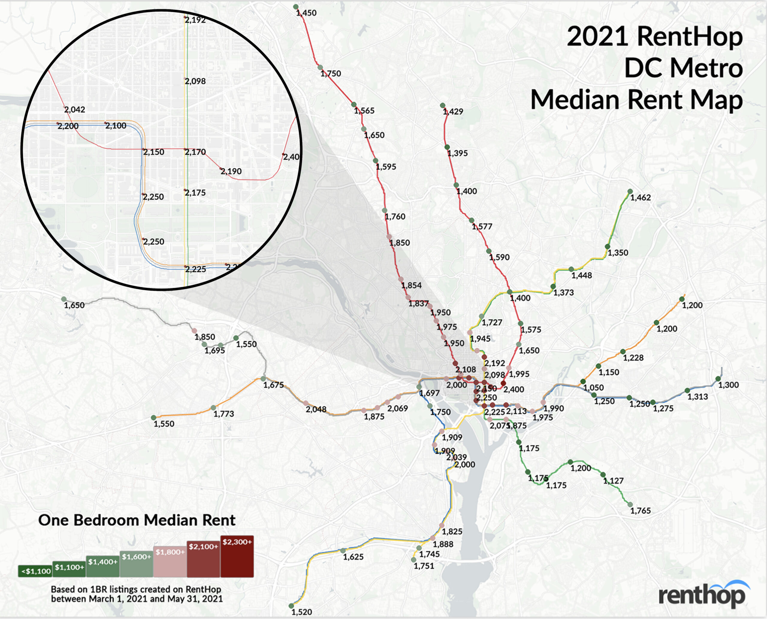
RentHop data scientist Shane Lee mapped out rental prices for one-bedroom apartments by Metrorail stop. Here’s what she discovered for the period of March 1, 2021 to May 31, 2021:
- Rents decreased at 55 out of 91 stops across all train lines.
- That’s 60% of the stops we tracked.
- Rents increased at just 32 stops, but showed no change at 4 stops
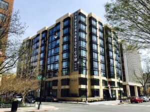
- Median 1BR rent dipped 12.74% around Farragut North — a short walk from The Drake where prices dropped 12.3% year-over-year
- Median 1BR rent slid more than 12.97% around the Rosslyn stop near the Blue, Orange, and Silver lines.
- That’s close to 1121 Arlington Blvd., a condo building with units for sale that saw prices drop -10.3%
RentHop also whipped up an interactive map showing all rents, stops, and YoY price fluctuations:
<
The top 10 biggest rent drops on one-bedroom apartments occurred at the following stops:
- Navy Yard/Nationals Ballpark — Green ($1,875; -13.79%)
- Archives-Navy Memorial — Green, Yellow ($2,175; -13%)
- Rosslyn — Blue, Orange ($1,950; -12.97%)
- Farragut North — Red ($2,042; -12.74%)
- Judiciary Sq. — Red ($2,190; -12.36%)
- Metro Center — Red, Blue, Orange, Silver ($2,150; -12.16%)
- McPherson Sq. — Blue, Orange, Silver ($2,100; -12.13%)
- Federal Center SW — Blue, Orange, Silver ($2,250; -11..76%)
- L’Enfant Plaza — Green, Yellow, Orange, Blue, Silver ($2,225; -11%)
- Eastern Market — Blue, Orange, Silver ($1,980; -10%)
With this in mind, apartment hunters would be wise to check RentHop for listings in and around these area — especially the Farragut North stop. The Drake (pictured below) over at 1355 17th Street, for example, saw a median 1BR rent drop of over 12.7% year-over-year, offers luxury apartments in Dupont Circle.

Of the 32 stops where rent increased, these were the top 5 stops that saw the largest uptick:
- West Hyattsville — Green, Yellow ($1,372.50; +5.58%)
- Georgia Ave. Petworth — Green, Yellow ($1,727; +4.41%)
- Naylor Road — Green ($1,200; +4.35%)
- Braddock Road — Blue, Yellow ($1,825; +4.29%)
- Branch Ave. — Green ($1,765; +3.82%)
Ride the Metro to Savings
Would you travel an extra stop to save a couple hundred dollars? How about for over $1000? RentHop dug deep into the data for the best single stop rent savings and found some very useful results.
The list below represents the largest price drops between a single stop. Sometimes this is because the stops are in different neighborhoods, rents fell at one stop, prices soared at the other, or all of the above. It’s also possible that apartments near a particular stop aren’t apples-to-apples with the apartments just one stop away. We may have left some out due to miles-long stretches between stops.
Turn your commute into extra cash at these stops:
- Save $1,200 by moving to Minnesota Ave. ($1,050) from Federal Center SW ($2,250) – Orange Line
- Save $422.50 by leaving Rosslyn ($1,697) for Addison Road ($1,274.50) – Blue/Orange/Silver Line
- Save $375 between Ronald Reagan Washington National Airport ($2,000) and Van Dorn St. ($1,625) – Blue/Yellow Line
Tell Your Friends! Here’s A Condensed Map for Easy Sharing

Methodology
To calculate the median rent for the map above, we used RentHop’s rental data for one-bedroom apartments from March 1 through May 31 2020 & 2021 as well as WMATA GIS data for Metrorail stops from OpenData DC. To get accurate prices near the Metro stops, we looked first at non-duplicated listings within half a mile of a WMATA stop and if there were 20 unique data points we calculated the median. If not, the radius from the stop was increased and the data was resampled to ensure enough unique listings were used when calculating the median.
What Does This Mean for You?
Finding an apartment in Washington D.C. isn’t easy. Deciding where to live and starting your search is probably the most difficult step. By giving you as much information about the market as possible, RentHop hopes to point you in the right direction. Maps like this are just one of the data-backed insights we offer. All of our Washington DC apartments for rent are ranked using available data to ensure that renters always see the best quality apartments.


