The post Best Time of Year to Rent appeared first on Real Estate Data & Research.
]]>But is that always the case across the US? What is the exact impact and how strong is the effect? To answer these questions, we do a deeper dive into rental trends across the country. Specifically, we look at the top 10 cities (based on their metropolitan statistical area population) to find the best and worst times to rent.
We wrote our original piece last year, but we’ve since updated our data (to include 2018 and Q1 2019). Even though we’ve updated some of our methodology, the results are largely the same.
We find that:
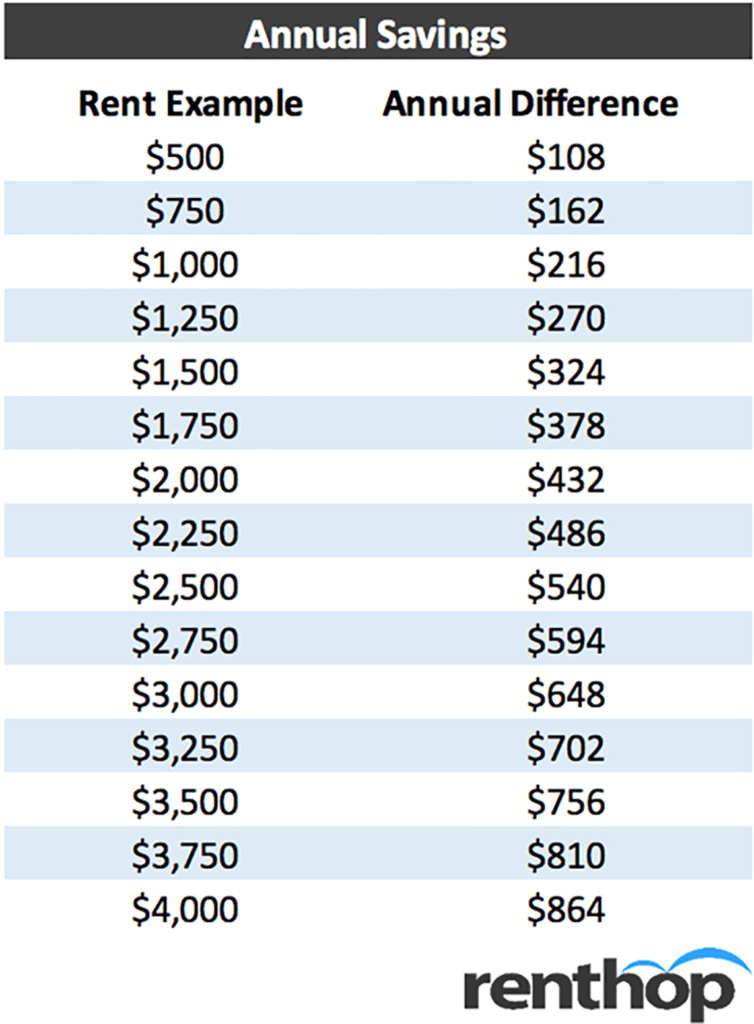
- Peak-to-trough (most expensive month versus least expensive month) differences are between 2.0% to 4.7% for 1-bedroom apartments and 1.6% to 7.1% for 2-bedroom apartments across the top 10 metropolitan areas. The dollar savings (depending on city and apartment size) can be anywhere between $38 and $139 per month (for 1-bedroom apartments) and $47 and $176 for 2-bedroom apartments.
- The “best” or cheapest months to rent tended to be between December and March (early winter to early spring) across the 10 cities.
- The “worst” or most expensive months across all the metros are in the May through October (basically early summer to early fall).
- New York had the largest 1-bedroom seasonality (4.7%) whereas Chicago had the highest 2-bedroom seasonality (7.1%).
- The theory that wintry weather is keeping people away might have some merit. We find a correlation of 0.61 between peak-to-trough temperature variations in a city and peak-trough rental price variations (average of 1 and 2 bedrooms).
- However, college enrollment as a percentage of metro population doesn’t seem to have much of an impact on rent variation. The correlation is even a slight negative at -0.23. However, the 5 cities with highest enrolled student percentage had an average seasonal variation of 3.7% vs 3.0% for the 5 cities with lowest student percentage.
What’s the best time of year to rent?
In general, rents tended to be lower during the winter. The “best” months to rent are between December and March (during the winter). Conversely, the “worst” months are between May and October (during the summer). This relationship held for all cities that we looked at (and for both 1 and 2-bedroom apartment units), regardless of region. On average, we see around a 3.4% “discount” between cheaper months and peak months. Methodology notes at the bottom.
Below, we show the best and worst months for each city (as well as the peak-to-trough discounts). Note that we used an approximate 2018 median pricing for 1 and 2-bedroom apartments (rounded to the nearest $100) to put the seasonality into dollar terms (not the current snapshot of rental prices).
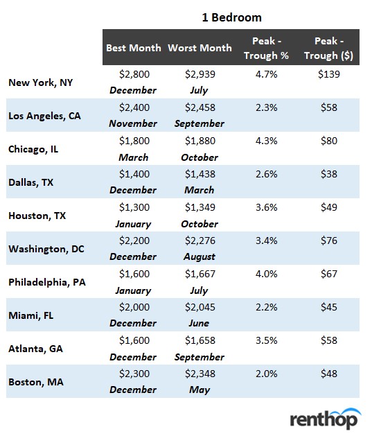
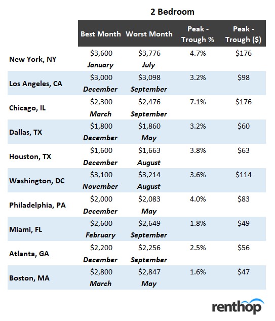
Overall, the peak-to-trough differences are between 2.0% to 4.7% for 1-bedroom apartments and 1.6% to 7.1% for 2-bedroom apartments across the top 10 cities. In addition, there doesn’t seem to be much of a difference in seasonal variability between 1-bedrooms and 2-bedrooms (average seasonal variation of 2-bedrooms is only around 0.1% more than 1-bedrooms) across cities. We also notice that in most cities, December happens to be the cheapest month, while September tends to be the most expensive.
Even though 2-5% might seem small, the total annual savings can be significant. In New York for example, 1-bedroom units were roughly $139/month cheaper (or $1,668 annually) in December versus July. 2-bedroom apartments were $176/month cheaper (or $2,112 annually).
Obviously, dollar savings will be smaller in cities where the cost of living is cheaper. The Texas cities, for example, are around 2x cheaper than New York or Boston (so the dollar savings are also much smaller). However, $600-$800 dollars in savings over a 12-month lease is nothing to scoff at. Given the opportunity, renters should opt to end their leases near the wintertime (or at least be wary of non-standard lease terms that might push them off a good cycle). They should also be wary of any discounts from “months free” type concessions which won’t stick around for the next renewal. Note, though, that we’re not considering the potentially lower selection during the winter months. Generally, higher turnover means more possible apartments (though they’ll likely get swooped up faster!). Next, we look at a city by city basis.
A City by City Look
New York, NY
We first look at apartments in New York, arguably the largest and diverse rental market. Not only is New York filled with out-of-town enrolled university students, but it’s also a major hub for new graduates. Every year, tens of thousands of new graduates flock to the city to start their new jobs. Being in the northeast, New York is also subject to high seasonal temperature variation (at least relative to the West or South).
Rental prices start to increase in early May and peak around June/July/August. Rents start to taper again starting in October (before reaching a low in February). Interestingly, the lower-price periods and higher-price periods last for a while, and seasonal price flips happen rapidly (over a span of only 1-2 months).
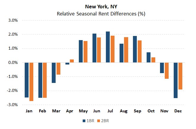
In NYC, you’re looking at roughly 4.7% and 4.7% peak-to-trough seasonal differences for 1 and 2-bedroom units, respectively. Assuming a 1-bedroom costs $2.8K, that equates to around $139 in savings monthly between peak months and low months. Assuming a 2-bedroom costs $3.6K, that equates to around $176 in savings monthly.
Los Angeles, CA
The Los Angeles seasonal chart is a bit messier than the New York one. In fact, while there appears to be price increases during the summer (between May and September) they are generally milder than the ones we saw above (for New York). The slower season, though, abruptly starts around November/December.
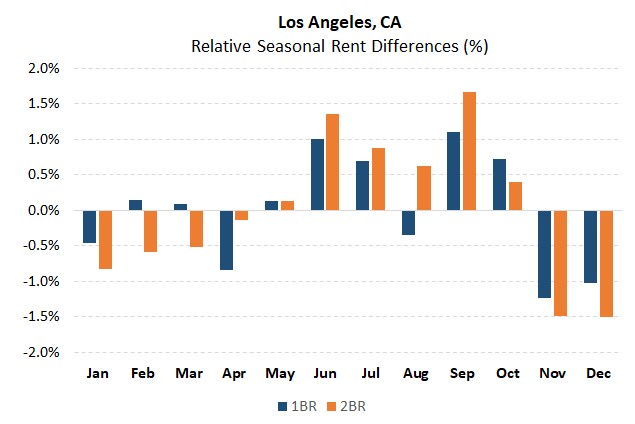
In LA, you’re looking at roughly 2.3% and 3.2% peak-to-trough seasonal differences for 1 and 2-bedroom units, respectively. Assuming a 1-bedroom costs $2.4K, that equates to around $58 in savings monthly between peak months and low months. Assuming a 2-bedroom costs $3K, that equates to around $98 in savings monthly.
Chicago, IL
Moving on to Chicago, we see that the seasonal rental pattern is smoother than that of New York (less abrupt seasonal changes). In addition, we see that 2-bedrooms appear to be more impacted by the seasonality effect than 1-bedroom apartments. Prices appear to peak around September/October and trough around March and April (slightly shifted from LA and New York). The dreaded Chicago winter might impact this (since the cold weather might linger a bit longer).
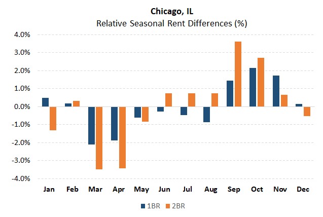
In Chicago, you’re looking at roughly 4.3% and 7.1% peak-to-trough seasonal differences for 1 and 2-bedroom units, respectively. Assuming a 1-bedroom costs $1.8K, that equates to around $80 in savings monthly between peak months and low months. Assuming a 2-bedroom costs $2.3K, that equates to around $176 in savings monthly.
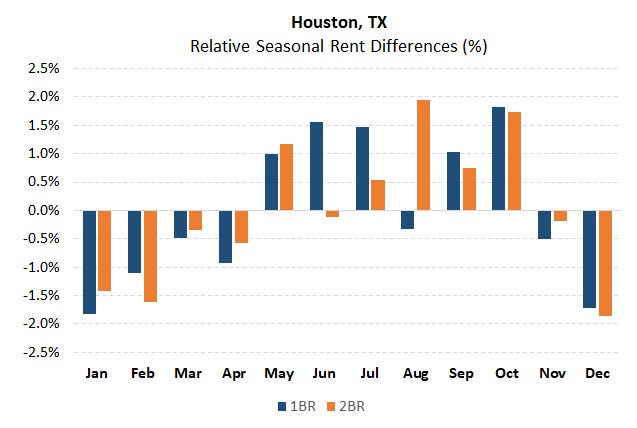
Dallas, TX and Houston, TX
We’ve lumped Dallas and Houston together because they’re the only two top-10 metros that are in the same state (ranked 4th and 5th by population size!). For both Dallas and Houston, we see that the slow season tends to be between November and February. In Dallas, the peak season starts around March (lasting through August). In Houston, the high season kicks off in May before peaking in August.
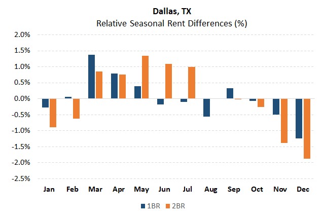
In Dallas, you’re looking at roughly 2.6% and 3.2% peak-to-trough seasonal differences for 1 and 2-bedroom units, respectively. Assuming a 1-bedroom costs $1.4K, that equates to around $38 in savings monthly between peak months and low months. Assuming a 2-bedroom costs $1.8K, that equates to around $60 in savings monthly.
In Houston, you’re looking at roughly 3.6% and 3.8% peak-to-trough seasonal differences for 1 and 2-bedroom units, respectively. Assuming a 1-bedroom costs $1.3K, that equates to around $49 in savings monthly between peak months and low months. Assuming a 2-bedroom costs $1.6K, that equates to around $63 in savings monthly.
Washington, DC
Washington DC exhibits seasonality patterns like the other north-eastern cities. Specifically, we see that asking prices start to increase between April and May, peaking in June. The slower season starts right after September (with a low in November). For those currently looking for apartments, January and February are still in the cheaper period of the year.
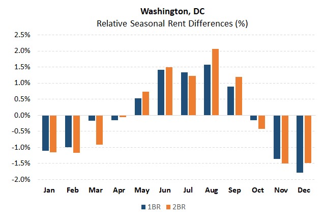
In DC, you’re looking at roughly 3.4% and 3.6% peak-to-trough seasonal differences for 1 and 2-bedroom units, respectively. Assuming a 1-bedroom costs $2.2K, that equates to around $76 in savings monthly between peak months and low months. Assuming a 2-bedroom costs $3.1K, that equates to around $114 in savings monthly.
Philadelphia, PA
The hot period for Philadelphia rentals seems to be a month shorter than some of the other cities we’ve looked at. The peak season seems to pick up in March before peaking in May. The slower season seems to start in September/October (though these two months might be considered neutral). The trough in rental prices starts between November and December.
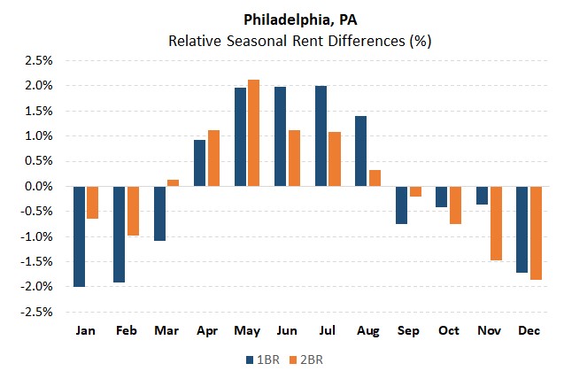
In Philadelphia, you’re looking at roughly 4.0% and 4.0% peak-to-trough seasonal differences for 1 and 2-bedroom units, respectively. Assuming a 1-bedroom costs $1.6K, that equates to around $67 in savings monthly between peak months and low months. Assuming a 2-bedroom costs $2.0K, that equates to around $83 in savings monthly.
Miami, FL
In general, the seasonal fluctuations in the Miami rental market appear to be less pronounced than that of the northern cities. Rents seem to peak in June (with a high season running between May and September). Around October through February, rents drop slightly.
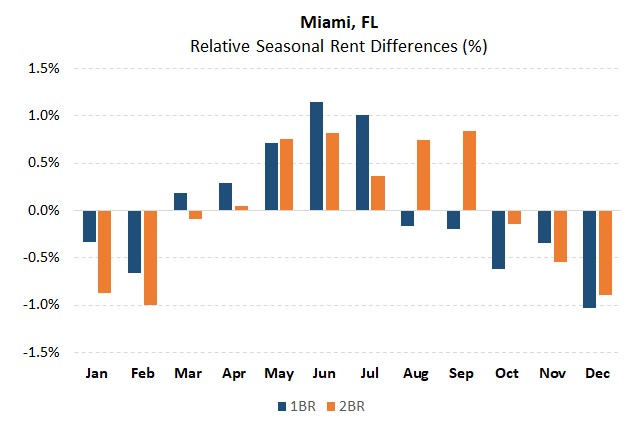
In Miami, you’re looking at roughly 2.2% and 1.8% peak-to-trough seasonal differences for 1 and 2-bedroom units, respectively. Assuming a 1-bedroom costs $2.0K, that equates to around $45 in savings monthly between peak months and low months. Assuming a 2-bedroom costs $2.6K, that equates to around $49 in savings monthly.
Atlanta, GA
Like Miami, Atlanta’s seasonal rental variations are less pronounced than those of the north-eastern cities (at least for two-bedroom apartments). The high season for both 1 and 2-bedroom apartments ramps up in May before peaking in September. This high season doesn’t end until November (with a short 4-month lower-rent period).
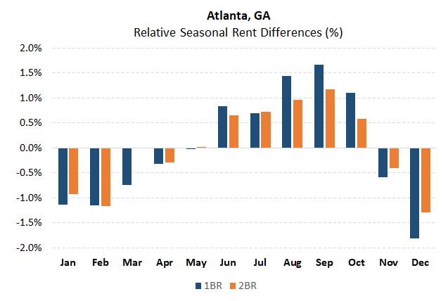
In Atlanta, you’re looking at roughly 3.5% and 2.5% peak-to-trough seasonal differences for 1 and 2-bedroom units, respectively. Assuming a 1-bedroom costs $1.6K, that equates to around $58 in savings monthly between peak months and low months. Assuming a 2-bedroom costs $2.2K, that equates to around $56 in savings monthly.
Boston, MA
Finally, we look at Boston, MA (excluding Cambridge, MA). Rents in Boston start ramping around April. The slow season begins in December and ends around April.
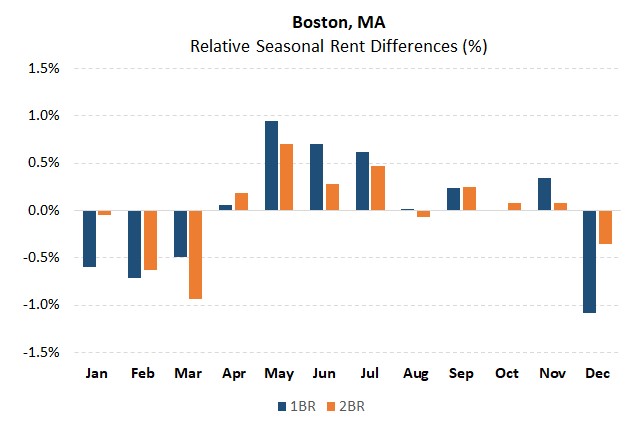
In Boston, you’re looking at roughly 2.0% and 1.6% peak-to-trough seasonal differences for 1 and 2-bedroom units, respectively. Assuming a 1-bedroom costs $2.3K, that equates to around $48 in savings monthly between peak months and low months. Assuming a 2-bedroom costs $2.8K, that equates to around $47 in savings monthly.
Possible Causes
No seasonality study would be complete without exploring possible causes. We take a rough look at two possibilities: Weather and student populations. Note though, that there are likely stronger drivers of seasonal pricing than just these two. For both these possibilities, we’ll be using the average of the 1 and 2-bedroom peak-to-trough rental price changes (which we call the “Rent Variation”). Doing so allows us to incorporate the two data points for each city.
First, are temperature variations keeping people away from looking for an apartment? Specifically, do peak-to-trough temperatures impact peak-to-trough rents? To answer this query, we looked at average monthly temperatures for each of the major cities.
Some parts of the country (like Los Angeles and Miami) have very mild weather changes throughout the year, with average monthly temperatures ranging by only 12-16 degrees (F). Other parts, though have wild variations. Everyone has heard of the dreaded Chicago winter… and for good reason! Chicago’s monthly temperatures vary by a whopping 55 degrees (F).
So how well does this explanation hold up? It turns out that there is a moderate correlation (0.61) between temperature variations and rent variations.
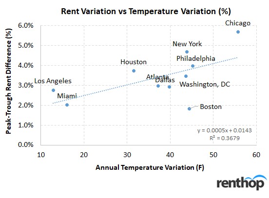
If we run a simple regression, we find an R^2 of 0.37 (with every 10 degrees of temperature increasing the seasonal variation by 0.5%). Of course, this figure should be taken with a grain of salt. The rental index data is itself volatile. In addition, we’re only working with only 10 data points. Nevertheless, this shows that temperature variations could have an impact (with cold weather keeping some people from going out and looking for their new homes).
Next, we test the “Student population” theory. Does the ebb and flow of seasonal students impact how the rental market plays out? Most people living in Boston are familiar with the September moving season. Certainly, September seems to coincide with the peak in prices for many of the cities. But do these college students explain price variations?
Even though we don’t have good data on the number of enrolled students, we rely on the data-table from CityLab scaled by 2016 metro populations. In addition, we assume that Atlanta has enrolled student/population ratio of around 3.6%.
Here, we find a low negative 0.23 correlation between student population % and seasonal variation. However, the 5 lower enrollment cities have an average of 3% variation vs 3.8% variation for the higher enrollment cities. As a result, the explanation doesn’t really hold water.
While temperature seem to explain somewhat the monthly variations across the cities, they’re certainly not comprehensive. The make-up of local inventory (student only inventory – for example), movement of new graduates, and a plethora of other factors could be larger drivers of rental seasonality.
Conclusion
In general, we see that seasonal variation across the 10 largest metro-areas to be in the 1.6 to 7.1% range (for both 1 and 2-bedrooms). Ultimately, renters who can get on the “winter” lease renewals schedule should try for it. In addition, renters should be wary of non-standard lease-terms (basically lease terms greater than 1 year) that might push them from a winter schedule into a summer / early spring one. They should also be wary of any discounts from “months free” type concessions which won’t stick around for the next renewal. Finally, there might ultimately be a trade-off between cheaper rents versus potentially larger selection that renters should be cognizant of.
Methodology Notes
To avoid problems with shifting inventory inside each rental market, we don’t use the simple median price across markets. We calculate prices (based on apartment characteristics) in tight geographic zones and use fixed weights (based on inventory %) across these zones over time. In addition, though we’re focusing on the top 10 metro areas, we’re using data from the “city” (not the MSA itself). Outlier changes are removed.
We used prices “net” of any concessions that might be offered by landlords. Even with these adjustments, though, median pricing data is far from perfect. Seasonality factors were obtained by detrending the data using moving averages (data between 2011 – 2019Q1).
Note, for Boston, we excluded the city of Cambridge when calculating this year’s data.
Addendum
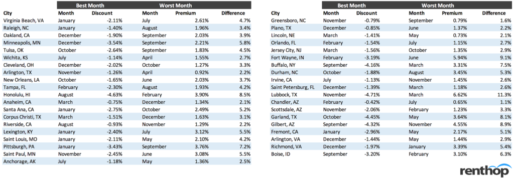
As an addendum to our “Best Time of Year to Rent” study, we’ve expanded the study to include 79 additional cities (of the top 100 cities that we have data for). To keep it uniform (and to include the best data), we only looked at 1 BR units.
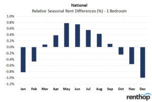
Nationally overall, we find that indeed, the winter months tend to feature lower prices than the summer ones. On average, December tends to be the best month to start a lease and May tends to be the worst (1% discount vs. 0.8% premium). See below for a table that shows the potential annual savings if renting an apartment in May, when the peak-to-trough difference for a 1-bedroom apartment is 1.8%, and a bar chart that shows the national relative seasonal rent differences for a 1-bedroom apartment.
Note: Even though we excluded cities with insufficient data, and we cleaned up outliers, data in smaller cities may not be perfect. However, the general seasonality trend (winter months being cheaper) seems to hold across the nation.
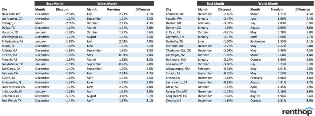
See the table below for a full list of cities with their best and worst months
Methodology Notes (Expanded)
We included 79 cities out of the top 100 cities (by population). 21 cities were excluded because we did not have at least 4 years of data (which was minimum to be included). Most of the data begins in January 2012. However, a few cities had less data (beginning January 2014. We only looked at 1-bedroom units (because of data availability).
To avoid problems with shifting inventory inside each rental market, we don’t use the simple median price across markets. We calculate prices (based on apartment characteristics) in tight geographic zones and use fixed weights (based on inventory %) across these zones over time.
We used prices “net” of any concessions that might be offered by landlords. Even with these adjustments, though, median pricing data is far from perfect. Seasonality factors were obtained by detrending the data using moving averages.
The national “overall” summary was done by taking a simple average of the monthly discounts/premiums across the 79 cities (i.e., each city is equally weighted).
The post Best Time of Year to Rent appeared first on Real Estate Data & Research.
]]>The post A 10 Minute Walk Could Be Worth 10% Off Your Rent appeared first on Real Estate Data & Research.
]]>
If you’re like most New Yorkers, you (unfortunately) rely heavily on the subway to get you where you need to go. As such, proximity to the nearest subway is a determining factor when choosing your next apartment. With the subway as the backbone of the city, it’s pretty common knowledge that you’ll pay a premium to be nearest to a subway entrance. This extra cost is often worth it, and we’re reminded why every time it rains.
To find out just how much that premium is, RentHop data scientist calculated median rent of all apartments within different proximities of any subway entrance in all neighborhoods and boroughs. Below you’ll find maps of Manhattan, Brooklyn, and Queens (Fig. 2,3,4) demonstrating the how rent usually decreases as you get further from a subway entrance. You’ll also find a chart with all available NYC neighborhoods and their rent prices by distance to a subway (Fig. 1).
Here are some of the key takeaways from this study:
- For Brooklyn, Manhattan, and Queens; rent prices aligned with the borough median when about 1/4th mile from the nearest subway. Further than this generally offers a discount, while closer commands a premium (Fig. 2,3,4)
- Apartments closest to a subway cost 6-8% more than the borough median, while those furthest cost 8-10% less. Neighborhood level fluctuations can be much larger due to smaller sample sizes
- For most neighborhoods, the most expensive areas were those no more than 1/8th of a mile to the subway, although apartments closest to the subway in some places were cheaper, potentially because of subway noise. (Fig.1 shows all neighborhoods)
- Except in Manhattan, apartments furthest from a subway were cheaper. For Manhattan, when you’re 1/3rd of a mile from any subway you’re likely by the waterfront. (Fig. 2 shows Manhattan’s map)
- In the Bronx, rents were actually much cheaper nearest to the subway, possibly due to above-ground subway noise, but most likely due to the smaller sample size of available Bronx rental data for the study
Figure 1
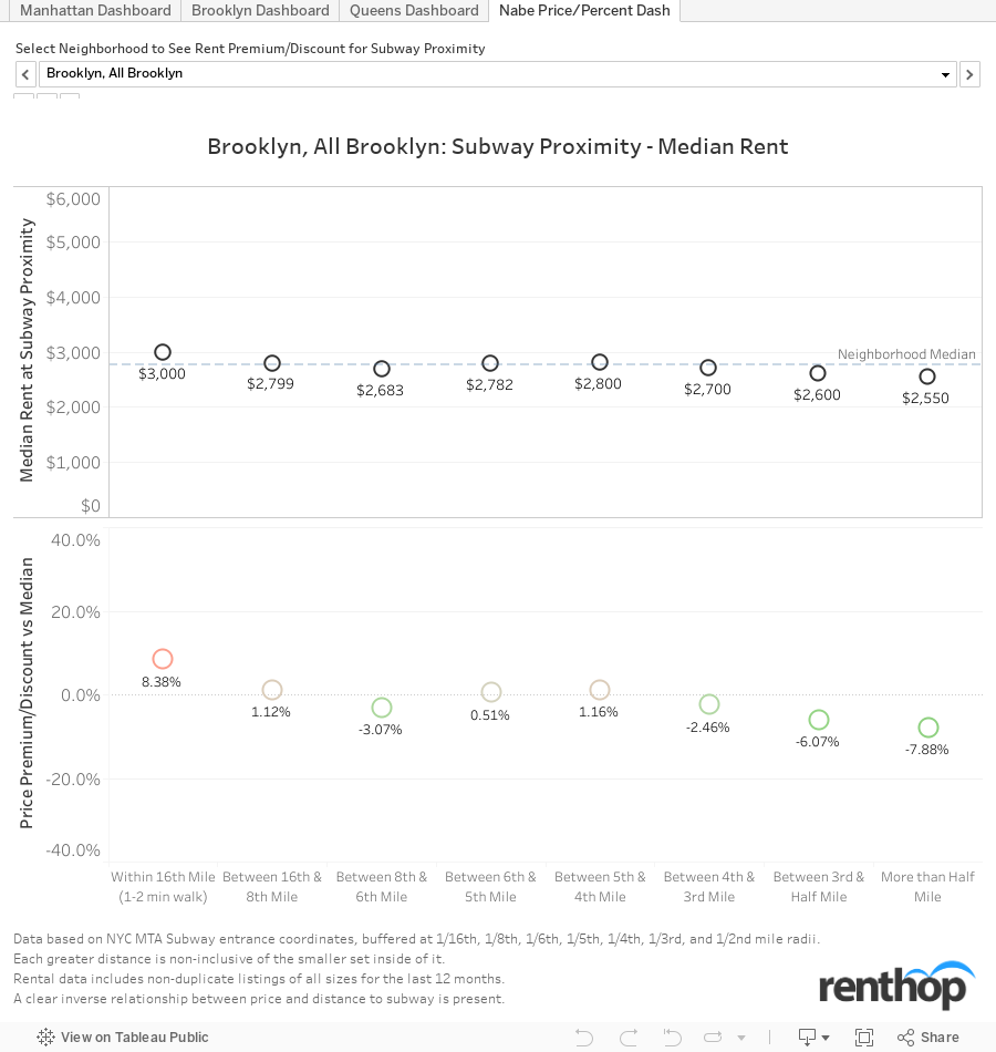
The charts above show the median rent and percentage premium/discount vs the borough median. Most areas show that prices vary 5-10% in each direction depending on the subway proximity. Other areas are more extreme, Crown Heights South commands a 16.7% premium for apartments near the subway ($2,800), while apartments between a third and half a mile from the subway are 32.2% cheaper ($1,626) than the neighborhood median of $2,400. Colloquial Williamsburg (North Side-South Side) apartments within 1/16th of a mile are nearly 11% higher than the neighborhood median, ($3,675 vs $3,300).
Of course, the conclusion that the subway gives the apartments this value isn’t necessarily true. Common sense would indicate that developers and landlords choose to build or renovate apartments that are close to the subway first, especially in outer borough areas that are in a development phase. It would be naive to say that one or the other is the sole cause of higher rents though. It’s almost certainly a combination of subway proximity and the knowledge that a renter will be willing to pay a bit more if they’re a short walk from the subway and the apartment is new, regardless of the neighborhood.
It should be noted that neighborhoods without at least 200 unique listings during the past 12 months are not presented in the above chart, but are taken into account at the borough level in the maps below.
Figure 2
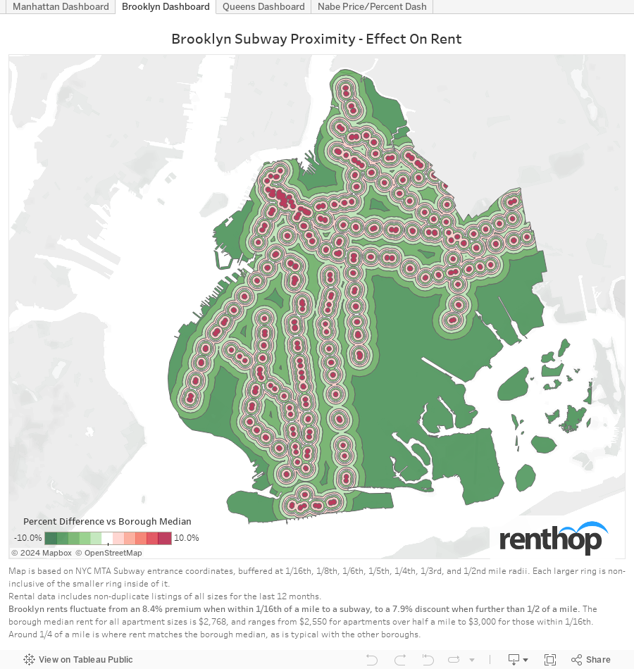
Brooklyn demonstrates the initial hypothesis pretty clearly. Looking at all apartments within 1/16th of a mile of a subway entrance in Brooklyn, we found prices to be 8.4% higher than the borough median. This means that instead of the borough median of $2,768, you can expect to pay around $3,000 per month for an apartment within a 2 minute walk of a subway entrance. On the other hand, if you don’t mind a 10 minute walk (depending on your walking speed) you can find apartments 6% below the borough median ($2,600) at the 1/3rd-1/2 mile distance, and nearly 8% cheaper at greater than half a mile ($2,550)
The apartments that fall outside of 1/6th of a mile and out towards 1/4th of a mile tended to have prices in line with the borough or neighborhood median. After 1/4th of a mile, there is a clear rent discount.
Figure 3
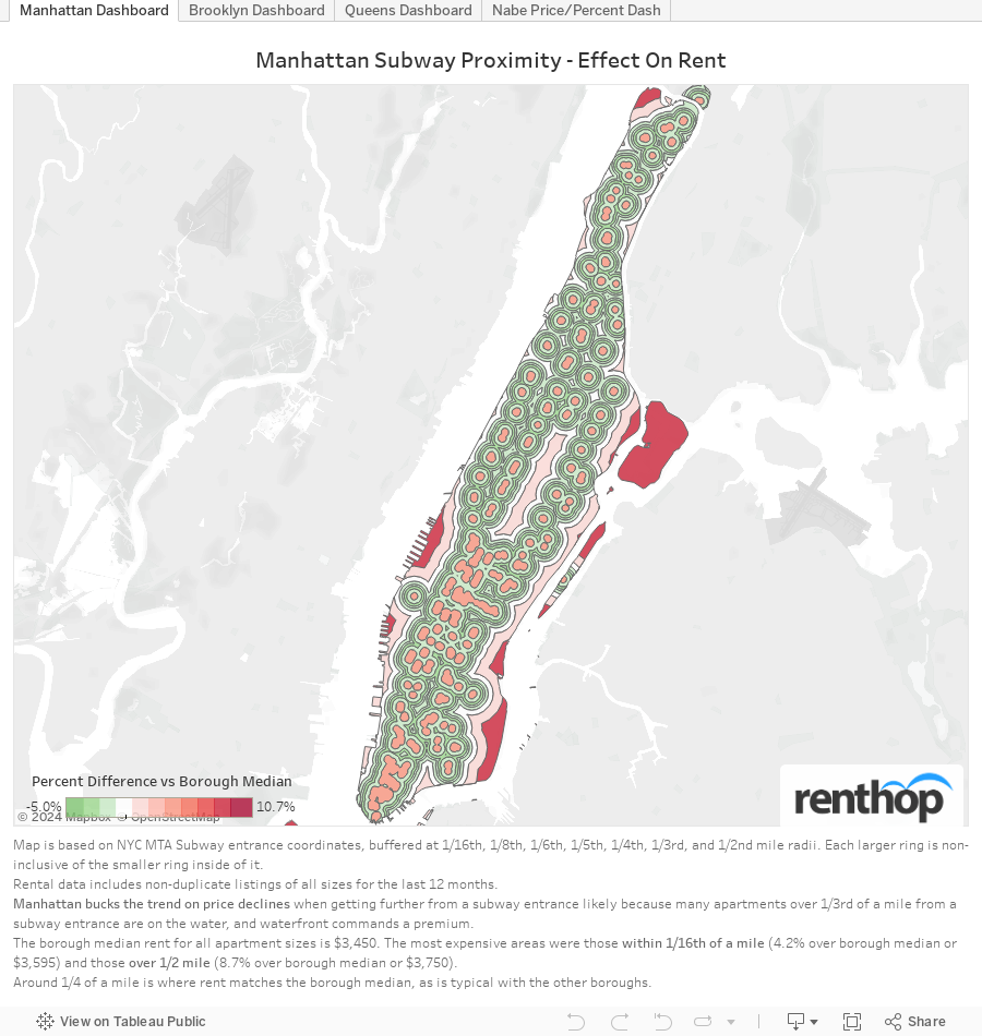
Manhattan is an interesting case; when initially analyzing the data, we found that about 90% of Manhattan was within a quarter mile of a subway. We decided it would be necessary to analyze smaller distance increments to see what’s really going on. At the the 1/16th of a mile (less than 2 minute walk) distance, apartments command a 4.2% premium ($3,595) but that quickly fades when getting a little further from the subway.
Apartments in Manhattan are actually cheapest when you’re between 1/6th and 1/8th of a mile from a subway entrance. It’s not a significant drop, just 2.9% off the borough median price of $3,450. Once you’ve passed 1/3rd of a mile price start to come back up again, presumably because we’re encompassing waterfront apartments with some of the best views in the city. Listings greater than one half mile from a subway are definitely on the water, and will cost an 8.7% premium or a median price of $3,750. this is likely to be worth it, but I couldn’t tell you first hand.
Figure 4
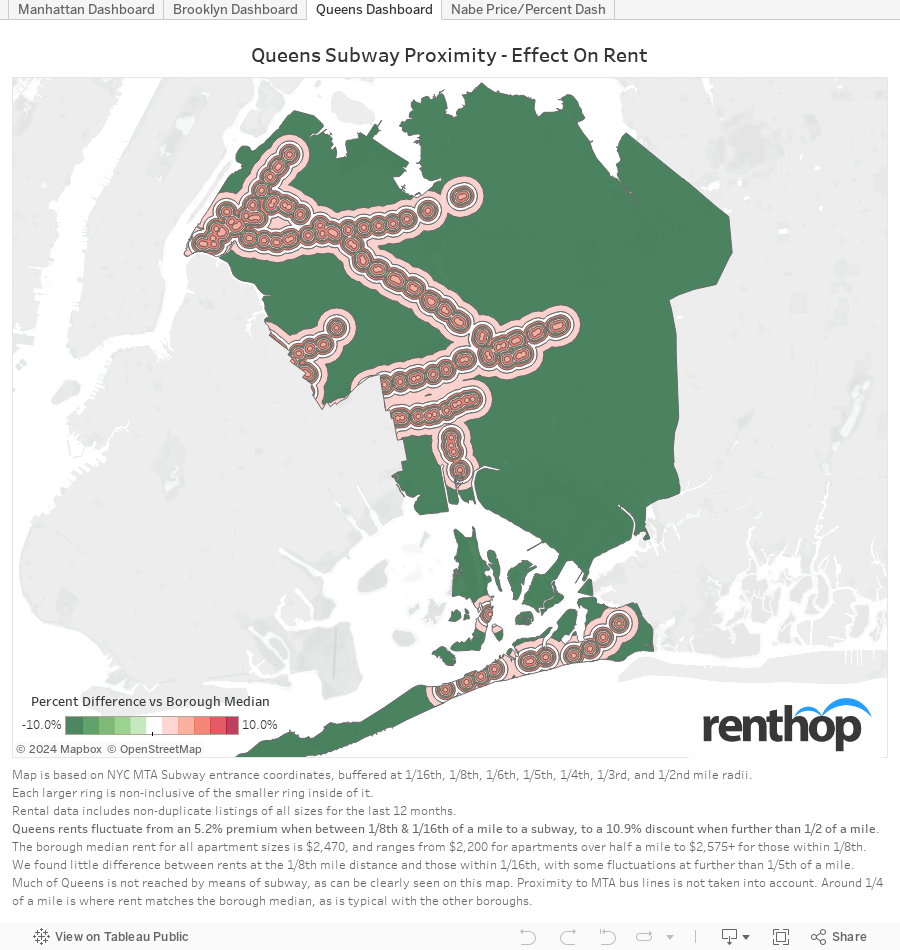
Queens follows a similar pattern to Brooklyn where rent is very clearly and consistently more expensive nearest to the subway entrances. Rent prices drop off slightly at the 1/6th and 1/5th of a mile range, but resume greater than median pricing until reaching the greater than half mile
looking outside of one half mile, when rent drops by more than 10% of the borough median ($2,200 vs $2,470).
Another interesting statistic to note, which is visible in the tooltip of the map, is that our database had just under 8,000 unique listings over the past 12 months for Queens outside of the 1/2 mile perimeter, which is a very large area. For the much smaller region of Queens between 1/16th of a mile and 1/8th, there were nearly 10,000 unique listings. This points to a conclusion that further from the subway, there tend to be less apartment buildings and higher rates of homeownership. It is also less densely populated and a less popular place to live.
It’s no secret that Queens suffers from poor access to subways, but it wasn’t widely understood exactly what that does to the rent of those living in Queens. Now we can visually see that transit desert areas are much cheaper places to live. We don’t take into account bus routes that serve most of the borough, but we can imagine it painting a similar, if not more complicated, picture.
Methods
To calculate median rent by proximity to subway we first started with the publicly available NYC dataset of MTA subway entrances. Using ‘QGIS’ topographic software, we created buffer areas around the entrance latitude/longitude at varying distances. We took the last full year (to combat seasonality) of our actual listings data, with apartment of all sizes, and removed duplicated listings.
When choosing the subway distances, we tried a few variations until deciding on distances that would give large enough sample sizes to draw confident conclusions. It’s important to note that each region is non-inclusive of the smaller regions inside of it. We decided to omit maps of Staten Island and Bronx due to our small sample sizes. In Figure 1 we omitted neighborhoods that didn’t have at least 200 total listings.
The post A 10 Minute Walk Could Be Worth 10% Off Your Rent appeared first on Real Estate Data & Research.
]]>The post Cold Weather, Lack of Heat Hits Less Expensive Neighborhoods Harder appeared first on Real Estate Data & Research.
]]>
In case you hadn’t noticed, it’s been cold outside. Bitter cold was the theme of the first week of 2018, with more cold New Yorkers in the past week than in any previous year on record. Actually, the nearly 30,000 complaints during the “bomb-cyclone” mean there were about as many cold New Yorkers as there were during the first week of the previous 3 years combined. This cold snap brought in 29,386 complaints, of which 18,567 were unique. Compare that to 8,092 complaints (5,828 unique) for the first week of last year. This brings the 2018 “Heat Season” to date (10/1/17-1/8/18) total to 120,780 complaints (83,161 unique).
We can’t highlight enough how important this distinction is, as some outlier addresses keep popping up every year. 89-21 Elmhurst Ave has received 1,298 complaints this season, spread across 50 days. This tops the record they set last year when they made 1,222 complaints for the whole heat season, which ends May 31. Surely someone there is really cold, but they’re fuming as they make over 25 complaints per day. 1025 Boynton Avenue also appeared on the top complaint list again with 574 complaints across 75 days (last year they made 430 complaints on 70 different days by January 7th). The top 50 complaint list is below (fig. 4 below).
De-duping helps minimize the effect of potentially malicious or very angry residents. By grouping together same-day calls from the same address that is reduced. We further normalize the data when looking at neighborhoods, by dividing by the number of rental units in a neighborhood (people that own their home and are cold should settle that dispute with their significant other). The number used when ranking neighborhoods and comparing to Median rents represent unique complaints per 1,000 rental units in a neighborhood.
With all this in mind, RentHop has analyzed which neighborhoods have the coldest New Yorkers and why. Here are the key findings from the study:
- A strong correlation was found between rent prices and complaints about lack of heat. the ‘Normalized Heat Complaints vs Median Rent’ chart demonstrates this (fig. 1)
- Erasmus, Brooklyn; Hamilton Heights, Manhattan; and Norwood, Bronx were the top 3 complaint neighborhoods and appeared in the top 5 last year as well (fig. 2)
- A side-by-side geographic comparison shows that the same NYC neighborhoods that were problematic for complaints last year are having issues again this year (fig. 3)
- Nearly half of the addresses receiving the most unique heat complaints this season ranked high last year as well (fig. 4)
- Heat Complaints for the first week of 2018 set a record and amounted to nearly as many as were received during the previous 3 years’ first weeks combined (fig. 5)
- Besides being the worst first week on record, it also ranked as the most complained-about week of any week over the past 3 years, in terms of unique and duplicated calls (fig. 6)
Figure 1
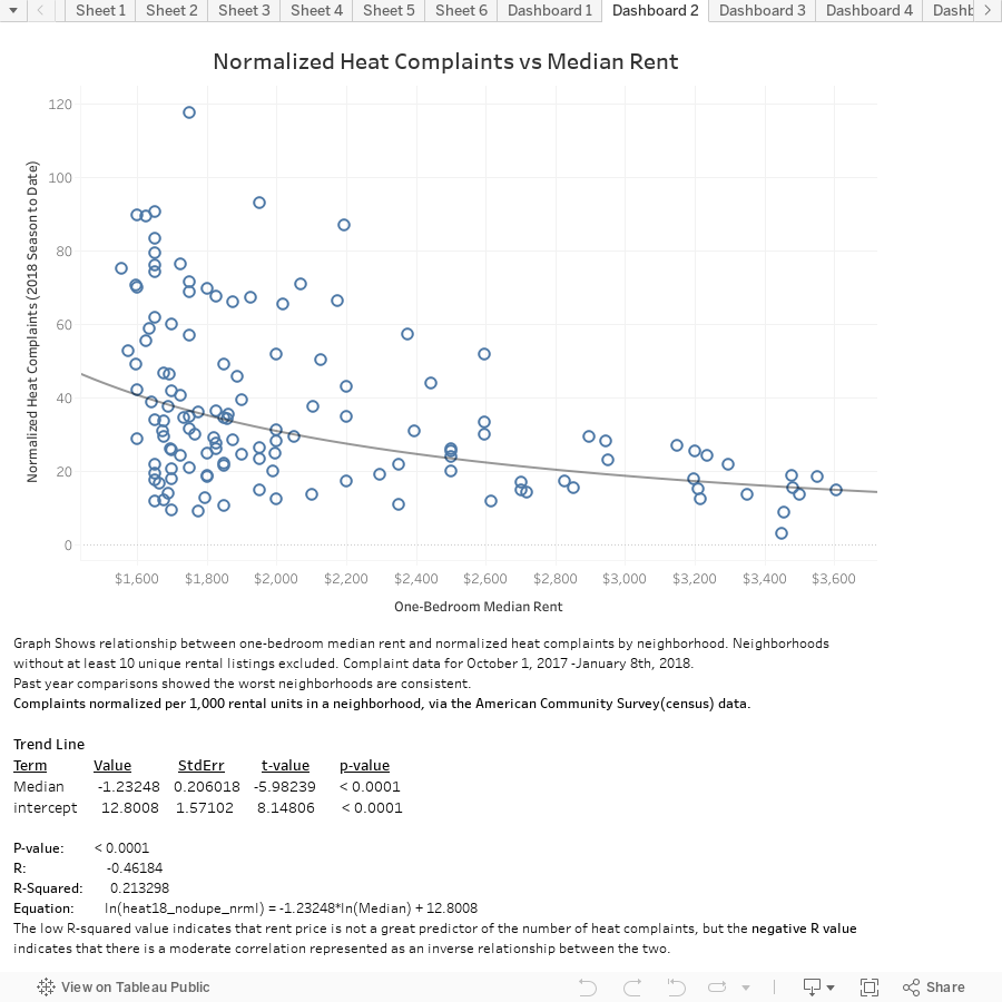
When looking at the graph of heat complaints versus median rent, with median rent as the independent variable, we can see clustering of high numbers of complaints where rents are lower. Complaints are less common as rents rise. While we also see some neighborhoods with both low rents and low complaints, but we don’t see any neighborhoods with high rents and high complaints. Median rent data is for all of 2017 via RentHop’s listing database; heat complaints are unique complaints normalized by the number of rental units in a particular neighborhood, via ACS data.
Figure 2
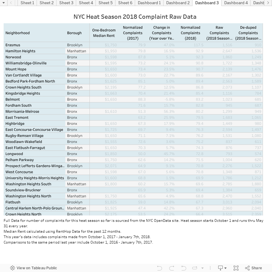
The above table contains the full list of NYC neighborhoods, 2017 one-bedroom median rents, the number of NYC heat complaints (unique, raw, and normalized 2017 & 2018). It’s currently sorted by the normalized number of complaints received through 1/7/2018, but can be re-sorted on any column. When re-sorting by normalized complaints for this period last year, the top 3 names – Erasmus, Hamilton Heights, and Norwood – stay in the top 5.
For the most part, the 10 neighborhoods with the most freezing New Yorkers are the same as last year but in a slightly different order. Rent in these neighborhoods is also well below the NYC median, which hovers around $3,000 for a one-bedroom. The top 10 neighborhoods all have rents below $2,000, save for Crown Heights. We can see that these issues are repeated and prevalent over time. Shown geographically next, it is even more clear how things are unfortunately not changing.
Figure 3
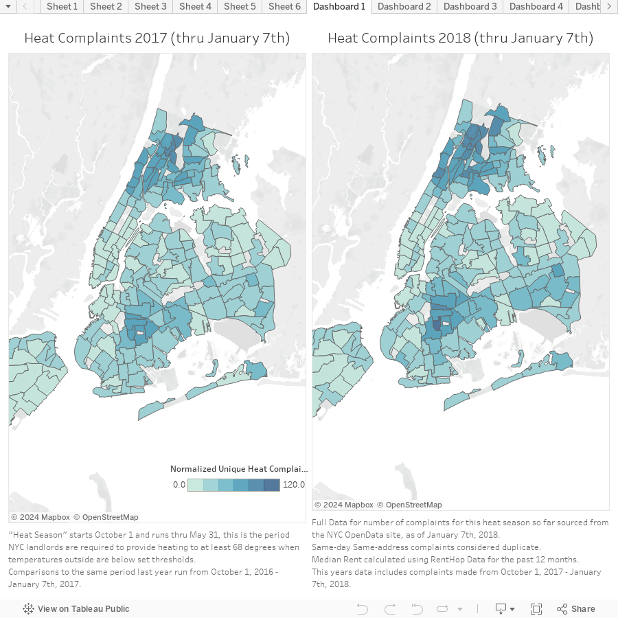
Taking a look at the above maps, it’s hard to discern one from another, which at first prompts a “so-what” or a kind of bored response. After some thought though, I realize this means that same people are suffering that were cold last year. The same landlords in the same areas still aren’t adequately heating their buildings, and the same Department of Housing isn’t doing enough to make sure these people aren’t cold. One can only imagine how the person or persons at these addresses making hundreds of calls must feel. Year-after-year, cold and seemingly screaming into the wind for help.
South-Central Brooklyn, Western Bronx and Harlem, Manhattan all appear in the darkest blue, representing the most complaints. Parts of Staten Island showed big percentage increases in their complaint numbers, although their totals have remained relatively low. Old Astoria saw a big jump in complaints as well as Queensboro Hill, Lincoln Square, and Brooklyn Heights. Battery Park City had the biggest drop in complaints (-60%).
Figure 4
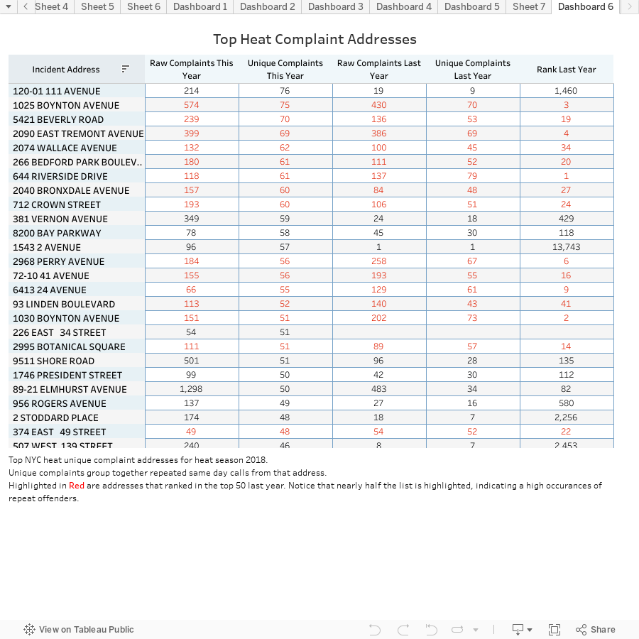
The table above lists the most complained about addresses, ranked by unique complaint count, with raw counts as well. If the address received complaints last year as well, the number of complaints from this same period last year (October 1 – January 7th) as well as their rank last year is displayed. Any address that also ranked in the top 50 last year is highlighted in red. Nearly half of the list appeared in the top 50 last year too.
The prevalence of repeat offenders is quite disconcerting. It’s certainly possible that there are people that have it out for their landlords, but this many repeat names likely means that things aren’t being fixed and the same people that suffered last year are again this year.
Figure 5
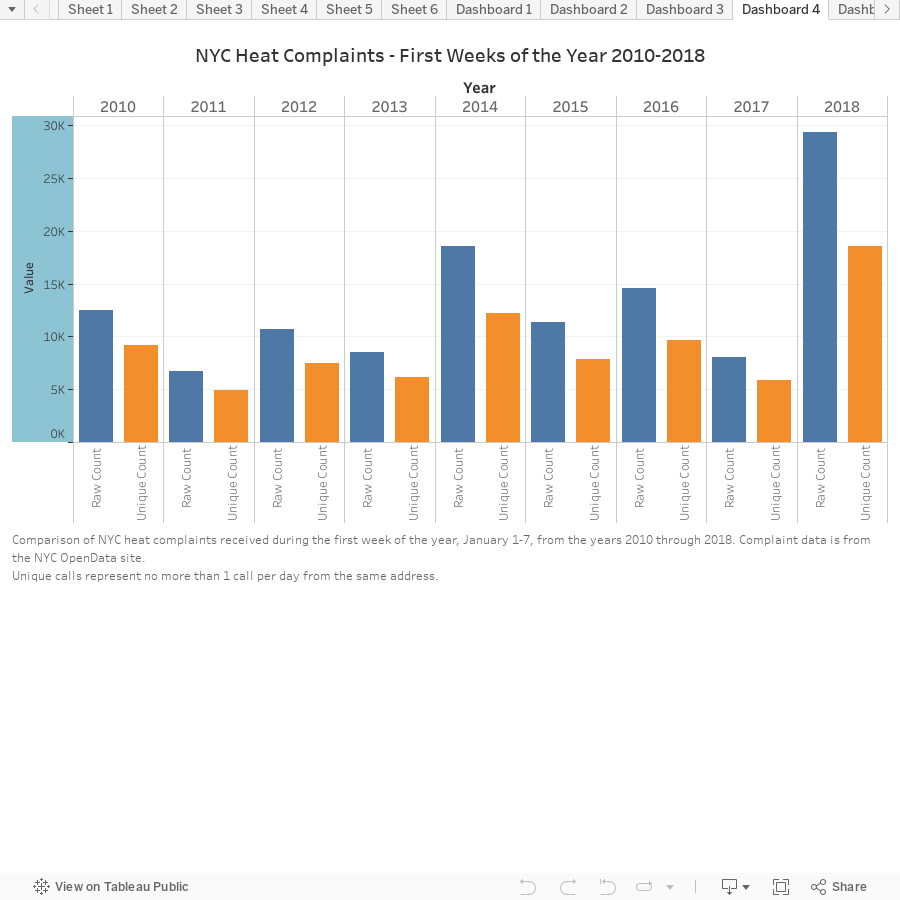
The chart above shows how bad last week really was, compared to other first weeks in the last 8 years. 2014 came the closest, but was still about 50% less.
How does the NYC “Heat Season” work?
From October 1st through May 31 landlords are required to provide heat for all tenants. The requirements are pretty low:
- Between 6:00 AM and 10:00 PM, if the outside temperature falls below 55 degrees, the inside temperature is required to be at least 68 degrees F
- Between 10:00 PM and 6:00 AM, if the temperature outside falls below 40 degrees, the inside temperature is required to be at least 55 degrees F
Figure 6
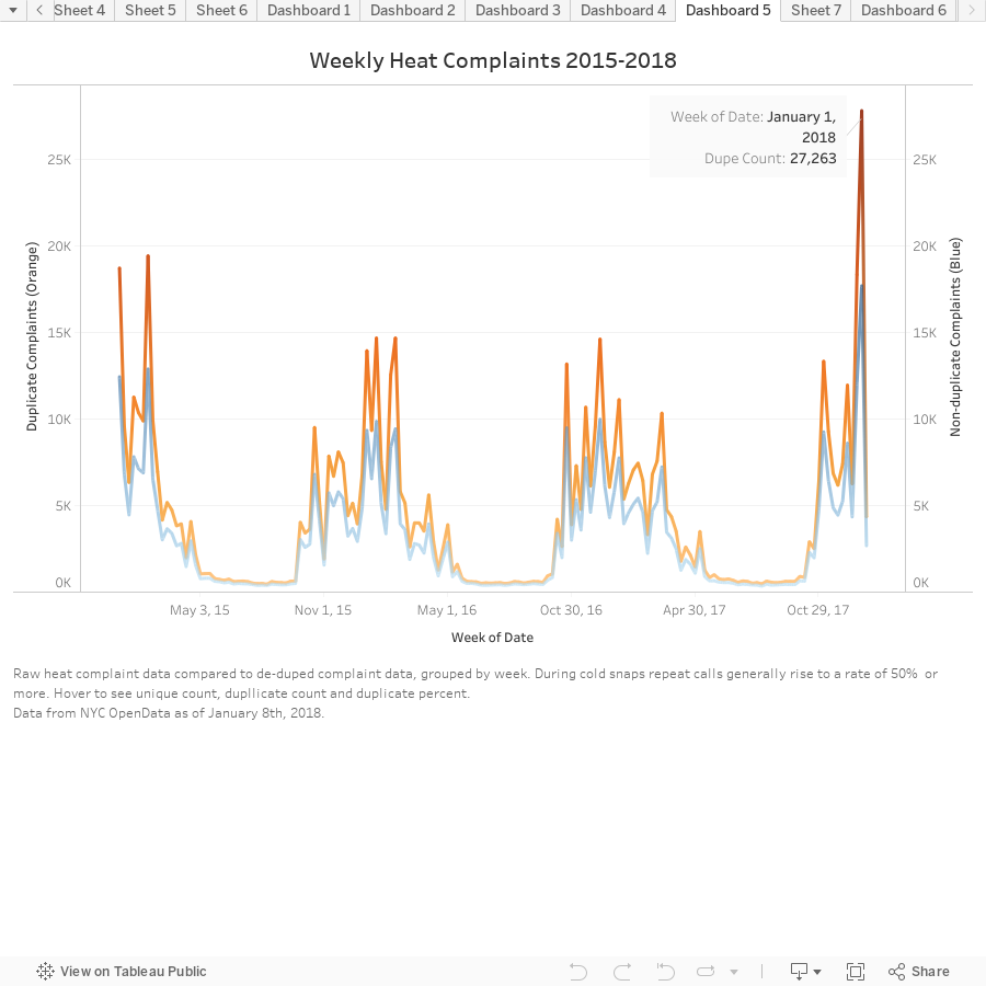
Looking back at the past 3 years of complaints, grouped by week, we can see that last week wasn’t just a bad first week, but a truly bad week overall. No other week in the past 3 years has even come close to generating as many complaints.
What can I do if I think my apartment isn’t being adequately heated?
If you find that your heat isn’t meeting the low minimum requirements, you should first reach out to your landlord. Certified Mail is recommended if it’s an ongoing issue, but I’ve found that text also helps keep a record of the issue and sometimes false promises. If this doesn’t work, calling 311 or visiting the online portal for creating complaints, allows you to make complaints, anonymously if you wish. An inspector from the NYC HPD will come to check the building for violations, usually within a few days, but from the looks of things, they may be backed up.
Regardless, be diligent. Repeated calls and texts to my own landlord has helped me get a little warmer. Usually just one call to 311 gets the message to a scroogey landlord that you know your rights.
Moving into a new place?
Use the NYC Housing Preservation & Developments’s tool to check the address of the building for past and open violations.
The post Cold Weather, Lack of Heat Hits Less Expensive Neighborhoods Harder appeared first on Real Estate Data & Research.
]]>The post Home Buyers In Most NYC Neighborhoods Are Borrowing Less appeared first on Real Estate Data & Research.
]]>Purchasing a home is one of the most memorable, rewarding, and anticipated moments in many peoples’ lives. As our world changes in many ways, the desire to own a home hasn’t subsided; home prices are rising and supply is falling. According to the Nation Association of Realtors, recently sold homes were on the market for just 3 weeks, a historical low. The typical buyer age was also 45, indicating a seller’s market that doesn’t favor Millennials and first-time home buyers.
Here in New York, housing supply is reaching lows as median sale prices reach highs, indicated by Douglas Elliman’s 3Q 2017 reports. Listing inventory (condos, co-ops, and 1-3 family homes) in Brooklyn has decreased 30.4%; there’s just 1,826 available units, versus 2,624 last year. Manhattan has shrunk 2.4% to 6,115 units, and Queens has increased 4.5% to 4,486 units. With this knowledge and data from the NYC ACRIS database, RentHop data scientists set out to see what effect this is having on NYC home buyers’ borrowing habits. Using the maps and graphs below we’ve illustrated these changes. We use the terms leverage percent and percent of home purchase mortgaged interchangeably, other times we refer to the inverse, the down payment, in a similar context.
Key Findings
- The median percent of a home purchase mortgaged was down (>1%) in 107 neighborhoods from 2010 to 3Q 2017, with 69 of those neighborhoods down at least 5%
- The median percent of a home purchase mortgaged was up (>1%) in 39 neighborhoods in the same period, with just 18 up more than 5%
- Less leveraging and larger down payments in the outer boroughs are a sign of greater financial health; Bronx down-payments grew from 7% to 16% while Queens grew from 20% to 25%
- A majority of the increased borrowing took place in Manhattan, although percent leveraged is still lower than other boroughs (down payments down from 36% to 31%)
- NYC as a whole has maintained a leverage rate of about 75% since 2010 (25% down payment), dropping slightly to 74% in 2017, far lower than the nationwide median of 90% (10% down payment)
- Three of the largest mortgages we found between 2010 and 3Q’ 2017 were for 432 Park Ave, including a $56 million mortgage for penthouse unit 96. The total sale price was $87,660,900 (63.9% leveraged), the top 6 are listed below
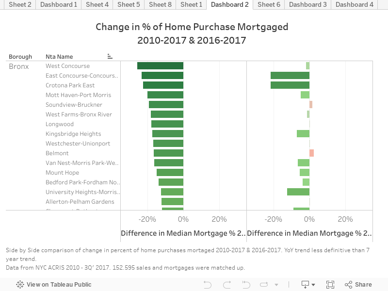
The first thing that one may notice in the above-left graphic is that just a handful of neighborhoods borrowed a larger percent for their home purchase than in 2010. This seems to indicate greater financial stability in homebuyers since the 2009 financial crisis. This is especially the case in West and East Concourse, Bronx; East New York and Crown Heights North, Brooklyn; and Queensbridge and Woodhaven, Queens. Manhattan actually saw borrowing increase, but upon closer inspection you’ll see purchases are still under 70% leveraged in most neighborhoods, making neighborhoods in Manhattan some of the least leveraged in NYC.
The above-right graphic shows year-over-year trends, which are more mixed. While there’s no definite trend in Queens, Brooklyn, and Manhattan; it’s clear that in the Bronx, people are borrowing less than they borrowed last year. The forthcoming graphs illustrate the trends over time more clearly.
How’d We Do It?
To compile the data for this report, records from NYC’s ACRIS database of sales were compiled and geocoded to find which neighborhood they were in. Sales records were then matched with mortgage records and commercial and bulk sales were filtered out. Just over 150,000 sales were mapped to corresponding mortgages. Due to recording delays of months or sometimes years; as of December 2017, it is likely that some records for 3Q’ 2017 may be missing (and 2Q’ 2017 for that matter). Data for Staten Island is not present as Richmond County maintains its own, separate registry for data like this.
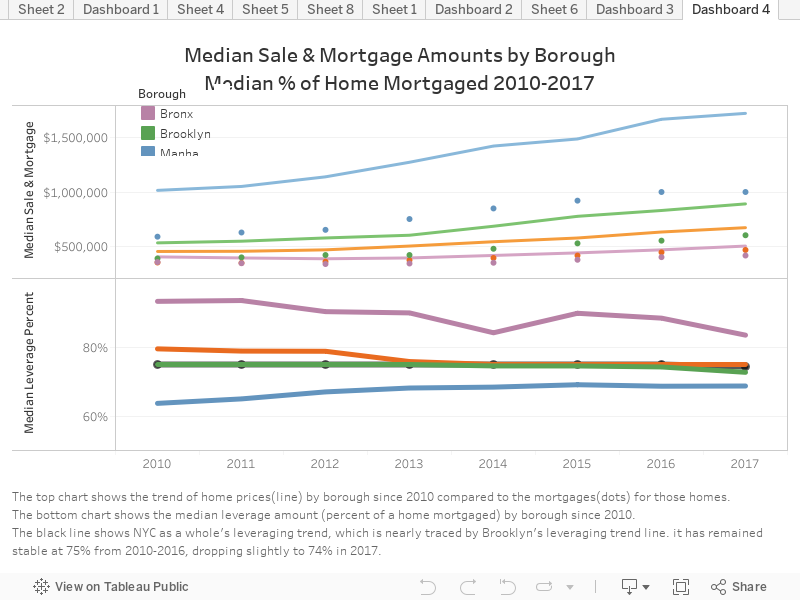
The line chart above shows, by borough, the trends of median sale prices, mortgage amounts, and leverage percent. Home prices are up across the board, and mortgages have risen accordingly. At the same time, down payments have risen, meaning leverage percent has gone down. One may conclude that lenders aren’t willing to lend as much, but data for Manhattan would contradict that. As sale prices have skyrocketed in Manhattan, leverage percent has risen, with all boroughs converging towards the NYC median leverage percent of 74%.
Manhattan – Some Very Large Mortgages
While digging through this data, I couldn’t help but check where the largest mortgages were issued. It came as no surprise that 3 of the top 5 were at 432 Park Ave, the tallest residential tower in the western hemisphere. Below are links to the original mortgage records.
- 432 Park Ave, #96 – $56,000,000 mortgage, $87,660,900 sale price – 63.9% leveraged
- 432 Park Ave, #83 – $30,500,000 mortgage, $65,163,600 sale price – 46.8% leveraged
- 157 West 57th St, #88 – $30,225,000 mortgage, $47,367,500 sale price – 63.8% leveraged
- 157 West 57th St, #86 – $30,200,000 mortgage, $47,367,000 sale price – 63.8% leveraged
- 432 Park Ave, #64A – $30,000,000 mortgage, $44,833,400 sale price – 66.9% leveraged
- 551 West 21st St, PH18 – $25,500,000 mortgage, $34,623,200 sale price – 73.7% leveraged
The Maps Below Show Geographically Where Home Prices are Rising and Borrowing is Decreasing
The map on the right indicates that home prices are up across the board, save for Marble Hill-Inwood and West Brighton. Most neighborhoods saw median home prices increase by 40% or more percent, as indicated by the lighter shades of blue covering most of the map on the right. Hamilton Heights in Upper Manhattan saw median sales prices rise the most, followed by Brooklyn Heights and West village. DUMBO, Stuyvesant Heights, Long Island City, and Manhattanville also rose sharply.
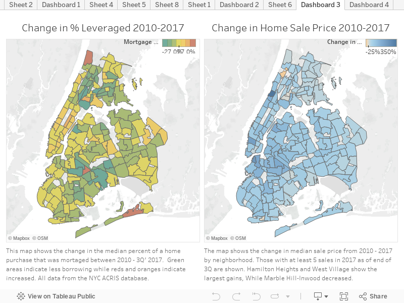
The map on the left shows how the distribution of borrowing has changed over the past 7 years. A majority of neighborhoods are shades of green, indicating lower borrowing and larger down payments. This is especially evident in Southeast Brooklyn and Queens; in neighborhoods like Crown Heights North, East New York and Woodhaven.
Looking North towards the Bronx, there are signs of positive change, as home buyers are leveraging significantly less to buy their homes. Median down payments in many Bronx neighborhoods were as low as 3-5% in 2010 but are now mostly between 15-25%.
Lower borrowing in the face of higher home prices may signal greater financial health for the NYC market, while also possible indicated that lenders are becoming more reluctant to lend. In a market where supply is having difficulty keeping up with demand, competition for great homes is fierce. This means making lightning-fast decisions is important. Having all the information at your fingertips is essential and with RealtyHop you can make a well-informed purchase.
The post Home Buyers In Most NYC Neighborhoods Are Borrowing Less appeared first on Real Estate Data & Research.
]]>The post NYC 3rd Quarter 2017 Rent Report and Trends appeared first on Real Estate Data & Research.
]]>New York City is internationally known for its posh apartments and luxurious living. This, of course, comes at a price. For the 3rd Quarter of 2017 that price is $3,025 – asking rent for a median one-bedroom apartment anywhere in the city that is. This is up from $3,000 in the 2nd quarter, but rents vary greatly across boroughs and neighborhoods. Below you’ll find maps showing current prices and graphs displaying rent changes over the past two years. Further down you’ll find a table with all available neighborhood data.
Here are some key findings from our 3rd quarter market report:
- As a borough, Queens showed the largest rise in rent from 2Q to 3Q (6.5%)
- The Bronx had the largest Year-over-Year gains with a 10.7% hike across all neighborhoods, 84% of available neighborhoods saw rent go up at least 1%
- The top 9 most expensive neighborhoods were in Manhattan; number 10 was North Side-South Side (Colloquially Williamsburg) in Brooklyn
- Manhattan rents have largely stabilized, with 57% of neighborhoods showing little or no change from last quarter, and 57% showing at least a 1% drop from last year
- The biggest price drops are happening in the most expensive area (Soho, Gramercy Park) while the biggest gains are in the least expensive (Schuylerville, Ridgewood, Mott Haven)
Using our own data, RentHop has looked back at the data for the 3rd quarter as well as past years to see where rents are up, down, or stabilized. In NYC there are 195 NTAs, (Neighborhood Tabulation Areas) some of which are parks, airports or cemeteries. RentHop data scientists calculated median one-bedroom rent, Quarter-over-Quarter, and Year-over-Year change for 130 of them where sufficient data is available. This was done from a pool of 52,918 unique listings for 3rd Quarter 2017 with an average of 407 and median of 58 data points per neighborhood.
The Maps Below Show Median Rent as well as the Change Since Last Quarter
The maps above show Quarter-over-Quarter (2nd Quarter 2017 vs 3rd Quarter 2017) one-bedroom rent fluctuations by neighborhood tabulation area on the left, and 3rd Quarter median rents on the right. Dark red, as seen in Ridgewood and Schuylerville indicates larger price jumps. Dark green, like Sunset Park West, Bath Beach, and Queensboro Hill indicates price drops. Grayed out neighborhoods are where we didn’t have sufficient data, many of which are in Staten Island where higher rates of home ownership mean less rental units.
Looking at the map on the right, it’s quite clear that the most expensive New York neighborhoods are in Manhattan (the top 9 actually) but thankfully prices are stabilizing. Brooklyn neighborhoods like Fort Greene, North Side-South Side (Colloquial Williamsburg), and Dumbo are close behind Manhattan. Hunter’s Point and Long Island City of Queens are also catching up. Click a neighborhood to see the median rent or QoQ rent change.
The graph under the maps show neighborhoods that have fluctuated the most over the past two years.
To diversify the data I chose to highlight at least one neighborhood from each borough that made a drastic rise as well as a drop. Manhattan’s (shades of Green) biggest drop (down 7.6%) was SoHo: $3,894.50 to $3,595, while Queens’ (shades of yellow) biggest “drop” was Woodside, which actually remained the same over 2 years as everything else has risen. Bronx (Red) neighborhoods posted the most drastic gains, Mott Haven rose from $1,382 to $1,950 over the past two years. Brooklyn (Blues) were mixed, but Fort Greene grew the most at 15% ($2,850 to $3,279) over the past two years.
The table below has two tabs. One shows the median rents, Quarter-over-Quarter changes, and Year-over-Year changes for all neighborhoods. The other is a breakdown of what percentage of the neighborhoods in each borough saw rent increase or stay the same or drop. Keep in mind, these percentages are not how much the rent has changed, but how what percentage of neighborhoods posted rises, drops, or no change.
Most notable are Year-over-Year changes for Bronx and Queens, with rents rising 10.7% and 9.1%, respectively. 84% of observed Bronx neighborhoods saw rents rise more than 1% since last year. Manhattan showed the greatest number of neighborhoods with rents stabilizing or dropping, with more than half of neighborhoods showing no gains since last quarter, and 57% down from last year. The city as a whole saw one-bedroom rent up .8% since last year as well as last quarter. A greater number of neighborhoods showed little or no change since last quarter versus since last year, while the general trend is still towards higher rents for the entire city.
The post NYC 3rd Quarter 2017 Rent Report and Trends appeared first on Real Estate Data & Research.
]]>The post Looking To Save Money On Rent? (Get a Roommate) appeared first on Real Estate Data & Research.
]]>One of the most common, although not necessarily the easiest, ways to lower your rent is to move out of that one-bedroom apartment, get a roommate, and move in to a two-bedroom apartment. It’s probably best if it’s not that boyfriend or girlfriend you’ve been dating for a few weeks nor that friend that’s just crashing on your couch “until he figures some stuff out”.
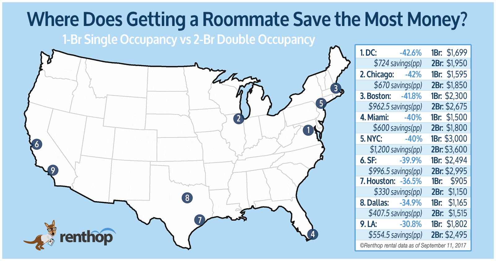
RentHop isn’t here to make life choices for you though, we just want to show you where you can save money and how much. A quick look at the monthly median rent differences in 9 major metro areas showed savings varied from 30.8% in Los Angeles all the way to 42.6% in DC.
Here Are Our Key Findings:
- On average, across the US, one can expect to save around 40% off their monthly rent by sharing a two-bedroom versus having a one-bedroom alone
- The most expensive and oldest neighborhoods generally had the lowest savings (~30%). Some such areas are Upper East Side(NYC), Beverly Hills(LA), South Pointe(Miami), and North Beach(SF)
- Neighborhoods outside the city center or that were less expensive generally had greater savings (>40%) due to the lower incremental cost of an additional bedroom. Ocean Hill(NYC), West Roxbury(Boston), and Leesburg(DC) all had savings of over 45%
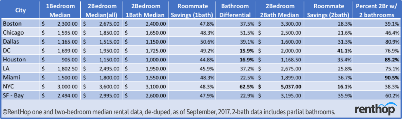
- The most consistent determinant of savings was the presence of a second bathroom in a two-bedroom apartment. A 2-bedroom/2-bath can cost anywhere from 16% to 62% more than a 2-bedroom/1-bath
- Dallas and Los Angeles bucked some of these trends, with a wider price gap between one & two-bedroom apartments, translating to less savings for those looking to get a roommate
The Map Below shows roommate savings in each city – Scroll Down for a table of savings by neighborhood
Variability drastically increased at the neighborhood level. Neighborhoods such as South Pointe, Miami Beach and Carnegie Hill / Upper East Side, New York showed little or no savings on the move to a two bedroom (the rent approximately doubles). In high-luxury areas like these there’s a higher occurrence of coveted two-bedroom two-bathroom apartments and less of those pesky two-bedroom “flex” apartments.
Other neighborhoods were at the other end of the spectrum: North Oakland (Bay Area) and West Side (Chicago) have median one & two-bedroom median rents that are very similar. This is often correlated with a rarity of one-bedroom apartments or where one-bedroom apartments are very similar in size to two-bedroom apartments. Flex bedroom apartments were filtered out of the data, with only “true” one & two-bedroom apartments being used to calculate median rent.
Flex rooms are made when a wall is put up to split a spacious one-bedroom into a two-bedroom. They are common especially in New York and San Francisco where new construction doesn’t meet the demand for housing and the desire for location outweighs the desire for space. An often-annoying occurrence for prospective renters is finding out an apartment advertised as a two-bedroom is “flex-able”, but actually doesn’t have the wall put in place yet. RentHop works to ensure these types of listings are properly classified; these apartments won’t be the reason one & two-bedroom apartment prices converge in some regions.
Bathrooms As a Determiner of Savings
Of all the compromises one must make when getting a roommate, sharing a bathroom puts people off the most. For good reason, as it’s usually the dirtiest room in a house. This can easily become a point of tension when shared by people with different hygiene standards. It should be no surprise then that one will need to pony up for a private porcelain throne.
So how much does a second bathroom affect rent?
In NYC the “get-a-roommate” savings drops to 16.1% for a two-bedroom apartment with at least 1.5 baths. In DC, Houston, and Miami the second bathroom had a less significant effect on the rent, likely due, in part, to the prevalence of additional bathrooms in a two-bedroom apartment.
The table below shows how an additional bathroom affects rents in different cities
We’ve Compiled A Table of Savings For All Neighborhoods In Nine Major Metros
Sort/re-sort by any parameter by clicking that column. Change cities by clicking the city’s tab and search for your neighborhood by typing it into the box.
A forthcoming apology from the RentHop data scientists: we’re sorry to have left out many neighborhoods and regions due to unavailability of accurate data. Luckily, many of the neighborhoods we call home are sub-neighborhoods of a larger region. If you don’t see your neighborhood, consider the name of the larger region and search for that.
Below are some Standout Nabes to get a Roommate in Each City (Most Savings)
Boston: Jamaica Hills – Pond (46.6%), West Roxbury (45.6%), Everett (45.5%)
Chicago: South Shore (49.7%), West Side (48.7%), South Side (47.1%)
Dallas: Arlington (40.1%), Glencoe Park (38.7%), Fort Worth (36.2%)
District of Columbia: Leesburg (46.2%), Huntington (43.4%), Old Town North (42.1%)
Houston: Brazoria County (48%), Conroe (44%), Pearland (43.7%)
Los Angeles: The Colony (46%), Laguna Woods (45.8%), Chino Hills (45.8%)
Miami: New Hampton (45.5%), Little Haiti (45%), San Matera at The Gardens (45%)
New York City: Ocean Hill (48.7%), Gramercy Park (46.4%), East Shore (46.1%)
San Francisco Bay Area: North Oakland (47.5%), Lower Hills District (45.6%), The Old Quad (45.4%)
These are the Nabes NOT to get a Roommate in Each City (Least Savings)
Boston: Oak Grove (20.5%), Back Bay East (24.8%), Lowell (26.3%)
Chicago: Kilbourn Park (-5.3%), Addison (7.8%), Berwyn (14.9%)
Dallas: City Center District (7.1%), Henderson (7.5%), North Oaklawn (10%)
District of Columbia: Downtown Alexandria (5.4%), Prince William County (10%), North Rosslyn (11.8%)
Houston: Washington Ave – Memorial Park (13.8%), Greater Heights (14.1%), Memorial (16.7%)
Los Angeles: City Center (-3.1%), Silver Lake (1.7%), Downtown Huntington Beach (7.2%)
Miami: South Pointe (0%), Barrier Island (7.3%), Fleetwood (8.4%)
New York City: Carnegie Hill (8.3%), West New York (13.9%), Battery Park City (16.3%)
San Francisco Bay Area: Downtown Berkeley (15.8%), North Beach (21.5%), Telegraph Hill (21.5%)
RentHop knows there are many things you consider before getting an apartment. Cost and location are undeniably among the top considerations for most people, but we’re all different. Make your choices based on what’s right for you.
The post Looking To Save Money On Rent? (Get a Roommate) appeared first on Real Estate Data & Research.
]]>The post Building Ages and Rents in New York appeared first on Real Estate Data & Research.
]]>We find that:
- Pre-war apartments (1-bedroom, elevator) average around 10-12% cheaper than their newer counterparts.
- One-bedroom apartments (in elevator buildings) tend to be cheaper by around $6 per year of age (some of which can be accounted for by the pre-war discount). This $6 figure can be significant since most Manhattan buildings are decades old.
- In Battery Park City (a neighborhood with only newer buildings), the average price difference for 1 year of age (in a 1-bedroom elevator apartment) is around $42!
- Paradoxically, even though age and prices are negatively related inside neighborhoods, there is no real relationship between age and price across neighborhoods.
***
To better understand how a building’s age affects rental prices, we first look at the distribution of building age across the city. We also isolate the “oldest” and “newest” neighborhoods (by the median age of their residential buildings). To better compare data across neighborhoods/boroughs, we only consider multi-dwelling buildings (3 or more units). It’s important to note that NYC is a pretty old city. The median age of a surviving residential building is nearly 90 years old (obviously, with some renovations along the way). The city’s massive population growth of nearly 63% between 1900 and 1920, contributed to high levels of residential construction during that era.
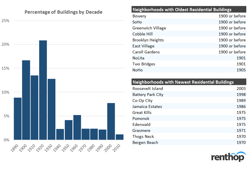
Note: the PLUTO built-year data isn’t perfect, and some years before 1900 may have been rounded to the nearest century
The “oldest” neighborhoods are East Village, Greenwich Village, and Soho. These neighborhoods largely coincide with zones of historical district designation. They also highlight the development pattern of the city itself (which sprawled outwards from the tip of lower Manhattan). The neighborhoods with the newest buildings include Roosevelt Island, Battery Park City, and Co-Op City (along with multiple neighborhoods in Staten Island). Those interested in NYC building age patterns should look to the wonderful map made by Brandon Liu in 2013.
One interesting thing to note, though, is that there is no strong relationship between a neighborhood’s age and median rents in that neighborhood. We plot median 1-bedroom apartment rents against the neighborhood age below.
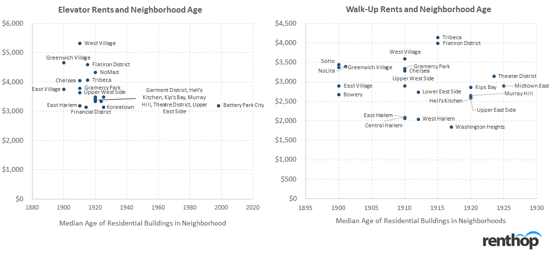
We see that for elevator buildings, there is even a slight negative relationship between neighborhood’s median building year and price. This relationship may be due to zoning in the historic districts, which make elevator buildings (or newer buildings) particularly coveted in those areas. In fact, there are barely any modern buildings in West Village and Greenwich Village. For walk-ups, we don’t detect much of a relationship at all. However, we do notice that prices tend to decrease as you move more north in Manhattan.
The lack of a strong relationship between prices and neighborhoods suggests that we can’t simply look at buildings and prices across the city, since location and the actual neighborhood matter more.
***
Though we don’t see much of a relationship between prices and age between neighborhoods, what about prices within neighborhoods? To explore this, we do a deep dive into the neighborhoods of Manhattan. We first find the representative prices of one-bedroom apartments in each building. We then run a simple one-variable regression of building year to prices. To isolate the impact of age, we further segment by neighborhood and only focus on elevator buildings. We focus on elevator buildings because most walk-ups tend to be clustered older and pre-war.
Obviously, this regression is extremely simplistic and doesn’t capture many of the physical differences between newer and older buildings (along with potential differences in quality of amenities). For example, older, pre-war buildings might have older plumbing or fixtures. However, they might also have better flooring and higher ceilings. Certainly, architecture (both external and internal) has changed over time. Regardless, though, the regression does give us an estimate of how newer and older buildings stack up in price.
Note: we applied a 5% trim within each neighborhood for outliers. Neighborhoods with fewer than 10 data points were excluded. *’s refer to p-value buckets
Within neighborhoods, we generally see a positive relationship between building year and rent (older buildings are cheaper). Even though this relationship is positive across most of the neighborhoods in Manhattan, we don’t see a strong statistical relationship in every neighborhood. Some neighborhoods (like Flatiron and Gramercy Park) tend to be smaller (in geographical size) or have a lower number of dwelling units available for rent (which impacts the regression). In the case of Greenwich Village and East Village, most of the rental buildings are skewed very old (around the early 1900s). In these cases, there isn’t much of a rent difference between a building built in 1915 versus one built in say, 1930. We also don’t take into account major alterations and potential conversions (for example, old office buildings in FiDi being converted to residential space). In these cases, even though the facade will be pre-war, the actual units will be modern.
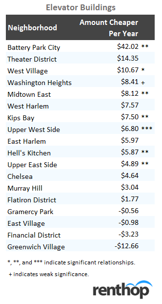
On average (across Manhattan neighborhoods), we see that rents are cheaper by $6 per year of age. Given that buildings can be decades old, this difference could be huge. For example, an apartment in a 50-year old building (which is still young by New York standards) might be $300 cheaper than one in a newer building. Given that a median apartment in Manhattan is around $3,100, that’s around 9-10% cheaper.
The one stand-out neighborhood is Battery Park City. BPC is unique in that it’s a very “new” neighborhood (on built year). In fact, the median building age in BPC is 1998 (with almost no pre-war buildings). The newer developments in the neighborhood are significantly more expensive than the older apartments.
So, given what we know about prices and age, how large is the “pre-war discount”? We compare buildings built before 1940 against buildings built after 1940. We also remove neighborhoods where there wasn’t significant post-war rental inventory (such as Greenwich Village and West Village).
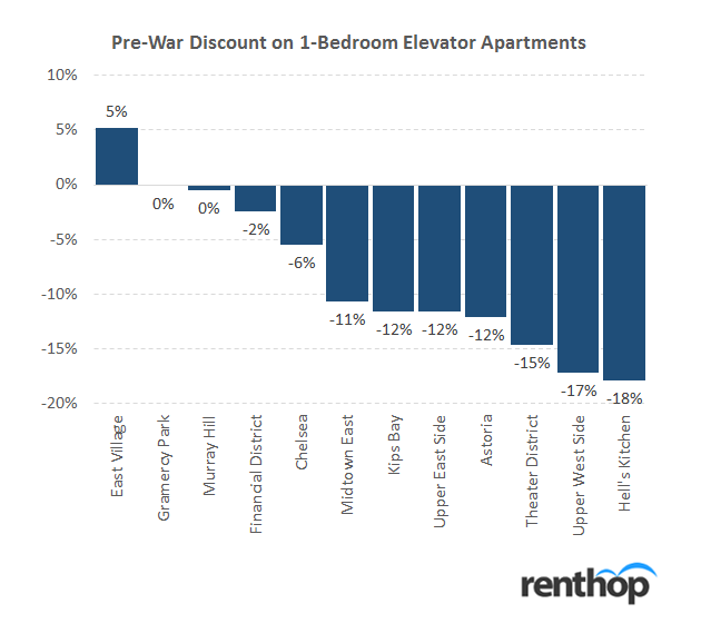
We see that the pre-war discount is actually very large! In fact, in a neighborhood like Hell’s Kitchen, the discount is as much as 18%. We see this discount across most of the neighborhoods in Manhattan, with the average ranging between 10-12%.
***
If you’re a renter on a budget, you might want to consider living in an older modern or pre-war building. The units themselves might not be as new, but you could potentially save a significant amount of money. As the data shows, pre-war apartments are significantly cheaper than their modern brethren. Some of these pre-war buildings might have also been renovated to have similar amenities as newer buildings (though probably less extravagant). If you’re only looking for modern, luxury buildings, consider slightly older modern buildings. Even a few years could potentially shave off a lot of rent.
The post Building Ages and Rents in New York appeared first on Real Estate Data & Research.
]]>The post New York Has Less Affordable Neighborhoods Than Other Major US Cities appeared first on Real Estate Data & Research.
]]>Despite what you’ve heard, finding an apartment in NYC is actually pretty easy; affording one is the hard part. With median asking rents that vary from expensive ($1,750 for a 2-bedroom in West Concourse) to downright insane ($5,232.50 in Lincoln Square) it’s no wonder New Yorkers are so pleasant. To get a better understanding of the NYC affordable housing crisis, RentHop took a look at the data on two-bedroom apartments and compared it to the most recent median income data available at the neighborhood level. (Interactive map and full list below)
Of the 139 neighborhoods that we had data for, just 9 of them had median asking rents that could be afforded with 35% of the neighborhood’s median income. That’s just 6.5% of neighborhoods – the lowest percent among the 5 major cities we looked at. Recommended affordability is 30% but we added an additional 5% to make room for income growth that has taken place since the Census data was released.
- Miami was the next least affordable with just 9.3% of neighborhoods being “affordable”
- Los Angeles had 30.8% of neighborhoods within reach
- Chicago was a little better with 42% of neighborhoods being affordable
- Boston had the highest percent of affordable neighborhoods at 60.7%
The Map Below Compares NYC Two-Bedroom Median Rents to Neighborhood Incomes
The map above shows the median asking rent of two-bedroom apartments in neighborhood tabulation areas (NTAs) across New York City and how that relates to the income of those neighborhoods. Darker shades of red indicate lower affordability, while the few green areas indicate that median asking rents are within reach for the neighborhood’s median household income.
It’s important to keep in mind that these are median asking rents and not necessarily what people living there are actually paying. Neighborhood median rent means that half of apartments rent for less than this amount and half are above. RentHop didn’t have sufficient data in the neighborhoods that are grayed out.
The 40x Rule – 30% of Income
You may have heard you shouldn’t spend more than 30% of your income on rent. The way the math works out, your household’s yearly income should be 40 times the monthly rent to afford an apartment and many landlords won’t accept anyone who doesn’t.
For example: for NYC as a whole, the median two-bedroom rent was $3,500 (for the quarter ending June 30, 2017) which would require household income of $140,000 to secure and comfortably afford. The median income for the city stands at $55,752 according to the most recent census data, putting the median two-bedroom far out of reach, since spending 75.3% of your income on rent isn’t a good idea.
There are exceptions to the rule: If you have vast savings or a guarantor whom makes 80 times the rent, a landlord is likely to let you slide without meeting the income requirements. It’s also not unheard of for a landlord to request last month’s rent in addition to the first month and security deposit for those with below average credit / income. Our “how much can I afford” guide can give you a little more info on these rules and some ways to overcome them.
These Neighborhoods Are NYC’s Least Affordable
The neighborhood tabulation area of Queensbridge-Ravenswood-Long Island City topped the list of unaffordable neighborhoods. Median rent for a two-bedroom is $3,300 while median household income is just $28,378. Rent prices soar higher as the real estate boom continues to change the face of the area while putting new apartments far out of reach of the current households. Spending 139.5% of your income on rent is not just absurd, it’s mathematically impossible.
In a close second was Williamsburg (not the hipster haven that’s colloquially called Williamsburg which the city still calls ‘North Side-South Side’) but the area a bit south of there known for being home to much of the city’s Hasidic population. Here, the $2,499 two-bedroom median rent would require 139.5% of the $21,502 median household income to be spent on rent.
The neighborhood with the third largest income-housing cost gap was Lower East Side, where the median household would need to spend 134% of the $31,273 neighborhood income for two-bedroom asking rent of $3,495. LES is known for its night life and rough-and-tumble past, but the wealth gap and expensive apartments are the true story here.
Mott Haven-Port Morris in the Bronx (130% of area income needed for the $2,200 2br-rent), and East Harlem North (115%) round out the top 5 least affordable, while many areas of the Bronx make the top 10. The high poverty rate in the Bronx (27.9% of households in poverty) is certainly correlated.
The Table Below Displays All Two-Bedroom Median Asking Rents
It also shows the percent of income spent and income required in all neighborhoods for which we had sufficient data. You can sort by price, alphabetically, or (un)affordability by clicking the top of the column.
Is There Anywhere in New York That’s Actually Affordable?
Click a column head to re-sort the table in ascending order. This will show the most affordable places in New York.
Upper East Side-Carnegie Hill topped our list of affordable neighborhoods, bolstered by having the highest median income in the city. Just 27.5% of the neighborhood’s $155,213 income would be needed to rent a median two-bedroom for $3,555.
Great Kills of Staten Island was a close second, being one of just a handful where the median income ($88,868) could comfortably afford the median rent ($2,050). Just 27.7% of the median income would be spend on rent here. Whitestone, Queens at 29.1% income for rent rounds out the top 3. New Dorp Staten Island and a handful of neighborhoods in Queens make the short list of neighborhoods where rent is affordable to those making median income.
What Does This Mean For You?
While these stats aren’t the only factor that determines what one can and cannot afford; they serve to highlight the widespread affordable housing crisis afflicting many US cities. NYC is known for being the center of much of the country’s wealth, with some truly awesome apartments designed for those residents.
Looking at our hundreds of thousands of apartment listings we certainly notice a trend: most apartments are being built and advertised to the higher end of the market, leaving a majority of people left wondering how and where they’ll live. We encourage you to entertain all options when finding a new apartment, including having as many income-earners in the household as possible and looking at apartments with more bedrooms to bring down the average cost per bedroom.
The post New York Has Less Affordable Neighborhoods Than Other Major US Cities appeared first on Real Estate Data & Research.
]]>The post Can You Afford To Live In Chicago? (Armour Square Ranked Least Affordable) appeared first on Real Estate Data & Research.
]]>Curious which parts of Chicago are actually affordable? With widely varying rents across the city ($725 in Burnside vs $3,100 in Near North Side for the median two-bedroom) it’s no surprise that some neighborhoods have rents that are just too damn high. Given that income varies across neighborhoods as well, this means that most expensive neighborhood isn’t necessarily the least affordable.
Of the 69 Chicago neighborhoods that we had data for, just 21 had median rents within reach of the median income for that neighborhood and three of those were right at the limit. Below, we’ve mapped out all the neighborhoods and their affordability. Further down is a table with all available neighborhoods, rents, and incomes.
We used data from a 2016 study by researchers Dr. Jim Lewis (UIC) and Rob Paral (Fellow in the Global Cities Program of the Chicago) based on the Census American Community Survey, to get median household income for Chicago’s 77 neighborhoods. This, combined with RentHop’s own rental data has allowed us to calculate which neighborhoods are and are not affordable in Chicago.
The 40x Rule – 30% of Income
You may have heard you shouldn’t spend more than 30% of your income on rent. The way the math works out, your household’s yearly income should be 40 times the monthly rent to afford an apartment and many landlords won’t accept anyone who doesn’t.
For example: The Loop’s $2,885 median two-bedroom rent would require household income of $115,400 to secure and the median household income is only $88,756. The average household would be spending nearly 40% of their income to rent a new apartment in the Loop. Not good, but other neighborhoods are much worse!
There are exceptions to the rule: If you have vast savings or a guarantor whom makes 80 times the rent, a landlord is likely to let you slide without meeting the income requirements. It’s also not unheard of for a landlord to request last month’s rent in addition to the first month and security deposit for those with below average credit / income. Our “how much can I afford” guide can give you a little more info on these rules and some ways to overcome them.
So how much income DO you need in order to live in a Chicago neighborhood?
The Map Below Shows Income Required for a 2-Bedroom Apartment in Chicago
The map above shows the median cost of two-bedroom apartments across Chicago and how that relates to the income of those neighborhoods. Shades of red indicates less affordability. Green indicates that median household income would be enough to secure an apartment there and not pay over 30% of one’s income for rent.
It’s important to keep in mind that these are median asking rents and not the rent paid by all residents of these neighborhoods. Median rent means that half of apartments rent for less than this amount and half are above. Neighborhoods where RentHop didn’t have sufficient data will be grayed out.
These Chicago Neighborhoods Are The Least Affordable
Amour Square topped the list of unaffordable neighborhoods due to it high median two-bedroom rent ($1,995) and low median household income ($23,590). Armour Square closely borders the Illinois Institute of Technology campus as well as Comiskey Park err Guaranteed Rate Field. The constant development of new apartments paid for with money from outside the neighborhood have made Armour Square an epicenter of gentrification on the South Side of Chicago. One would need to spend over 100% of the area household income to afford the typical apartment here.
We found East Garfield Park ($1,375 median 2Br rent) to be the second least affordable, with one needing to spend almost 75% of the median household income ($22,103) to rent. Oakland (64%) New City (62%) and Englewood (57%) round out the top 5.
The Table Below Displays All Two-Bedroom Median Asking Rents
It also shows the percent of income spent and income required in all neighborhoods for which we had sufficient data. You can sort by price, alphabetically, or (un)affordability by clicking the top of the column.
Is There Anywhere in Chicago That’s Actually Affordable?
Click a column head to re-sort the table in ascending order. This will show us the most affordable places in Chicago. Topping the list is a bunch of north side and far southwest side neighborhoods.
Beverly’s $91,239 median income makes the $1,500 median rent easily affordable, requiring just 19.7% of that income for an apartment. Forest Glen apartments are easily within reach, at $1,450 for a two-bedroom requiring 20.6% of the $84,347 median income for rent.
Calumet Heights (21.7% of income for a two-bedroom) Edison Park (22%) and Mount Greenwood (22.9%) round out the top 5 most affordable neighborhoods. Nearly all of these neighborhoods were helped along by the higher incomes and reasonable rents, highlighting the income disparity that exists in Chicago today.
Lincoln Park earned an honorable mention, with the median rent of $2,020 requiring just 27.6% of the area median income ($87,694) to comfortably rent a two-bedroom.
What Does This Mean For You?
While these stats aren’t the only factor that determines what one can and cannot afford, they certainly give an advantage to anyone that didn’t know where to start when deciding where to live and how much they can afford. We encourage you to entertain all options when finding a new apartment, including having as many income-earners in the household as possible and looking at apartments with more bedrooms to bring down the average cost per bedroom.
The post Can You Afford To Live In Chicago? (Armour Square Ranked Least Affordable) appeared first on Real Estate Data & Research.
]]>The post Can You Afford To Live In Boston? (Maybe Outside Suffolk County) appeared first on Real Estate Data & Research.
]]>We pulled data for two-bedroom median rents across Boston ($2,600 for the whole metro area), and found many neighborhoods to be quite affordable, much more affordable, in fact, than Los Angeles and Miami, where nearly all neighborhoods had rents out of reach of the average household. Unfortunately for many Bostonians, these affordable neighborhoods are outside Suffolk County. To determine what is and is not affordable, RentHop data scientists used the most recent Census’ American Community Survey data for median household income as well as our own rental data.
The ACS data shows highly varying incomes across the counties that make up the Boston/Cambridge Metro Area. Suffolk median household income is estimated at $56,771, while Essex is a bit higher at $68,455. Middlesex was significantly higher at $90,267 and Norfolk County one of the highest in the nation at $94,039. The lower income in Suffolk County greatly contributed to its not being affordable, despite the most expensive neighborhoods in the metro area were in Suffolk County.
The 40x Rule
Another metric we used to calculate what is and isn’t affordable is the 40x rule. This is the rule of thumb for most landlords in pretty much every major city. This guideline says that the household income must be at least 40 times the monthly rent. For example: two bedroom median rent across Boston is currently $2,600. A Boston household will need to make at least $104,000 combined for an apartment at that price. This is above any of the ACS estimates, even the more affluent Middlesex and Norfolk Counties.
There are exceptions to this rule: If you have vast savings or a guarantor whom makes 80 times the rent, a landlord is likely to let you slide without meeting the income requirements. It’s also not unheard of for a landlord to request last month’s rent in addition to the first month and security deposit for those with below average credit / income. Our “how much can I afford” guide can give you a little more info on these rules and some ways to overcome them.
So how much DO you need to make to live in a Boston neighborhood?
The Map Below Shows Income Required for a 2-Bedroom Apartment in Boston/Cambridge
The map above shows the cost of a two-bedroom apartment in neighborhoods across The Boston Metro Area, including most of Essex, Middlesex, Norfolk, Plymouth, and Suffolk Counties. We used data for the trailing 6 months as of July 1, 2017 to calculate the median asking rent and multiplied that by 40 to calculate the customary income requirement to rent an apartment. Median household income is all according to the Census American Community Survey 2015, table S1903.
If the data presented on the map doesn’t align with what you pay or makes you wonder how people can afford to live, that’s because we are only mapping current asking rents. Housing stock is fairly limited, and many people are locked in at lower rents negotiated in the past.
What Are the Least Affordable Places to Live in Boston?
The sub-neighborhood of Bay Village topped the list of least affordable neighborhoods with median rent of $6,215 per month, requiring $248,600 of annual income to afford. That’s 438% of the Suffolk County median household income. Not too far behind was Back Bay, with income of $176,000 required to secure a $4,400 two-bedroom there. Chinatown-Leather District($4,270) is 3rd most expensive while Downtown Boston($4,138) and West End($3,947.50) round out the Top 5.
Kendall Square is the least affordable non-Suffolk County neighborhood on the list, requiring $162,880 to rent a $4,072 two-bedroom there; 180% of the Middlesex County median income.
The Table Below Displays all Two-Bedroom Median Asking Rents
It also shows the income required for all neighborhoods that we had sufficient data. Click any column name to sort by that column, or type in a neighborhood name to search for yours.
Is There Anywhere in Boston That’s Actually Affordable?
Click a column head to re-sort the table in ascending order. This will show us the most affordable places in the Boston Metro area. Topping the list is a chunk of Norfolk County neighborhoods.
Adams Shore($1,550 for a two-bedroom), East Weymouth($1,550), and Braintree Highlands($1,575) are all very affordable, requiring less than 70% of the annual median income to rent, helped by the much higher median income of Norfolk County.
Downtown Woburn($1,650) was the most affordable Middlesex County neighborhood, needing just 73% ($66,000) of the median income to afford to live there. Peabody Town Center($1,400) is the most affordable Essex County neighborhood, requiring $56,000 or 82% of the $68,455 median income to live there.
What Does This Mean For You?
While these stats aren’t the only factor that determines what one can and cannot afford, they certainly give an advantage to anyone that didn’t know where to start when deciding where to live and how much they can afford. We encourage you to entertain all options when finding a new apartment, including having as many income-earners in the household as possible and looking at apartments with more bedrooms to bring down the average cost per bedroom.
The post Can You Afford To Live In Boston? (Maybe Outside Suffolk County) appeared first on Real Estate Data & Research.
]]>