The post Fundraising by Zip Code – Which Candidate Does Your Neighbor Support? appeared first on Real Estate Data & Research.
]]>- Among the 20 cities in our study, Trump leads in 10 cities, including Jacksonville, Billings, Houston, Las Vegas/North Las Vegas, and Phoenix.
- Meanwhile, voters in Los Angeles, Denver, and New York are really feeling the bern. Mr. Sanders also leads Chicago, San Jose, Detroit, and Seattle.
- Mayor Pete leads the unique donor count in Indianapolis. He is also D.C.‘s favorite, with over 2,000 unique donors.
- While Buttigieg takes the lead in Chicago in terms of the total number of unique donors, Sanders leads in 30 zip codes, 16 more than Buttigieg.
- Senator Klobuchar secured her home base in Minneapolis with just over 1,200 unique donors attracted as of Q4 2019.
- Sanders enjoys strong support in some of the most populous U.S. cities, including New York City, where he’s attracted 6,971 unique donors, Los Angeles with 5,165 unique donors, and Chicago, where 1,917 donors have shown support via donations.
- While Biden falls behind in many cities in terms of individual donations, he currently ranks second in Miami, with a total of 604 unique donors as of Q4 2019, around 250 fewer than Trump.
Click on images to learn more about our findings in each city.
 |
 |
 |
 |
 |
 |
 |
 |
 |
 |
 |
 |
 |
 |
 |
 |
 |
 |
 |
 |
The background colors indicate which party wins the majority within each city. Blue means that the Democratic Party has attracted over 55% of the unique donors, red means that the Republican Party has attracted over 55% of the unique donors, and purple means that none of the parties has reached 55%.
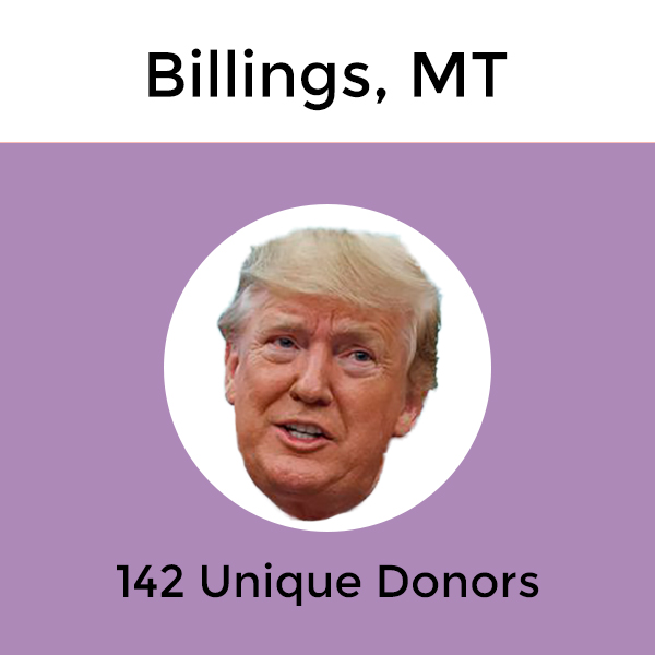
Billings, MT
Which Candidate Does Your Neighbor Support?
The interactive map below highlights Billings and its zip codes. More detailed, the map shows where each zip code stands, politically, and which presidential candidate is the front-runner in each zip code. By clicking on the zip code or selecting from the drop-down menu, you will get more information on which candidate is the front-runner and which candidate raised the most money in donations in that specific zip code. For a more detailed analysis of how each candidate is doing in the same zip code, view the corresponding interactive line graph above the map.
It is clear from the interactive graph above the map that President Donald Trump is the candidate which had the most unique donors at the end of the fourth quarter. In December, Trump had a total of 142 unique donors, while runner-up, Joe Biden had a total of 91. Coming third was Bernie Sanders with a total of 35 unique donors.
Looking at the map, the colors vary. The city of Billings only has four zip codes, so it was easy to analyze the numbers from Q4. In terms of which party held the majority of donor share (55% +), the Democratic party secured two zip codes, the Republican party one zip code, while one zip code went unclaimed by majority. President Trump secured all four zip codes in terms of unique donor count and amount raised.
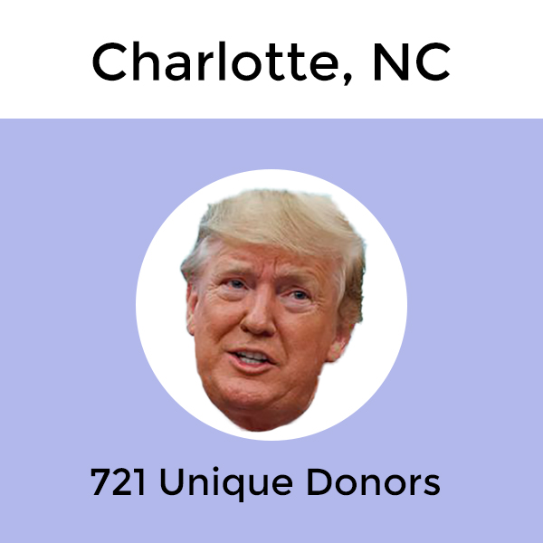
Charlotte, NC
Which Candidate Does Your Neighbor Support?
The interactive map below highlights Charlotte and its zip codes. More detailed, the map shows where each zip code stands, politically, and which presidential candidate is the front-runner in each zip code. By clicking on the zip code or selecting from the drop-down menu, you will get more information on which candidate is the front-runner and which candidate raised the most money in donations in that specific zip code. For a more detailed analysis of how each candidate is doing in the same zip code, view the corresponding interactive line graph above the map.
For the Charlotte interactive map listed above we see that the colors displayed are vastly blue. However, when we look at the corresponding interactive line graph above the map, we see that President Donald Trump has a significant lead when we look at the numbers for unique donors in December for Charlotte. For the city of Charlotte overall, Donald Trump gained 721 unique donors in December. That is 428 more unique donors compared to the runner-up, Bernie Sanders, who clocked in 293 unique donors in December. Behind Sanders, we have Joe Biden with a total of 200 unique donors in Charlotte for the fourth quarter. So when we look at the number of unique donors overall, Donald Trump is clearly in the lead. But how does the different zip codes stand, politically?
Diving deeper into Charlotte’s zip codes we see that only 3 zip codes are held by the Republican party where the Republican party held 55% + of the share of unique donors for the fourth quarter. For comparison, the Democratic party secured 23 zip codes. 5 zip codes were “neutral”, meaning neither party held 55% + of the share. Taking a closer look at which Presidential candidate made the leaderboard in terms of the most unique donors and amount raised in most zip codes, the winner was President Donald Trump. Trump managed to secure 18 zip codes in terms of most unique donors and 15 zip codes for the highest amount raised. But which zip code donated the most? Let’s break that down as well.
Unique Donors Leaderboard – Top 10 Zip Codes With the Most Unique Donors
We thought we would break down the zip codes with the most donations for the fourth quarter. You can also select the zip codes from the drop-down menu on the map to learn more.
- Zip code 28277: Trump received 83 unique donors (179 total unique donors) / highest amount raised was for Trump ($29,696.38)
- Zip code 28173: Trump received 69 unique donors (113 total unique donors) / highest amount raised was for Trump ($38,875.36)
- Zip code 28226: Trump received 56 unique donors (165 total unique donors) / highest amount raised was for Biden ($35,598)
- Zip code 28078: Trump received 50 unique donors (106 total unique donors) / highest amount raised was for Trump ($32,325.24)
- Zip code 28211: Trump received 46 unique donors (124 total unique donors) / highest amount raised was for Biden ($45,395)
- Zip code 28210: Trump received 41 unique donors (111 total unique donors) / highest amount raised was for Biden ($26,716)
- Zip code 28205: Sanders received 40 unique donors (118 total unique donors) / highest amount raised was for Sanders ($11,571.77)
- Zip code 28270: Trump received 38 unique donors (87 total unique donors) / highest amount raised was for Trump ($16,143.73)
- Zip code 28269: Trump received 29 unique donors (72 total unique donors) / highest amount raised was for Trump ($11,875.44)
- Zip code 28207: Biden received 28 unique donors (89 total unique donors) / highest amount raised was for Biden ($67,781)
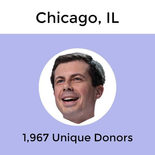
Chicago, IL
Which Candidate Does Your Neighbor Support?
The interactive map below highlights Chicago and its zip codes. More detailed, the map shows where each zip code stands, politically, and which presidential candidate is the front-runner in each zip code. By clicking on the zip code or selecting from the drop-down menu, you will get more information on which candidate is the front-runner and which candidate raised the most money in donations in that specific zip code. For a more detailed analysis of how each candidate is doing in the same zip code, view the corresponding interactive line graph above the map.
Looking at the interactive map it looks like the map is covered mostly in blue. We also see from the corresponding interactive graph above the map that the three Presidential candidates in the lead are from the Democratic party, however not much is separating the top two. At the top, we have Peter Buttigieg, with a total of 1,967 unique donors at the end of the fourth quarter. Right behind we have Bernie Sanders, with a total of 1,917 unique donors. There was only 50 unique donors separating first and second place. Elizabeth Warren ended up with a total of 1,171 unique donors while Trump secured only 672 unique donors in Chicago.
If we look closer at who secured the total amount of zip codes in terms of Presidential candidates and political party, we see that Bernie Sanders secured the most zip codes in terms of unique donors (30 zip codes). Buttigieg came in second with 14 zip codes. When we look at which candidate raised the most money in zip codes we see the findings flip with Buttigieg raising the most in 22 zip codes and Sanders coming in second with 15 zip codes. For which political party had the majority of shares, the Democratic party ended up holding 55% + of the share in 54 zip codes.
Unique Donors Leaderboard – Top 10 Zip Codes With the Most Unique Donors
We thought we would break down the zip codes with the most unique donors for the fourth quarter. You can also select the zip codes from the drop-down menu on the map to learn more.
- Zip code 60614: Buttigieg received 225 unique donors (675 total unique donors) / highest amount raised was for Buttigieg ($265,507.58)
- Zip code 60657: Buttigieg received 223 unique donors (589 total unique donors) / highest amount raised was for Buttigieg ($232,306.71)
- Zip code 60647: Sanders received 204 unique donors (455 total unique donors) / highest amount raised was for Sanders ($65,793.17)
- Zip code 60611: Buttigieg received 168 unique donors (611 total unique donors) / highest amount raised was for Biden ($248,298.36)
- Zip code 60640: Buttigieg received 154 unique donors (442 total unique donors) / highest amount raised was for Buttigieg ($101,713.32)
- Zip code 60613: Buttigieg received 134 unique donors (390 total unique donors) / highest amount raised was for Buttigieg ($89,944.25)
- Zip code 60618: Sanders received 131 unique donors (369 total unique donors) / highest amount raised was for Buttigieg ($70,009.03)
- Zip code 60610: Buttigieg received 126 unique donors (383 total unique donors) / highest amount raised was for Buttigieg ($144,083.39)
- Zip code 60622: Sanders received 104 unique donors (288 total unique donors) / highest amount raised was for Buttigieg ($49,874.65)
- Zip code 60625: Sanders received 88 unique donors (258 total unique donors) / highest amount raised was for Buttigieg ($29,712.27)
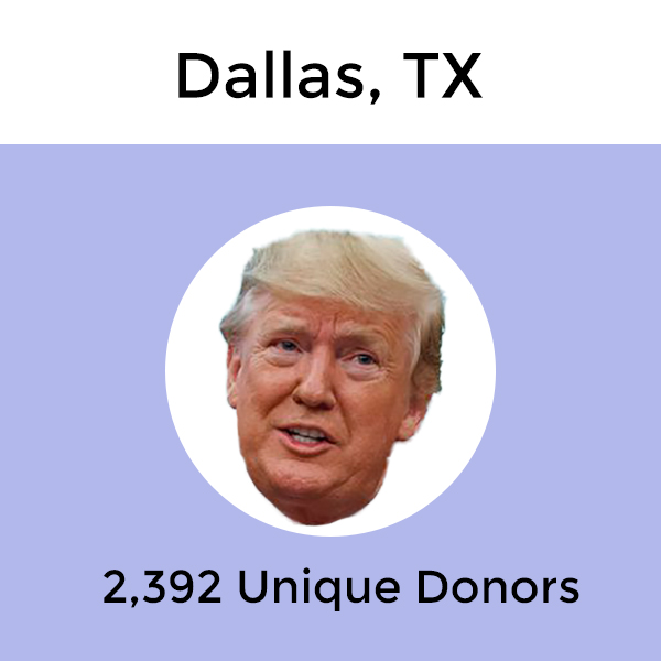
Dallas, TX
Which Candidate Does Your Neighbor Support?
The interactive map below highlights Dallas and its zip codes. More detailed, the map shows where each zip code stands, politically, and which presidential candidate is the front-runner in each zip code. By clicking on the zip code or selecting from the drop-down menu, you will get more information on which candidate is the front-runner and which candidate raised the most money in donations in that specific zip code. For a more detailed analysis of how each candidate is doing in the same zip code, view the corresponding interactive line graph above the map.
As stated above, the map shows where each zip code stands politically and what we see when we look at the map is a spread out political stand for Dallas, when looking at just the colors. Taking a deeper look at Dallas, and how each candidate stand, we see that President Donald Trump is a clear front-runner, with a total of 2,392 unique donors in December. There is a big gap between the front-runner, Donald Trump, and the runner-up, Bernie Sanders. To be specific, 1,740 unique donors separate the two candidates as Bernie Sanders only had 652 unique donors in Dallas in December. Buttigieg ended up in third, with a total of 515 unique donors in Dallas for the fourth quarter.
Overall, Trump secured the most zip codes in terms of the total number of unique donors and amount raised. For unique donors, Trump took the win in 69 zip codes. For the amount raised, Trump took the lead in 68 zip codes. It’s important to note that the colors approach the data from a different angle. We can also note that in terms of zip codes held by a party, the Democratic party held 55 + of the share in 50 zip codes while the Republican party only held the majority share in 19 zip codes. There were 18 zip codes where neither party holds the majority of unique donors share.
Unique Donors Leaderboard – Top 10 Zip Codes With the Most Unique Donors
We thought we would break down the zip codes with the most unique donors for the fourth quarter. You can also select the zip codes from the drop-down menu on the map to learn more.
- Zip code 75093: Trump received 142 unique donors (253 total unique donors) / highest amount raised was for Trump ($109,782.51)
- Zip code 75225: Trump received 128 unique donors (255 total unique donors) / highest amount raised was for Trump ($184,134.8)
- Zip code 75205: Trump received 96 unique donors (253 total unique donors) / highest amount raised was for Trump ($199,300.56)
- Zip code 75230: Trump received 92 unique donors (245 total unique donors) / highest amount raised was for Trump ($80,256.02)
- Zip code 75248: Trump received 78 unique donors (174 total unique donors) / highest amount raised was for Trump ($46,804.6)
- Zip code 75219: Trump received 73 unique donors (283 total unique donors) / highest amount raised was for Buttigieg ($81,293.46)
- Zip code 75229: Trump received 56 unique donors (203 total unique donors) / highest amount raised was for Biden ($44,639)
- Zip code 75214: Trump received 54 unique donors (247 total unique donors) / highest amount raised was for Trump ($40,198.76)
- Zip code 75206: Trump received 39 unique donors (203 total unique donors) / highest amount raised was for Trump ($51,012.2)
- Zip code 75209: Trump received 37 unique donors (168 total unique donors) / highest amount raised was for Trump ($62,274.28)
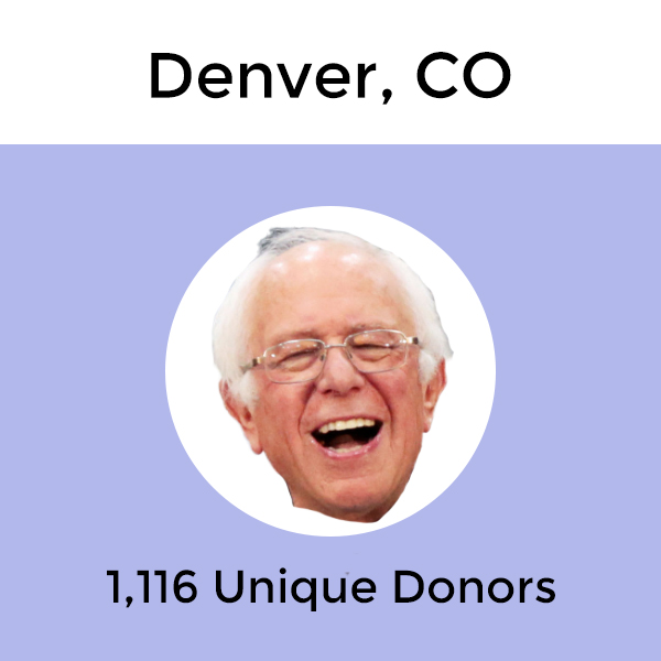
Denver, CO
Which Candidate Does Your Neighbor Support?
The interactive map below highlights Denver and its zip codes. More detailed, the map shows where each zip code stands, politically, and which presidential candidate is the front-runner in each zip code. By clicking on the zip code or selecting from the drop-down menu, you will get more information on which candidate is the front-runner and which candidate raised the most money in donations in that specific zip code. For a more detailed analysis of how each candidate is doing in the same zip code, view the corresponding interactive line graph above the map.
It appears the donor share % is mostly Democratic in Denver, and the race for donations appears to be between Presidential candidate Bernie Sanders and President Donald Trump. Bernie Sanders received a total of 1,116 unique donors in Denver for the fourth quarter. Trump was a bit behind, with a total of 865. Coming in third is Elizabeth Warren, with a total of 552 unique donors in Denver. Now let’s break down the zip code leaders.
As we mentioned in the paragraph above, it does appear that the donor share % is mostly Democratic in Denver. In fact, the Democratic party held 55% + of the share of unique donors in 46 zip codes while the Republican party only had the majority in 3 zip codes. For the Presidential candidate that secured the most zip codes in terms of unique donors that honor went to Bernie Sanders, who took the lead in 23 zip codes. For amount raised, Donald Trump took the lead in total 18 zip codes in Denver.
Unique Donors Leaderboard – Top 10 Zip Codes With the Most Unique Donors
We thought we would break down the zip codes with the most unique donors for the fourth quarter. You can also select the zip codes from the drop-down menu on the map to learn more.
- Zip code 80203: Sanders received 84 unique donors (177 total unique donors) / highest amount raised was for Sanders ($27,559.51)
- Zip code 80206: Bennet received 69 unique donors (440 total unique donors) / highest amount raised was for Bennet ($68,423)
- Zip code 80220: Bennet received 61 unique donors (332 total unique donors) / highest amount raised was for Bennet ($46,754.75)
- Zip code 80211: Sanders received 57 unique donors (186 total unique donors) / highest amount raised was for Sanders ($23,607.25)
- Zip code 80210: Sanders received 49 unique donors (327 total unique donors) / highest amount raised was for Bennet ($37,324.12)
- Zip code 80218: Sanders received 49 unique donors (229 total unique donors) / highest amount raised was for Bennet ($36,265)
- Zip code 80209: Bennet received 46 unique donors (355 total unique donors) / highest amount raised was for Biden ($52,042)
- Zip code 80113: Trump received 43 unique donors (223 total unique donors) / highest amount raised was for Biden ($43,750)
- Zip code 80202: Sanders received 42 unique donors (303 total unique donors) / highest amount raised was for Biden ($48,019.22)
- Zip code 80111: Trump received 38 unique donors (192 total unique donors) / highest amount raised was for Trump ($28,000.26)
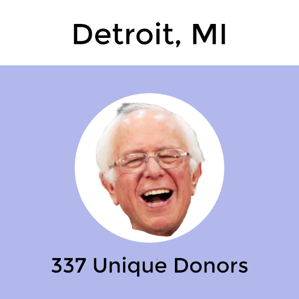
Detroit, MI
Which Candidate Does Your Neighbor Support?
The interactive map below highlights Detroit and its zip codes. More detailed, the map shows where each zip code stands, politically, and which presidential candidate is the front-runner in each zip code. By clicking on the zip code or selecting from the drop-down menu, you will get more information on which candidate is the front-runner and which candidate raised the most money in donations in that specific zip code. For a more detailed analysis of how each candidate is doing in the same zip code, view the corresponding interactive line graph above the map.
We see from the interactive map above that the majority donor share % goes to the Democratic party. To be specific, the Democratic party in Detroit held 55% + of the donor share in 37 zip codes while the Republican party only secured 4 zip codes (5 zip codes were “neutral”). Remember, that only means the aggregated number of unique donors of all the Democratic candidates is higher than the number of unique donors received by Donald Trump in those zip codes. When we break it down by the total number of unique donors, we still see a Democratic candidate in the lead, Bernie Sanders. By the end of the quarter, Sanders received a total of 337 unique donors while Donald Trump received 258.
If we break it down even further, we can see which Presidential candidate took the lead in the most unique donors and amount raised by total zip codes. Sanders was able to secure 25 zip codes in terms of having the most unique donors while President Trump only secured 13. However, for the amount raised Trump secured 13 zip codes in total while Sanders secured 10. Biden followed Sanders with 10 total zip codes for the amount raised.
Unique Donors Leaderboard – Top 10 Zip Codes With the Most Unique Donors
We thought we would break down the zip codes with the most unique donors for the fourth quarter. You can also select the zip codes from the drop-down menu on the map to learn more.
- Zip code 48236: Trump received 63 unique donors (139 total unique donors) / highest amount raised was for Trump ($45,264.47)
- Zip code 48220: Sanders received 36 unique donors (81 total unique donors) / highest amount raised was for Sanders ($17,294.68)
- Zip code 48230: Trump received 32 unique donors (96 total unique donors) / highest amount raised was for Biden ($22,351)
- Zip code 48239: Trump received 21 unique donors (47 total unique donors) / highest amount raised was for Trump ($6,630.04)
- Zip code 48226: Sanders received 18 unique donors (37 total unique donors) / highest amount raised was for Biden ($12,400)
- Zip code 48202: Sanders received 16 unique donors (45 total unique donors) / highest amount raised was for Biden ($10,000)
- Zip code 48207: Sanders received 16 unique donors (42 total unique donors) / highest amount raised was for Biden ($4,060)
- Zip code 48221: Sanders received 13 unique donors (43 total unique donors) / highest amount raised was for Buttigieg ($8,700)
- Zip code 48146: Trump received 13 unique donors (33 total unique donors) / highest amount raised was for Trump ($5,389.27)
- Zip code 48214: Sanders & Warren received 8 unique donors each (32 total unique donors) / highest amount raised was for Warren ($7,110.46)
Houston, TX
Which Candidate Does Your Neighbor Support?
The interactive map below highlights Houston and its zip codes. More detailed, the map shows where each zip code stands, politically, and which presidential candidate is the front-runner in each zip code. By clicking on the zip code or selecting from the drop-down menu, you will get more information on which candidate is the front-runner and which candidate raised the most money in donations in that specific zip code. For a more detailed analysis of how each candidate is doing in the same zip code, view the corresponding interactive line graph above the map.
At first glance, without diving deep into the Houston zip codes, we see a colorful interactive map above. As we dig deeper into the zip codes, we’ll most likely see different front runners in different zip codes. However, looking just at Houston as a city we can clearly see that President Donald Trump is the front-runner in terms of unique donors since December. President Trump ended up with a total of 4,274 unique donors in Houston in December. runner-up was Biden, but the number of unique donors is significantly lower, and by lower Biden received 3,285 less unique donors than Trump in Houston for the fourth quarter. Coming in third on the list was Presidential candidate Buttigieg, with a total of 660 unique donors. So what does it look like when we dive deeper into the zip codes instead of looking at the overall city picture?
Looking at the zip code leaderboard for unique donors and for the amount raised, the overall political stand doesn’t change much in Houston. President Trump still remains on top, as he took the lead in terms of unique donors in 112 zip codes in Houston. He also took the lead in 109 Houston zip codes in terms of amount raised from donations. Considering the runners up have significantly lower numbers in terms of securing zip codes in terms of unique donors and amount raised, it’s safe to say Trump has secured Houston when looking at the findings for Q4. In terms of which party held the majority share for the number of unique donors, the Republican party held 55% + of the share in 60 zip codes while the Democratic party only held the majority in 50 zip codes. Now let’s take a closer look at which zip codes had the most unique donors.
Unique Donors Leaderboard – Top 10 Zip Codes With the Most Unique Donors
We thought we would break down the zip codes with the most unique donors for the fourth quarter. You can also select the zip codes from the drop-down menu on the map to learn more.
- Zip code 77024: Trump received 167 unique donors (359 total unique donors) / highest amount raised was for Trump ($115,120.7).
- Zip code 77379: Trump received 148 unique donors (216 total unique donors) / highest amount raised was for Trump ($75,996.44).
- Zip code 77494: Trump received 138 unique donors (241 total unique donors) / highest amount raised was for Trump ($63,898.17).
- Zip code 77056: Trump received 90 unique donors (207 total unique donors) / highest amount raised was for Trump ($95,817.5).
- Zip code 77019: Trump received 75 unique donors (319 total unique donors) / highest amount raised was for Biden($46,804.6).
- Zip code 77005: Trump received 69 unique donors (324 total unique donors) / highest amount raised was for Trump ($66,902.68).
- Zip code 77027: Trump received 56 unique donors (193 total unique donors) / highest amount raised was for Trump ($46,871.81).
- Zip code 77007: Buttigieg received 50 unique donors (279 total unique donors) / highest amount raised was for Buttigieg ($29,950.97).
- Zip code 77006: Warren received 49 unique donors (289 total unique donors) / highest amount raised was for Biden ($47,950.64).
- Zip code 77008: Trump received 46 unique donors (274 total unique donors) / highest amount raised was for Trump ($26,400.59).
Indianapolis, IN
Which Candidate Does Your Neighbor Support?
The interactive map below highlights Indianapolis and its zip codes. More detailed, the map shows where each zip code stands, politically, and which presidential candidate is the front-runner in each zip code. By clicking on the zip code or selecting from the drop-down menu, you will get more information on which candidate is the front-runner and which candidate raised the most money in donations in that specific zip code. For a more detailed analysis of how each candidate is doing in the same zip code, view the corresponding interactive line graph above the map.
For the city of Indianapolis, we see that the total number of unique donors by Presidential candidate goes to Peter Buttigieg. In December, Buttigieg had received a total of 982 unique donors. That is only 119 unique donors more than the runner-up, President Donald Trump, but still enough to secure the lead in Indianapolis for the fourth quarter. President Donald Trump had a total of 863 unique donors and there was a bigger gap between Trump and Bernie Sanders, who came in third in total unique donors, with a total of 390 unique donors.
Looking at the interactive map for the city of Indianapolis, we see that color-wise the percentage of donor share is rather spread out throughout the various zip codes. Taking a deeper look at the percentages, we see that the Democratic party held a 55% + donor share in 31 zip codes throughout Indianapolis while the Republican party only secured 10 zip codes in terms of percentage donor share. There were 9 zip codes were neither party held the majority percentage donor share.
The Presidential candidate that secured the most zip codes in terms of unique donors was President Donald Trump with a total of 25 zip codes. Coming in second was Peter Buttigieg with 20 zip codes, 5 zip codes behind Trump. However, in terms of amount raised we see that Buttigieg takes the lead from Trump, securing the win in 25 zip codes while Trump only secured a total of 21 zip codes throughout Indianapolis.
Unique Donors Leaderboard – Top 10 Zip Codes With the Most Unique Donors
We thought we would break down the zip codes with the most unique donors for the fourth quarter. You can also select the zip codes from the drop-down menu on the map to learn more.
- Zip code 46220: Buttigieg received 113 unique donors (235 total unique donors) / highest amount raised was for Buttigieg ($78,538.89).
- Zip code 46202: Buttigieg received 71 unique donors (122 total unique donors) / highest amount raised was for Buttigieg ($65,036.7).
- Zip code 46032: Buttigieg received 67 unique donors (201 total unique donors) / highest amount raised was for Buttigieg ($53,650.67).
- Zip code 46205: Buttigieg received 60 unique donors (117 total unique donors) / highest amount raised was for Buttigieg ($49,625.62).
- Zip code 46077: Buttigieg received 54 unique donors (138 total unique donors) / highest amount raised was for Buttigieg ($45,957).
- Zip code 46143: Trump received 52 unique donors (92 total unique donors) / highest amount raised was for Trump ($20,178.93).
- Zip code 46240: Buttigieg received 51 unique donors (115 total unique donors) / highest amount raised was for Buttigieg ($39,679.02).
- Zip code 46260: Buttigieg received 49 unique donors (118 total unique donors) / highest amount raised was for Buttigieg ($29,782.33).
- Zip code 46037: Trump received 43 unique donors (95 total unique donors) / highest amount raised was for Trump ($16,286.33).
- Zip code 46256: Buttigieg received 38 unique donors (95 total unique donors) / highest amount raised was for Buttigieg ($28,078.26).
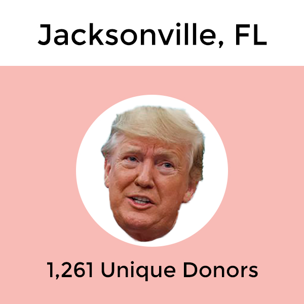
Jacksonville, FL
Which Candidate Does Your Neighbor Support?
The interactive map below highlights Jacksonville and its zip codes. More detailed, the map shows where each zip code stands, politically, and which presidential candidate is the front-runner in each zip code. By clicking on the zip code or selecting from the drop-down menu, you will get more information on which candidate is the front-runner and which candidate raised the most money in donations in that specific zip code. For a more detailed analysis of how each candidate is doing in the same zip code, view the corresponding interactive line graph above the map.
Above we see the interactive map of Jacksonville that shows where each zip code stand, politically. By giving the map a brief overlook, it does appear that most Jacksonville zip codes are politically standing with President Trump, based off of the donations numbers alone. We see that Trump received a total of 1,261 unique donors at the end of December. That is a significantly higher number than the runner-up Bernie Sanders, who clocked 215 unique donors in the same time period. That is a difference of 1,046 unique donors. Let’s dive into a deeper analysis of the Jacksonville zip codes and not just Jacksonville overall to see if anything changes.
Our findings remain the same when looking at the individual zip codes compared to Jacksonville as a whole, and that is that President Donald Trump is a clear front-runner. Out of the 41 zip codes in Jacksonville, President Trump secured 37 zip codes in terms of unique donors and 33 zip codes in terms of amount raised. The other candidates on the leaderboard were Sanders, Biden, Yang, and Buttigieg. For the party share, the Republican party secured the majority share in 27 zip codes, while the Democratic party only secured 10 zip codes. There were 5 zip codes where neither party held 55% + of the share.
Unique Donors Leaderboard – Top 10 Zip Codes With the Most Unique Donors
We thought we would break down the zip codes with the most unique donors for the fourth quarter. You can also select the zip codes from the drop-down menu on the map to learn more.
- Zip code 32034: Trump received 135 unique donors (188 total unique donors) / highest amount raised was for Trump ($58,422.75).
- Zip code 32259: Trump received 70 unique donors (127 total unique donors) / highest amount raised was for Trump ($31,688.51).
- Zip code 32256: Trump received 69 unique donors (123 total unique donors) / highest amount raised was for Trump ($24,117.33).
- Zip code 32250: Trump received 67 unique donors (102 total unique donors) / highest amount raised was for Trump ($31,387.08).
- Zip code 32224: Trump received 65 unique donors (108 total unique donors) / highest amount raised was for Biden($25,224.6).
- Zip code 32003: Trump received 61 unique donors (92 total unique donors) / highest amount raised was for Trump ($49,617.75).
- Zip code 32225: Trump received 60 unique donors (95 total unique donors) / highest amount raised was for Trump ($36,539.3).
- Zip code 32210: Trump received 56 unique donors (90 total unique donors) / highest amount raised was for Trump ($24,044.83).
- Zip code 32207: Trump received 53 unique donors (94 total unique donors) / highest amount raised was for Trump ($26,912.31).
- Zip code 32233: Trump received 45 unique donors (89 total unique donors) / highest amount raised was for Trump ($19,443.48).
Kansas City, MO
Which Candidate Does Your Neighbor Support?
The interactive map below highlights Kansas City and its zip codes. More detailed, the map shows where each zip code stands, politically, and which presidential candidate is the front-runner in each zip code. By clicking on the zip code or selecting from the drop-down menu, you will get more information on which candidate is the front-runner and which candidate raised the most money in donations in that specific zip code. For a more detailed analysis of how each candidate is doing in the same zip code, view the corresponding interactive line graph above the map.
In terms of where the zip codes stood politically in Kansas City, we see that 33 of the zip codes in Kansas City were zip codes where the Democratic party held 55% + of the donor share for the fourth quarter. The Republican party had 55% + donor share in 11 zip codes. There were 12 zip codes in Kansas City where neither party had the majority of the donor share.
In terms of which Presidential candidate took the lead in total unique donors, we see from the corresponding graph above the interactive map that President Donald Trump is clearly in the lead. Trump received a total of 503 unique donors by the end of Q4 while the runner-up Bernie Sanders received 344 unique donors. Coming in third is Peter Buttigieg with a total of 243 unique donors. For the Presidential candidate scoring the most zip codes in terms of unique donors and amount raised, President Donald Trump took an overwhelming lead securing 34 zip codes for unique donors and 38 zip codes for the amount raised.
Unique Donors Leaderboard – Top 10 Zip Codes With the Most Unique Donors
We thought we would break down the zip codes with the most unique donors for the fourth quarter. You can also select the zip codes from the drop-down menu on the map to learn more.
- Zip code 64152: Trump received 45 unique donors (90 total unique donors) / highest amount raised was for Trump ($26,399.76).
- Zip code 64111: Sanders received 36 unique donors (87 total unique donors) / highest amount raised was for Sanders ($12,930.39).
- Zip code 64055: Trump received 30 unique donors (56 total unique donors) / highest amount raised was for Trump ($10,179.2).
- Zip code 64112: Buttigieg received 28 unique donors (67 total unique donors) / highest amount raised was for Buttigieg ($53,746.42).
- Zip code 64113: Buttigieg received 26 unique donors (79 total unique donors) / highest amount raised was for Buttigieg ($51,196.89).
- Zip code 64114: Sanders received 24 unique donors (90 total unique donors) / highest amount raised was for Trump ($8,614.54).
- Zip code 64068: Trump received 22 unique donors (54 total unique donors) / highest amount raised was for Trump ($10,681.74).
- Zip code 64151: Trump received 21 unique donors (47 total unique donors) / highest amount raised was for Trump ($6,552.69).
- Zip code 64108: Buttigieg received 19 unique donors (48 total unique donors) / highest amount raised was for Buttigieg ($38,111.44).
- Zip code 64081: Trump received 18 unique donors (49 total unique donors) / highest amount raised was for Sanders ($4,480.13).
Las Vegas/North Las Vegas, NV
Which Candidate Does Your Neighbor Support?
The interactive map below highlights Las Vegas and its zip codes. More detailed, the map shows where each zip code stands, politically, and which presidential candidate is the front-runner in each zip code. By clicking on the zip code or selecting from the drop-down menu, you will get more information on which candidate is the front-runner and which candidate raised the most money in donations in that specific zip code. For a more detailed analysis of how each candidate is doing in the same zip code, view the corresponding interactive line graph above the map.
While the percentage of donor share by zip code is mostly by the Democratic party, 20 zip codes to be exact, we see that President Donald Trump is the Presidential candidate with the most unique donors for the city of Las Vegas. Specifically, Trump leads the race in Las Vegas with a total of 1,192 unique donors. That is 731 more unique donors that Bernie Sanders was able to collect at the end of Q4. His total ended up being 461 unique donors. Joe Biden is right behind Sanders with a total of 367 unique donors in Las Vegas in December.
It might therefore not be surprising when we say that President Donald Trump was the candidate that secured the most zip codes in terms of unique donors, with a total of 30 zip codes. Donald Trump also took the lead in terms of the most zip codes for the amount raised, with a total of 18 zip codes. For amount raised the runner-up was Biden with a total of 14 zip codes, 4 zip codes short to take the lead.
Unique Donors Leaderboard – Top 10 Zip Codes With the Most Unique Donors
We thought we would break down the zip codes with the most unique donors for the fourth quarter. You can also select the zip codes from the drop-down menu on the map to learn more.
- Zip code 89135: Trump received 82 unique donors (256 total unique donors) / highest amount raised was for Biden ($142,271.9).
- Zip code 89117: Trump received 82 unique donors (204 total unique donors) / highest amount raised was for Biden ($81,451).
- Zip code 89131: Trump received 82 unique donors (134 total unique donors) / highest amount raised was for Trump ($35,730.28).
- Zip code 89134: Trump received 74 unique donors (170 total unique donors) / highest amount raised was for Biden ($45,621).
- Zip code 89149: Trump received 51 unique donors (99 total unique donors) / highest amount raised was for Trump ($32,980.12).
- Zip code 89129: Trump received 48 unique donors (118 total unique donors) / highest amount raised was for Trump ($19,111.2).
- Zip code 89145: Trump received 46 unique donors (100 total unique donors) / highest amount raised was for Biden ($46,425).
- Zip code 89128: Trump received 45 unique donors (104 total unique donors) / highest amount raised was for Biden ($23,844).
- Zip code 89144: Trump received 34 unique donors (87 total unique donors) / highest amount raised was for Biden ($62,095).
- Zip code 89102: Trump received 20 unique donors (81 total unique donors) / highest amount raised was for Biden ($15,162).
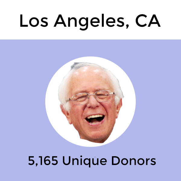
Los Angeles, CA
Which Candidate Does Your Neighbor Support?
The interactive map below highlights Los Angeles and its zip codes. More detailed, the map shows where each zip code stands, politically, and which presidential candidate is the front-runner in each zip code. By clicking on the zip code or selecting from the drop-down menu, you will get more information on which candidate is the front-runner and which candidate raised the most money in donations in that specific zip code. For a more detailed analysis of how each candidate is doing in the same zip code, view the corresponding interactive line graph above the map.
From the interactive map we can see that Los Angeles is vastly covered in blue, which indicates a high number of democratic donations. If we take a closer look at the corresponding interactive line graph above the map, we are able to see which Presidential candidate is in the lead, in Los Angeles overall and in different zip codes. Starting with Los Angeles as a whole, the Presidental candidate taking the lead in terms of unique donors as of December 2019 was Bernie Sanders, with an impressive 5,165 unique donors. That is 1,593 more unique donors than the runner-up, which in the fourth quarter was Peter Buttigieg. Coming in third was Donald Trump, 473 unique donors behind Buttigieg, with a total of 3,099 unique donors in December.
When looking more closely at the different Los Angeles zip codes we are able to see which Presidential candidate was able to secure most zip codes in terms of unique donors and amount raised. For unique donors, Bernie Sanders took the lead in 68 zip codes. President Donald Trump came in second, securing the lead in 33 zip codes. For the amount raised, however, Donald Trump was the front-runner, securing 45 zip codes. Sanders came in second taking the win in 28 zip codes while Biden secured 25 zip codes. For the party share, the Democratic party rocked the leaderboard by holding 55% + of the share in an impressive 124 zip codes. The Republican party, however, didn’t secure one zip code in terms of having 55% + of the unique donors share. There were 7 zip codes where neither party had majority.
Unique Donors Leaderboard – Top 10 Zip Codes With the Most Unique Donors
We thought we would break down the zip codes with the most unique donors for the fourth quarter. You can also select the zip codes from the drop-down menu on the map to learn more.
- Zip code 90069: Buttigieg received 276 unique donors (576 total unique donors) / highest amount raised was for Buttigieg ($297,871.34)
- Zip code 90046: Buttigieg received 226 unique donors (690 total unique donors) / highest amount raised was for Buttigieg ($261,216.35)
- Zip code 90026: Sanders received 212 unique donors (471 total unique donors) / highest amount raised was for Sanders ($69,536.35)
- Zip code 90049: Buttigieg received 201 unique donors (863 total unique donors) / highest amount raised was for Biden ($287,434)
- Zip code 90027: Sanders received 188 unique donors (562 total unique donors) / highest amount raised was for Buttigieg ($73,695.25)
- Zip code 90272: Biden received 135 unique donors (622 total unique donors) / highest amount raised was for Biden ($263,777.5)
- Zip code 90210: Buttigieg & Trump received 121 unique donors each (575 total unique donors) / highest amount raised was for Trump ($304,113.39)
- Zip code 90402: Buttigieg received 104 unique donors (463 total unique donors) / highest amount raised was for Biden ($195,674)
- Zip code 90025: Sanders received 98 unique donors (500 total unique donors) / highest amount raised was for Biden ($145,011)
- Zip code 90064: Warren received 72 unique donors (481 total unique donors) / highest amount raised was for Biden ($114,477.96)
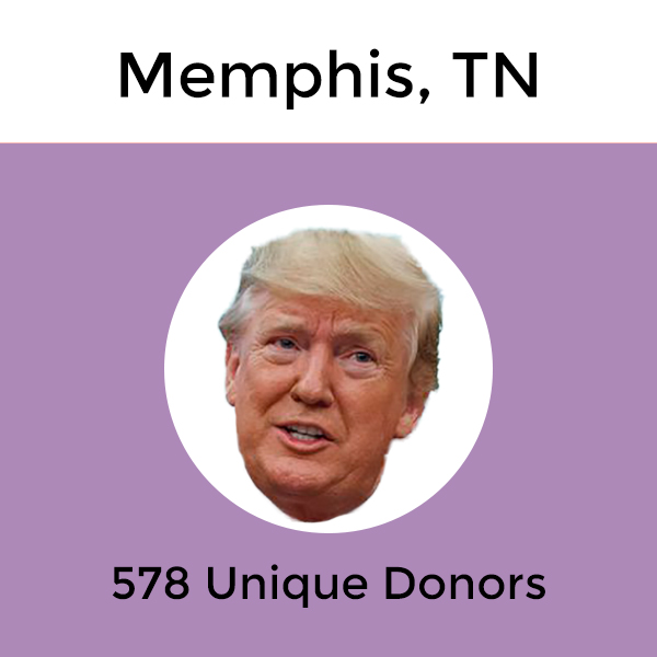
Memphis, TN
Which Candidate Does Your Neighbor Support?
The interactive map below highlights Memphis and its zip codes. More detailed, the map shows where each zip code stands, politically, and which presidential candidate is the front-runner in each zip code. By clicking on the zip code or selecting from the drop-down menu, you will get more information on which candidate is the front-runner and which candidate raised the most money in donations in that specific zip code. For a more detailed analysis of how each candidate is doing in the same zip code, view the corresponding interactive line graph above the map.
For the city of Memphis we see that the percentage of donor share by zip code is pretty tied by the political party. When we look at it deeper, we see that the Republican party holds the lead in terms of holding 55% + of the donor share in 15 zip codes while the Democratic party had the majority in 14 zip codes. There were 4 zip codes in Memphis where neither party had the majority of the percentage donor share.
When we break it down by Presidential candidates we see that President Donald Trump takes the lead in the fourth quarter with a total of 578 unique donors. Second place in terms of total unique donors goes to Bernie Sander; however, he only received a total of 153 unique donors. Biden was right behind Sanders with a total of 129 unique donors. Donald Trump had the most unique donors in 22 zip codes and the highest amount raised in 21 zip codes, racing past the other Presidential candidates by a lot.
Unique Donors Leaderboard – Top 10 Zip Codes With the Most Unique Donors
We thought we would break down the zip codes with the most unique donors for the fourth quarter. You can also select the zip codes from the drop-down menu on the map to learn more.
- Zip code 38138: Trump received 59 unique donors (104 total unique donors) / highest amount raised was for Trump ($40,932.27).
- Zip code 38139: Trump received 56 unique donors (92 total unique donors) / highest amount raised was for Trump ($33,364.79).
- Zip code 38002: Trump received 46 unique donors (62 total unique donors) / highest amount raised was for Trump ($17,769.25).
- Zip code 38120: Trump received 40 unique donors (67 total unique donors) / highest amount raised was for Trump ($20,296.18).
- Zip code 38018: Trump received 34 unique donors (60 total unique donors) / highest amount raised was for Trump ($9,167.74).
- Zip code 38117: Trump received 32 unique donors (74 total unique donors) / highest amount raised was for Trump ($15,832.17).
- Zip code 38111: Trump received 31 unique donors (82 total unique donors) / highest amount raised was for Biden ($22,591).
- Zip code 38119: Trump received 29 unique donors (55 total unique donors) / highest amount raised was for Biden ($14,658.1).
- Zip code 38104: Sanders received 23 unique donors (86 total unique donors) / highest amount raised was for Buttigieg ($11,187.2).
- Zip code 38103: Biden & Trump received 12 unique donors (57 total unique donors) / highest amount raised was for Buttigieg ($10,118.68).
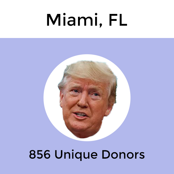
Miami, FL
Which Candidate Does Your Neighbor Support?
The interactive map below highlights Miami and its zip codes. More detailed, the map shows where each zip code stands, politically, and which presidential candidate is the front-runner in each zip code. By clicking on the zip code or selecting from the drop-down menu, you will get more information on which candidate is the front-runner and which candidate raised the most money in donations in that specific zip code. For a more detailed analysis of how each candidate is doing in the same zip code, view the corresponding interactive line graph above the map.
From the first look at the map, we see that the findings are more scattered for Miami than other cities. The majority of zip codes does appear to have a more democratic stand than republican. However, when we look at Miami as a whole, we see that President Donald Trump managed to secure a total of 856 unique donors in Miami in December. Trump secured 252 unique donors more than the runner-up, Joe Biden. But that is just an overall of Miami. Let’s take a deeper look at the zip codes to see if the picture changes.
Looking at which Presidential candidate took the lead in which Miami zip codes, President Donald Trump took the lead in regards to securing the highest number of zip codes in terms of unique donors. Trump managed to secure 17 zip codes, while Sanders secured 8. Both Biden and Buttigieg managed to secure 6 zip codes each in terms of the highest number of unique donors. In regards to the amount raised, Biden took the lead from Trump by taking the lead in 14 zip codes for the amount raised. Trump, however, is right behind with 12 zip codes. Buttigieg secured 5 zip codes, while Sanders secured 4 and Warren secured 2. Now, what were the numbers when we look at how the parties did? In fact, the Democratic party held the majority share in 31 zip codes while the Republican party only managed to hold 55% + of the share in 3 zip codes. 3 zip codes were left without a party winner.
Unique Donors Leaderboard – Top 10 Zip Codes With the Most Unique Donors
We thought we would break down the zip codes with the most unique donors for the fourth quarter. You can also select the zip codes from the drop-down menu on the map to learn more.
- Zip code 33139: Buttigieg received 91 unique donors (293 total unique donors) / highest amount raised was for Buttigieg ($106,556.06)
- Zip code 33133: Biden received 81 unique donors (291 total unique donors) / highest amount raised was for Biden ($106,035)
- Zip code 33156: Trump received 70 unique donors (211 total unique donors) / highest amount raised was for Biden ($58,068.4)
- Zip code 33134: Trump received 60 unique donors (215 total unique donors) / highest amount raised was for Biden ($74,405)
- Zip code 33140: Buttigieg received 51 unique donors (177 total unique donors) / highest amount raised was for Buttigieg ($81,799.29)
- Zip code 33160: Trump received 50 unique donors (120 total unique donors) / highest amount raised was for Trump ($55,694.35)
- Zip code 33131: Biden received 39 unique donors each (174 total unique donors) / highest amount raised was for Biden ($59,517)
- Zip code 33143: Biden received 38 unique donors (162 total unique donors) / highest amount raised was for Biden ($48,228)
- Zip code 33138: Buttigieg received 28 unique donors (123 total unique donors) / highest amount raised was for Buttigieg ($19,160.35)
- Zip code 33141: Buttigieg received 24 unique donors (98 total unique donors) / highest amount raised was for Biden ($37,306)
Minneapolis, MN
Which Candidate Does Your Neighbor Support?
The interactive map below highlights Minneapolis and its zip codes. More detailed, the map shows where each zip code stands, politically, and which presidential candidate is the front-runner in each zip code. By clicking on the zip code or selecting from the drop-down menu, you will get more information on which candidate is the front-runner and which candidate raised the most money in donations in that specific zip code. For a more detailed analysis of how each candidate is doing in the same zip code, view the corresponding interactive line graph above the map.
Looking at the map of Minneapolis there is no doubt where the majority of the city stands, politically, as the entire map is colored in blue. Looking at the numbers, the Democratic party held a 55% + donor share in all 34 zip codes of Minneapolis.
The Presidential candidate with the most unique donors in total was Amy Klobuchar, with a total of 1,202 unique donors in December. In second place we have Bernie Sanders with a total of 904 unique donors and in third we have Elizabeth Warren with 560 unique donors. Klobuchar secured the most zip codes in terms of unique donors, with a total of 17 zip codes. However, Bernie Sanders was right behind with 16 zip codes. For most zip codes in terms of amount raised Amy Klobuchar won by a landslide with a total of 21 out of 34 zip codes.
Unique Donors Leaderboard – Top 10 Zip Codes With the Most Unique Donors
We thought we would break down the zip codes with the most unique donors for the fourth quarter. You can also select the zip codes from the drop-down menu on the map to learn more.
- Zip code 55419: Klobuchar received 100 unique donors (254 total unique donors) / highest amount raised was for Klobuchar ($55,830.5)
- Zip code 55416: Klobuchar received 95 unique donors (281 total unique donors) / highest amount raised was for Klobuchar ($65,064.3)
- Zip code 55105: Klobuchar received 89 unique donors (237 total unique donors) / highest amount raised was for Klobuchar ($62,304.78)
- Zip code 55403: Klobuchar received 82 unique donors (206 total unique donors) / highest amount raised was for Klobuchar ($61,935.36)
- Zip code 55405: Klobuchar received 73 unique donors (185 total unique donors) / highest amount raised was for Klobuchar ($75,935)
- Zip code 55410: Klobuchar received 66 unique donors (225 total unique donors) / highest amount raised was for Klobuchar ($34,544.5)
- Zip code 55104: Sanders received 64 unique donors each (220 total unique donors) / highest amount raised was for Buttigieg ($25,154.21)
- Zip code 55406: Sanders & Warren received 57 unique donors (219 total unique donors) / highest amount raised was for Buttigieg ($20,268.37)
- Zip code 55414: Klobuchar received 52 unique donors (172 total unique donors) / highest amount raised was for Klobuchar ($46,321.16)
- Zip code 55408: Sanders received 50 unique donors (176 total unique donors) / highest amount raised was for Klobuchar ($27,455.49)
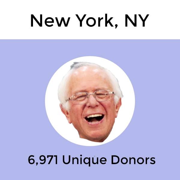
New York, NY
Which Candidate Does Your Neighbor Support?
The interactive map below highlights New York City and its zip codes. More detailed, the map shows where each zip code stands, politically, and which presidential candidate is the front-runner in each zip code. By clicking on the zip code or selecting from the drop-down menu, you will get more information on which candidate is the front-runner and which candidate raised the most money in donations in that specific zip code. For a more detailed analysis of how each candidate is doing in the same zip code, view the corresponding interactive line graph above the map.
From the interactive map above we can see that for New York City the majority of donor share is democratic, similar to the results of the previous quarter findings. When taking a closer look at the corresponding interactive line graph above the map, we see that Bernie Sanders is the candidate in the lead with 6,971 unique donors in December when looking at New York City overall. If we break down the numbers by boroughs, the findings vary among candidates. While Sanders obtained the lead in the Bronx with a total of 205 unique donors, candidate Donald Trump is right behind with 185 unique donors. Sanders also obtained the lead in Queens (984 unique donors) but again we see that Trump is not far behind (867 unique donors). For the borough of Brooklyn however, Sanders was the clear winner. Coming in at second was Elizabeth Warren but she was far behind Sanders with only 1,791 unique donors compared to Sanders’ number of 2,796 unique donors.
The boroughs of Manhattan and Staten Island had other Presidential candidates in the lead other than Sanders. For Manhattan, the clear candidate in the lead was Peter Buttigieg. In December, Buttigieg had a total of 3,928 unique donors, which was 1,141 more unique donors than Sanders (total of 2,787 unique donors in Manhattan). While Buttigieg might not have been as strong in other boroughs than Manhattan, Buttigieg had the highest number of unique donors by borough in New York City. For the borough of Staten Island, Donald Trump took a clear lead in December with a total of 388 unique donors compared to the runner-up, Sanders, with a total of 127 unique donors.
Taking a deeper look at the leaderboard for the Presidential candidates’ effort in securing the most unique donors and amount raised we see that Bernie Sanders secured 83 zip codes in terms of unique donors. Donald Trump ended up second, with a win totalling 66 zip codes. However, for the amount raised, the findings switch. Trump is now the front-runner, securing 80 zip codes in terms of the amount raised. Bernie Sanders now ranks second, with a total of 55 zip codes. We also want to take a brief look at the numbers for the two parties. Who holds the majority share in New York? Well, the Democratic party holds 55% + of the share in 182 zip codes while the Republican party only held the majority in 16 zip codes. 17 zip codes were “neutral”.
Unique donors Leaderboard – Top 10 Zip Codes With the Most Unique Donors
We thought we would break down the zip codes with the most unique donors for the fourth quarter. You can also select the zip codes from the drop-down menu on the map to learn more.
- Zip code 10011: Buttigieg received 416 unique donors (1,251 total unique donors) / highest amount raised was for Buttigieg ($638,260.45)
- Zip code 10023: Buttigieg received 339 unique donors (1,260 total unique donors) / highest amount raised was for Buttigieg ($556,375.45)
- Zip code 10024: Buttigieg received 288 unique donors (1,395 total unique donors) / highest amount raised was for Buttigieg ($432,055.12)
- Zip code 11215: Warren received 283 unique donors (934 total unique donors) / highest amount raised was for Warren ($117,530.24)
- Zip code 10025: Warren received 262 unique donors (1,221 total unique donors) / highest amount raised was for Buttigieg ($224,131.18)
- Zip code 11201: Warren received 220 unique donors (1,027 total unique donors) / highest amount raised was for Buttigieg ($184,768.11)
- Zip code 10003: Buttigieg received 210 unique donors each (912 total unique donors) / highest amount raised was for Buttigieg ($369,550.15)
- Zip code 10021: Biden received 198 unique donors (833 total unique donors) / highest amount raised was for Buttigieg ($535,273.95)
- Zip code 10128: Buttigieg received 182 unique donors (972 total unique donors) / highest amount raised was for Buttigieg ($325,592.22)
- Zip code 10028: Biden received 147 unique donors (852 total unique donors) / highest amount raised was for Biden ($285,872.31)
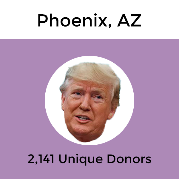
Phoenix, AZ
Which Candidate Does Your Neighbor Support?
The interactive map below highlights Phoenix and its zip codes. More detailed, the map shows where each zip code stands, politically, and which presidential candidate is the front-runner in each zip code. By clicking on the zip code or selecting from the drop-down menu, you will get more information on which candidate is the front-runner and which candidate raised the most money in donations in that specific zip code. For a more detailed analysis of how each candidate is doing in the same zip code, view the corresponding interactive line graph above the map.
From a quick look at the interactive map of Phoenix, it appears the zip codes are rather divided in terms of what their political stance is. However, looking at Phoenix overall we can see from the corresponding interactive line graph above that President Donald Trump has a big lead in the city. At the end of the fourth quarter in December, President Trump had received 2,141 unique donors, 1,312 more unique donors than Phoenix’s runner-up, Bernie Sanders. Sanders had received a total of 829 unique donors in December while Buttigieg had a total of 419 unique donors.
When we break down the party share, the Democratic party holds 55% + of the share in 29 zip codes in Phoenix. The Republican party holds the majority in 19 zip codes. There are currently 19 zip codes where neither party holds 55% + of the share. In terms of which Presidential candidate took the lead in terms of the total amount of zip codes secured in terms of unique donors and amount raised, President Donald Trump is the clear winner securing 49 zip codes for unique donors and 55 zip codes in terms of the highest amount raised from donations.
Unique Donors Leaderboard – Top 10 Zip Codes With the Most Unique Donors
We thought we would break down the zip codes with the most unique donors for the fourth quarter. You can also select the zip codes from the drop-down menu on the map to learn more.
- Zip code 85255: Trump received 217 unique donors (372 total unique donors) / highest amount raised was for Trump ($178,002.83)
- Zip code 85253: Trump received 116 unique donors (217 total unique donors) / highest amount raised was for Trump ($113,538.26)
- Zip code 85383: Trump received 109 unique donors (166 total unique donors) / highest amount raised was for Trump ($46,279.95)
- Zip code 85308: Trump received 87 unique donors (140 total unique donors) / highest amount raised was for Trump ($37,858.22)
- Zip code 85254: Trump received 84 unique donors (173 total unique donors) / highest amount raised was for Trump ($41,502.21)
- Zip code 85331: Trump received 83 unique donors (136 total unique donors) / highest amount raised was for Trump ($40,257.79)
- Zip code 85251: Trump received 69 unique donors each (143 total unique donors) / highest amount raised was for Trump ($36,230.91)
- Zip code 85018: Trump received 56 unique donors (164 total unique donors) / highest amount raised was for Trump ($54,850.98)
- Zip code 85016: Trump received 47 unique donors (149 total unique donors) / highest amount raised was for Trump ($26,011.34)
- Zip code 85282: Sanders received 45 unique donors (143 total unique donors) / highest amount raised was for Trump ($12,225.41)
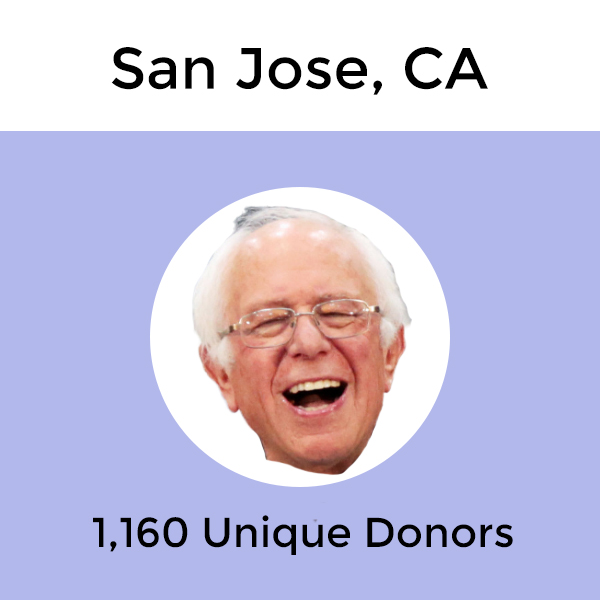
San Jose, CA
Which Candidate Does Your Neighbor Support?
The interactive map below highlights San Jose and its zip codes. More detailed, the map shows where each zip code stands, politically, and which presidential candidate is the front-runner in each zip code. By clicking on the zip code or selecting from the drop-down menu, you will get more information on which candidate is the front-runner and which candidate raised the most money in donations in that specific zip code. For a more detailed analysis of how each candidate is doing in the same zip code, view the corresponding interactive line graph above the map.
Viewing the interactive map above the map clearly shows that the total number of unique donors are mostly Democratic donations. Looking at San Jose as a whole, the front-runner Presidential candidate is Bernie Sanders. In December, Sanders had a total of 1,160 unique donors in San Jose. However, that is only 198 unique donors more than the runner-up, which in this case was President Donald Trump, who had a total of 962 unique donors by December. Coming in at third is Presidential candidate Andrew Yang, who had a total of 615 unique donors in San Jose by December. The gap between runner-up and third is slightly bigger than for the front-runner and the runner-up, but the difference is only 347 unique donors. Note, that unique donors don’t mean amount raised so while the total number of unique donors might be higher with one candidate than another, the amount raised might be higher for another candidate and vice versa. However, the unique donor counts give an indication of which Presidential candidate the people are standing by.
By looking at the Q4 numbers, we also see that Bernie Sanders took the lead in 20 zip codes throughout San Jose in terms of unique donors. The runner-up was Trump, with a total of 13 zip codes. For the amount raised, however, the numbers change a bit. Now, we have a tie between Presidential candidate Andrew Yang and President Donald Trump in terms of holding the most zip codes for the amount raised. Both Yang and Trump secured 12 zip codes each, while Sanders secured 8, Buttigieg secured 7, and Warren secured 1. If we look at who dominated in terms of the party share, the Democratic party held 55% + of the share in 39 zip codes, while the Republican party had none. 1 zip code was “neutral”.
Unique Donors Leaderboard – Top 10 Zip Codes With the Most Unique Donors
We thought we would break down the zip codes with the most unique donors for the fourth quarter. You can also select the zip codes from the drop-down menu on the map to learn more.
- Zip code 95014: Sanders received 75 unique donors (344 total unique donors) / highest amount raised was for Yang ($66,776.88)
- Zip code 95112: Sanders received 74 unique donors (245 total unique donors) / highest amount raised was for Trump ($34,041.17)
- Zip code 95070: Yang received 71 unique donors (319 total unique donors) / highest amount raised was for Yang ($70,494.13)
- Zip code 95037: Sanders received 65 unique donors (173 total unique donors) / highest amount raised was for Trump ($56,501.09)
- Zip code 95125: Sanders received 63 unique donors (313 total unique donors) / highest amount raised was for Buttigieg ($47,570.1)
- Zip code 95126: Sanders received 61 unique donors (209 total unique donors) / highest amount raised was for Buttigieg ($31,284.56)
- Zip code 95008: Sanders received 57 unique donors each (225 total unique donors) / highest amount raised was for Yang ($28,626.83)
- Zip code 95123: Sanders received 50 unique donors (184 total unique donors) / highest amount raised was for Trump ($18,817.8)
- Zip code 95124: Sanders received 47 unique donors (193 total unique donors) / highest amount raised was for Trump ($34,216.8)
- Zip code 95032: Buttigieg received 40 unique donors (181 total unique donors) / highest amount raised was for Trump ($56,205.28)
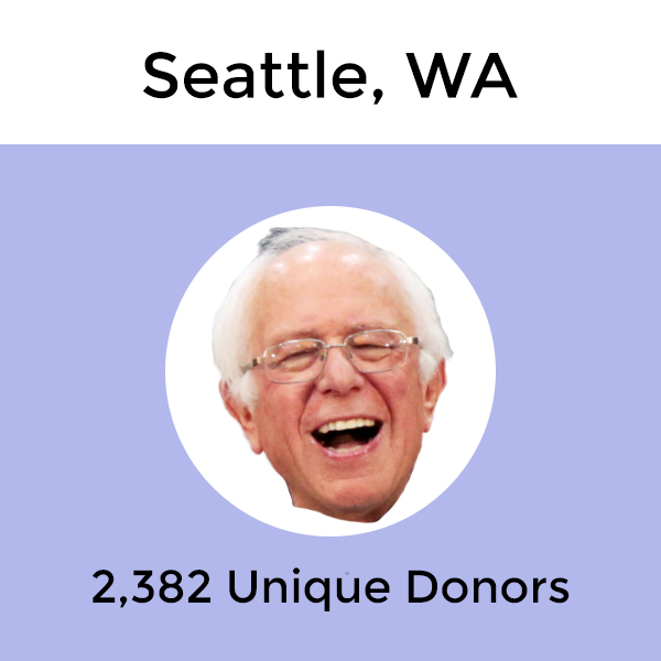
Seattle, WA
Which Candidate Does Your Neighbor Support?
The interactive map below highlights Seattle and its zip codes. More detailed, the map shows where each zip code stands, politically, and which presidential candidate is the front-runner in each zip code. By clicking on the zip code or selecting from the drop-down menu, you will get more information on which candidate is the front-runner and which candidate raised the most money in donations in that specific zip code. For a more detailed analysis of how each candidate is doing in the same zip code, view the corresponding interactive line graph above the map.
For Seattle, the interactive map shows all of Seattle’s zip codes covered in blue. Looking at the numbers to support the colors, we see that the Democratic party had the majority donor share (55% + of the donor share) in all of Seattle’s 37 zip codes. So just from the map, it seems the residents of Seattle are mostly supporting the Democratic candidates. But which candidate is taking the lead, according to the Q4 numbers?
Breaking it down by Presidential candidates, we see that Bernie Sanders received a total of 2,382 unique donors at the end of Q4. The runner-up candidate was Elizabeth Warren, with a total of 1,850 unique donors. Coming third is Peter Buttigieg, with a total of 1,317 unique donors. President Donald Trump only received a total of 528 unique donors in Seattle for Q4. Furthermore, Sanders took the lead in a total of 23 out of 37 zip codes in terms of the highest number of unique donors while Buttigieg secured most zip codes (12 out of 37) in terms of the highest amount raised.
Unique Donors Leaderboard – Top 10 Zip Codes With the Most Unique Donors
We thought we would break down the zip codes with the most unique donors for the fourth quarter. You can also select the zip codes from the drop-down menu on the map to learn more.
- Zip code 98103: Sanders received 220 unique donors (679 total unique donors) / highest amount raised was for Warren ($78,681.68)
- Zip code 98122: Sanders received 163 unique donors (536 total unique donors) / highest amount raised was for Buttigieg ($86,500.78)
- Zip code 98115: Sanders received 150 unique donors (580 total unique donors) / highest amount raised was for Warren ($66,358.78)
- Zip code 98102: Sanders received 146 unique donors (467 total unique donors) / highest amount raised was for Buttigieg ($76,340.26)
- Zip code 98118: Sanders received 117 unique donors (330 total unique donors) / highest amount raised was for Sanders ($51,827.97)
- Zip code 98112: Warren received 112 unique donors (520 total unique donors) / highest amount raised was for Buttigieg ($158,510.99)
- Zip code 95008: Warren received 104 unique donors each (385 total unique donors) / highest amount raised was for Warren ($47,293.15)
- Zip code 98109: Sanders received 104 unique donors (365 total unique donors) / highest amount raised was for Buttigieg ($48,284)
- Zip code 98105: Sanders received 94 unique donors (341 total unique donors) / highest amount raised was for Buttigieg ($48,936.63)
- Zip code 98119: Sanders received 78 unique donors (337 total unique donors) / highest amount raised was for Buttigieg ($60,702.21)
Washington D.C.
Which Candidate Does Your Neighbor Support?
The interactive map below highlights Washington D.C. and its zip codes. More detailed, the map shows where each zip code stands, politically, and which presidential candidate is the front-runner in each zip code. By clicking on the zip code or selecting from the drop-down menu, you will get more information on which candidate is the front-runner and which candidate raised the most money in donations in that specific zip code. For a more detailed analysis of how each candidate is doing in the same zip code, view the corresponding interactive line graph above the map.
From the map, we see that Washington D.C. is following the same trend as Seattle, with all of its zip codes being covered in blue. Out of Washington D.C.’s 28 zip codes, the Democratic party held a 55% + share of the unique donors for the fourth quarter in all of the city’s zip codes. There were no zip codes throughout Washington D.C. where the Republican party and President Trump had a significant lead in terms when looking at the Q4 numbers.
For the individual Presidential candidates, the front-runner in Washington D.C. was Peter Buttigieg, with a total of 2,167 unique donors. The runner-up was Elizabeth Warren, with a total of 1,346 unique donors, 821 fewer donors than Buttigieg. Peter Buttigieg was also the front-runner in terms of securing the most zip codes when looking at the total number of unique donors and the amount raised. Buttigieg secured 16 zip codes for total unique donors and 15 zip codes for highest amount raised in Washington D.C.
Unique Donors Leaderboard – Top 10 Zip Codes With the Most Unique Donors
We thought we would break down the zip codes with the most unique donors for the fourth quarter. You can also select the zip codes from the drop-down menu on the map to learn more.
- Zip code 20009: Buttigieg received 330 unique donors (909 total unique donors) / highest amount raised was for Buttigieg ($259,174.62)
- Zip code 20008: Buttigieg received 238 unique donors (887 total unique donors) / highest amount raised was for Buttigieg ($237,568.75)
- Zip code 20001: Buttigieg received 228 unique donors (710 total unique donors) / highest amount raised was for Buttigieg ($175,379.3)
- Zip code 20016: Buttigieg received 224 unique donors (922 total unique donors) / highest amount raised was for Biden ($285,302.62)
- Zip code 20002: Buttigieg received 195 unique donors (694 total unique donors) / highest amount raised was for Buttigieg ($137,965.04)
- Zip code 20007: Buttigieg received 175 unique donors (651 total unique donors) / highest amount raised was for Biden ($242,692.72)
- Zip code 20003: Buttigieg received 154 unique donors each (524 total unique donors) / highest amount raised was for Buttigieg ($101,951.67)
- Zip code 20015: Buttigieg received 120 unique donors (440 total unique donors) / highest amount raised was for Buttigieg ($124,269.91)
- Zip code 20010: Warren received 112 unique donors (345 total unique donors) / highest amount raised was for Buttigieg ($57,843.85)
- Zip code 20011: Buttigieg received 86 unique donors (389 total unique donors) / highest amount raised was for Buttigieg ($50,798.01)
Methodology
The campaign donations data was retrieved from the FEC. Note that the dataset only includes individual receipts and has yet to be categorized and coded by the FEC as of Feb 10th, 2020. It is pulled directly from each committee’s raw, electronic reports, and does not include paper filings. The city shapefiles were retrieved from the U.S. Census Bureau. In terms of unique donors, we deduped by names, zip codes, and committee names. We adopted 5-digit zip codes for this report as not all candidates collect 9-digit zip codes. We then grouped the zip codes by their respective cities and further analyzed the data by each candidate. People that have changed their names or moved in between donations could artificially inflate these numbers.
Frequently Asked Questions about Our Election Studies
1. Why would Trump be leading in a Blue city?
This is related to the nature of the primary. As we all know, there are currently 11 Democrats running for President in 2020, and so the support is divided among them. Meanwhile, while the Republican Party has 3 candidates running, all the support is gravitating towards Donald Trump, and therefore he alone could receive support from more unique donors than any single Democratic candidate.
2. Why should we care about unique donors?
While the dollar amount raised is important for candidates, we believe that it is more crucial to understand how many unique donors each candidate has attracted, as each unique donor potentially means one vote, and by measuring donor counts, it gives us a better idea of how many people support each candidate.
3. How is the party majority calculated?
The party majority is calculated using the aggregated unique donor count of a party and the aggregated unique donor count from Jan 1st to December 31st, 2019. For instance, if Democratic candidates attracted a total of 200 unique donors, and the total number of unique donors within a city is 500, then the Democratic share would be 40%. In terms of the color shades, purple areas are whether neither the Democratic candidates combined nor Trump has more than 55% of the donors. Light blue and light red represent zip codes where the party has 55% to 70% of the donors, and blue or red represents a majority of 70% and more.
The post Fundraising by Zip Code – Which Candidate Does Your Neighbor Support? appeared first on Real Estate Data & Research.
]]>The post Maximize Your Summer Fun with Data appeared first on Real Estate Data & Research.
]]>When we think of summertime, memories come to mind of walks through the park, dinner with friends on the patio of our favorite restaurants, riding bikes, and unfortunately, going to work also comes to mind. At RentHop, we embrace the summer (and all the strange smells that comes with it thanks to the warm weather if you live in New York City) and we always look to find the neighborhoods with the most summer fun.
In order to figure out which neighborhoods will maximize your summer fun, we’ve updated our previous SummerScore study by taking a dive into the oceans of data on all things summer. The SummerScore is a wide-ranging index of the things that make a summer day awesome, and not-so-awesome. Don’t like stepping in dog poop? Neither do we, so we accounted for that. Neighborhoods with high poop complaints per square mile received a Poop Penalty to their SummerScore.
This year, we kept the data the same for the SummerScore index but with a few additions. This year, BBQ areas and rooftops play a factor on the neighborhood’s SummerScore. Because let’s be honest, who doesn’t love a good BBQ or rooftop during the summer?
Read on and check out the map below to see if your neighborhood is the hottest neighborhood in terms of summer fun this summer.
The Interactive SummerScore Map
Which Neighborhood Was Number 1?
Only one neighborhood received the coveted 100 SummerScore: West Village. This Manhattan neighborhood had the best-overall amounts of everything good. West Village has 30 Citi Bike stations per square mile, for those interested in riding around the neighborhood with a bike this summer and 4.3 trees per 1000 square mile. Not surprisingly, West Village has the highest concentration of outdoor dining spots, with 153 cafes per square mile and 7 rooftop bars per square mile. Sadly, for those who enjoy outdoor BBQ, the West Village will not be your top 1 neighborhood, and unfortunately, there is some dog poop as well, but hey, you can’t have it all…!
Top 10 Neighborhoods For Summer Fun
| Neighborhood | Borough | SummerScore | |
| 1 | West Village | Manhattan | 100 |
| 2 | SoHo-TriBeCa-Civic Center-Little Italy | Manhattan | 91 |
| 3 | Brooklyn Heights-Cobble Hill | Brooklyn | 91 |
| 4 | Fort Greene | Brooklyn | 84 |
| 5 | Gramercy | Manhattan | 83 |
| 6 | Chinatown | Manhattan | 81 |
| 7 | Morningside Heights | Manhattan | 80 |
| 8 | North Side-South Side | Brooklyn | 80 |
| 9 | Upper East Side-Carnegie Hill | Manhattan | 80 |
| 10 | Park Slope-Gowanus | Brooklyn | 79 |
Above you see the top 10 list of the neighborhoods with the highest SummerScore, based on the factors included in the SummerScore Index. The top 10 neighborhoods were either located in Brooklyn or Manhattan, with a total of six neighborhoods being in Manhattan. The SummerScores of the top ten neighborhoods ranged from being in the high 70s to the West Village taking first place with a SummerScore of 100. Use the map and the generated bar charts to see breakdowns for each neighborhood’s score.
How Did We Do It?
Pulling this together was no small feat, with multiple data sources and years of data to sift through, we set out to ensure that the SummerScore covered aspects relevant to as many New Yorkers as possible. Most of the data came from open data sources, so anyone can access and have a look for themselves. The foundation upon which everything was built was the Neighborhood Tabulation Areas as defined by NYC, used for zoning and planning. In many cases, colloquial neighborhoods are combined into one area, but using these areas allows us to utilize official demographic information to normalize the data based on size, making for a fair comparison.
We used these data sources for the SummerScore Index:
- Citibike station location data from NYC DOT
- Sidewalk café data came from NYC’s data on business licenses for restaurants permitted to have outdoor seating
- Dog poop data came from a subset of NYC 311 complaints addressed by the city’s Canine Task Force
- Trees per person data was derived from the 2015 Street Tree Census
- Park Coverage data was calculated using the Open Space & Parks shapefile from NYC OpenData, which shows all of NYC’s parks
- Rooftop bars were collected using publicly available websites and social media platforms.
- BBQ areas were retrieved from the Directory of Barbecuing Areas.
In order to calculate the SummerScore, we counted the number of occurrences of many of the above factors there are/were in each neighborhood using a GIS spatial reference function. These counts were then normalized based on the size of the neighborhood. For park coverage percentage, we compared the sizes of all the parks, squares, playgrounds, and Greenstreets throughout the city to the sizes of the neighborhoods they were located in. Neighborhoods like Upper East Side, Park Slope, and Brighton Beach were given bumps to their score for bordering Central Park, Prospect Park and having a beachfront. Many neighborhoods have lower amounts of parks in them since they’re so close to other large parks and so we accounted for that. Lastly, to create the Poop Penalty, we looked at 311 data from 2016 to 2018 on canine waste complaints. We then calculated the average number of complaints per year and normalized the data based on the size of the neighborhood.
Other Findings
Not everyone might think that the beach is the definition of summer fun. Some people might relate other things to summer more than the beach, for example, rooftops or going for a BBQ. While calculating the SummerScore, we came across some other interesting findings. We took a look at the neighborhoods with the most poop complaints per square mile, the neighborhoods with the most rooftops per square mile, the neighborhoods with the most cafes per square mile, and the neighborhoods with the most BBQ areas per square mile.
Which neighborhoods had the most poop complaints over the years?
| Neighborhood | Borough | Poops/Square Mile | |
| 1 | Soundview-Bruckner | Bronx | 77.15 |
| 2 | Bronxdale | Bronx | 48.31 |
| 3 | West Farms-Bronx River | Bronx | 46.21 |
| 4 | Norwood | Queens | 42.00 |
| 5 | Yorkville | Manhattan | 38.96 |
Nothing spoils your summer fun like stepping in poop on a hot day. That’s why we took a closer look at the top five neighborhoods with the most poop complaints per square mile so you know where to be extra careful walking around this summer. The number one neighborhood with the most poop complaints per square mile was located in the Bronx and it is Strongview-Bruckner with 77.15 poops per square mile.
Which neighborhoods have the most sidewalk cafes?
| Neighborhood | Borough | Cafes/Square Mile | |
| 1 | West Village | Manhattan | 153 |
| 2 | East Village | Manhattan | 130 |
| 3 | SoHo-TriBeCa-Civic Center-Little Italy | Manhattan | 120 |
| 4 | Clinton | Manhattan | 80 |
| 5 | Yorkville | Manhattan | 80 |
The sun is out, and so should you be. Enjoy the summer and check out all the sidewalk cafe’s New York has to offer. Cafe’s with outdoor seating is extremely popular during the summer, so where should you go to make sure you have a chance to secure a seat for brunch and people watching? Well, first of all you should go to Manhattan, as the top five neighborhoods with the most sidewalk cafe’s are all located in Manhattan. The number one neighborhood with outdoor seating is West Village, with 153 cafes/square mile.
Which neighborhoods have the most rooftops?
| Neighborhood | Borough | Rooftops/Square Mile | |
| 1 | Midtown-Midtown South | Manhattan | 39 |
| 2 | Chinatown | Manhattan | 29 |
| 3 | North Side-South Side | Brooklyn | 21 |
| 4 | Gramercy | Manhattan | 15 |
| 5 | Turtle Bay-East Midtown | Manhattan | 14 |
Spending time on a rooftop, sipping on a cocktail or a glass of wine, is probably one of our favorite past times as New Yorkers during summer. So where should you go if you are looking to find new rooftops to try out? Which neighborhoods has the most rooftops? The top five neighborhoods are all in Manhattan, except for number three on the list which is North Side-South Side (North Williamsburg). The number one neighborhood is Midtown-Midtown South with 39 rooftops per square mile.
Which neighborhoods have the most BBQ areas?
| Neighborhood | Borough | BBQ Areas/Square Mile | |
| 1 | Windsor Terrace | Brooklyn | 16 |
| 2 | Prospect Lefferts Gardens-Wingate | Brooklyn | 7 |
| 3 | Flatbush | Brooklyn | 6 |
| 4 | Park Slope-Gowanus | Brooklyn | 5 |
| 5 | Manhattanville | Manhattan | 5 |
Regarding the top five neighborhoods with the most BBQ areas per square mile, it is not surprising that the majority of the neighborhoods on this list was located in Brooklyn. While Manhattan might be the borough with the most rooftops, Brooklyn can offer its residents and visitors designated areas to throw a BBQ.
The post Maximize Your Summer Fun with Data appeared first on Real Estate Data & Research.
]]>The post New Graduates, Here’s Where to Move to Make the Most Money appeared first on Real Estate Data & Research.
]]>
Congratulations, all new graduates! If you are one of those who just graduated from college or will be, these are exciting times! You no longer have tons of papers to finish, reading material to complete, waking up at the crack of dawn to attend a lecture, and most importantly: no more student loans! However, you now have some other, new daunting tasks in front of you, and that is getting a job, and for a lot of people that require relocation as well. Did you know that for some occupation fields, you might be able to get a higher annual salary than compared to other metros? Our dedicated research team here at RentHop took on the task of finding which metro you could potentially get paid the most and least based on your occupation field!
Metro Profiles
Before jumping into each occupation, let us first take a look at each of the top 50 metro areas in the U.S. After all, population growth and macroeconomic trends have a huge impact on your future career. The interactive map below outlines each metro’s population count and growth, employment growth, current unemployment rate, median income, the average time to work, and one-bedroom median rent, which is calculated using RentHop’s proprietary data.
Of all metros included in this study, the Austin metro area has seen a population growth of 25.5% in the past 10 years! Pittsburgh, PA, on the other hand, has experienced negative population growth. The total population has gone down to 2.3 million, or by 1.4%. In terms of employment growth, while all metros have experienced positive growth in the past year, thanks to the booming U.S. economy, the Orlando metro saw the most robust growth of 3.5%. Virginia Beach, meanwhile, saw only 0.2% growth from April 2018 to April 2019.
Where You Should Live if Your Goal is to Make the Most Money
For this study, we took a deeper look into 12 different major occupation fields that will most likely require a bachelor’s degree or higher and the annual income by occupation field at a metro level. To make sure that we take employment opportunities into consideration, we included only occupations with a location quotient above 1. Location Quotients quantify how concentrated industry or occupation is in a region compared to the nation. As measured by BLS, the location quotients show the occupation’s share of an area’s employment relative to the national average. Therefore, if an occupation has a location quotient above 1, it indicates that the occupation employs more people within that metro area relative to the U.S. and that people will more likely find a job related to that occupation field. See table below for the metros with the highest annual salary in each occupation field.
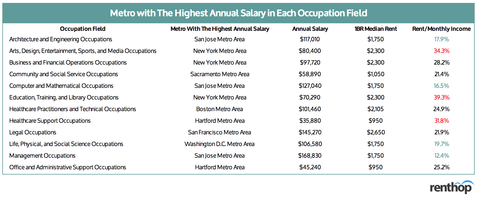
The table above is sorted alphabetically and gives an idea of where you should move if you are looking to move to an area where the job market is good in terms of job availability and annual salary. For those educated within the field of Architecture and Engineering, we see that the San Jose-Sunnyvale-Santa Clara, CA metro has the highest annual salary of $117,010. For those looking for jobs in Life, Physical, and Social Science, you might want to move to the Washington D.C. metro. Management Occupations enjoy the highest pay on this list. Of all metros, people in the management occupations in San Jose-Sunnyvale-Santa Clara receive an annual salary of $168,830.
Before you make up your mind, however, be sure to take into account the cost of living. While fashion designers, graphic designers, and media professionals make the most in the New York metro, the cost of living is so high that they will have to spend around 34% of their monthly income on rent to afford a one-bedroom apartment. Sounds scary, doesn’t it? That does not mean, however, that you have to spend more than a third of your income on rent. You can always find roommates to share an apartment with. In fact, across the US, one can expect to save on average 40% off their monthly rent by sharing a two-bedroom versus having a one-bedroom alone.
Where You Shouldn’t Live if Your Goal is to Make the Most Money
We also took a look at the occupation fields that would be paying the least, annually, and in which metro area. If your plan is to make as much money as possible, relocating to one of the following areas might not be the best option. See table below for the metros with the lowest annual salary in each occupation.
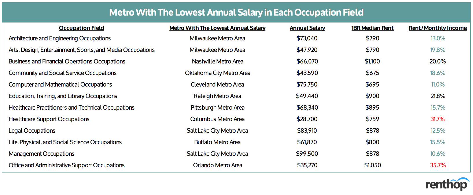
Again we see that the table above is sorted alphabetically and is meant to give an idea of which area has the lowest annual salary based on each occupation field. From the table above, we see that the Columbus, OH metro has the lowest annual salary for the Healthcare Support occupations, with an annual salary of $28,700 and rent/income ratio of 31.7%, and that does not include taxes, food, insurance, etc. If you are looking for a job in Office and Administrative Support, you might want to skip the Orlando-Kissimmee-Sanford metro, as on average around 36% of your annual income will go towards rent. Want to become a teacher? Make sure you don’t move to the Raleigh, NC metro area.
While the rent/income ratios in the table above are generally lower, lower rent does not always equal to more savings. Since most of these metros don’t have a convenient public transportation system, you will probably need a car, and that, after including the cost of gas, car insurance, maintenance, etc., translates into hundreds of dollars per month on top of your rent.
Occupation Fields by Metro
To give you a better sense of the labor market in each metro, we have compiled the interactive table below. The table includes all 12 occupation fields by metro, along with average annual income, location quotient, median rent, and rent/income ratio. You can sort by column or do a quick search using the search bar.
Methodology
This occupation study analyzed occupational employment data released by the Bureau of Labor Statistics at a metro level to give recent graduates a better sense of the labor market in the U.S. The study included 12 major occupation categories that will most likely require a bachelor’s degree or higher, and ranked them by the average annual income across the top 50 U.S. metro areas (based on the population size from the American Community Survey by the Census Bureau). Using our proprietary rental database, we at RentHop calculated the one-bedroom median rent across these 50 U.S. metro areas. In general, the higher the rent, the more expensive it is to live in a metro.
Full Dataset
The interactive table below includes all occupations under the 12 occupation categories, along with the highest- and lowest-paying metros, average annual income, and median rent. You can sort by column or do a quick search using the search bar.
The post New Graduates, Here’s Where to Move to Make the Most Money appeared first on Real Estate Data & Research.
]]>The post Where Does the Train of Rising Rents Stop in New York? appeared first on Real Estate Data & Research.
]]>New York’s MTA subway system is an essential part of many New Yorkers’ lives. With as many as 5.7 million riders each weekday, it truly is the backbone of the city. It should be no surprise then, that it is one of the first things that people consider when looking to rent an apartment. Close proximity to the right trains means shorter commutes and more time spent doing what you love. RentHop’s data scientists love maps and rental data, and so we’ve mapped out rental prices by subway stop to assist in your apartment hunting endeavors.
Our key findings this year include:
- Overall, 1BR median rent in NYC went up by 3% the past year.
- Rents increased at 314 MTA stops and fell at 115 stops. Meanwhile, 23 stops experienced no change in 1BR median rent.
- New developments drove up the median rent at multiple stops in Brooklyn, including G Train / Classon Av ($2,575, +13.2%), G Train / Metropolitan Av ($3,225, +12.2%), and L Train / Morgan Av ($2,475, +8.9%).
- Union Square continued to be the most expensive stop in the NYC metro area. 1BR median rent at this stop currently sits at $5,490, 3.9% higher than last year.
- Thanks to the new development at 29-22 Northern Blvd, Queens Plaza – E/M/R outranked Queensboro Plaza – 7/N/W and became the most expensive stop in Queens, with 1BR median rent at $3,025, and year-over-year growth of 9.2%.
- In the Bronx, Freeman St, Simpson St, and Intervale Av on the 2/5 lines experienced significant rent growth, which is largely driven by the new development at 1117 Hoe Avenue.
The Interactive Map Below Shows All Rents, Stops, and YoY Price Fluctuations
In order to calculate the median net effective rents for the map above, we used RentHop’s rental data for one-bedroom apartments from February through April 2018 & 2019, MTA Lines and Stops data, and GIS data for subway stops compiled by CUNY – Baruch College. To get accurate prices near the subway stops, we looked at least 50 non-duplicated listings within 0.6 mile of a subway stop and then calculated the median rents. If there were less than 50 non-duplicated listings, we expanded the distance to 1.2 miles of a subway stop.
Major subway hubs like Union Square, Fulton Street, and Atlantic Ave/Barclay’s Center give nearby residents flexibility and convenience when traveling or commuting to different places. They also make it easy to convene and get home from anywhere after a long day of work. It’s no wonder these subway stops ranked among the most expensive stops on the RentHop subway rent map.
One-Bedroom Rents at Major NYC Subway Hubs
- Union Square 14th St (4,5,6,L,N,Q,R,W Trains) – $5,490
- Times Square 42nd St (1,2,3,7,N,Q,R,S,W Trains) – $3,007
- West 4th St (A,B,C,D,E,F,M Trains) – $2,895
- Herald Square 34th St (B,D,F,M,N,Q,R,W Trains) – $3,274
- Fulton St (A,C,J,Z,2,3,4,5 Trains) – $3,693
- Atlantic Ave – Barclay’s Center (2,3,4,5,B,D,N,R,Q) – $3,435
- Broadway Junction (A,C,J,L,Z) – $1,900
Where Does the Train of Rising Rents Stop?
So far, in 2019, we’ve seen rents rising at many stops across Manhattan, Brooklyn, Queens, and the Bronx, mostly related to new or renovated buildings and reduced concessions, such as 305 86th Street by 86 St – Q train. The repositioned 298 Mulberry Street pushed up the 1BR median rent at Bleecker Street – 6 Train ($3,475) by 10.3%. ML House at 1050 Sixth Avenue, one of the newest addition to the Midtown luxury buildings, pushed the median rent up at both Bryant Park and Times Square. In the Bronx, the brand-new, six-story boutique building at 111u Hoe Avenue caused rental prices to surge at Simpson St and Intervale Avenue on the 2/5 Trains. Similarly, in Brooklyn, the Stanwix at 115 Stanwix Street and the Rheingold at 10 Montieth Street also put upward pressure on the rental prices around Flushing Av – J/M Trains.
Below, we’ve compiled a list of the stops with the largest price pops and drops.
These stops saw some of the biggest rent drops on one-bedroom apartments
- Fort Hamilton Parkway – F/G – $2,100 (YoY -8.7%)
- Lorimer St – J/M – $2,566 (YoY -8.4%)
- Canal St – A/C/E – $4,120 (YoY -7.2%)
- Jackson Av – 2/5 – $1,632 (YoY -6.1%)
- 36 St – D/N/R – $1,850 (YoY -5.7%)
These subway stops saw rent jumps
- Classon Av – G – $2,575 (YoY 13.2%)
- Simpson St – 2/5 – $1,573 (YoY 12.3%)
- Bergen St – 2/3 – $3,200 (YoY 12.3%)
- Metropolitan Av – G – $3,225 (YoY 12.2%)
- Flushing Av – J/M – $2,449 (YoY 11.3%)
Time or Money?
Would you travel a few extra stops to save a couple hundred dollars? How about for $1,000? We scanned the map for the best single stop rent savings and found some really surprising results.
The list below represents the largest price disparities between a single stop. This could be because they are on the edge of a business development district, rents dropped at one stop, prices soared at the other, both, or all of the above. It’s also possible that the typical one bedroom apartment near one stop is very different from an apartment a stop away.
Turn your commute into extra cash at these stops
- Save $1,101 between 96 St ($3,461) and 103 St ($2,360) – B/C Trains
- Save $1,020 between 68 St – Hunter College ($3,795) and 77 St ($2,775) – 6 Train
- Save $960 between Bedford Av ($3,360) and Graham Av ($2,400) – L Train
- Save $725 between 59 St – Columbus Circle ($3,825) and 72 St ($3,100) – B/C Trains
- Save $680 between 66 St – Lincoln Center ($3,925) and 72 St ($3,245) – 1 Train
Condensed Map for Easy Sharing – Click on the image for the full map!

What Does This Mean For You?
Finding an apartment in New York City is hard. Deciding where to live and starting your search is probably the most difficult step. By giving you as much information about the market as possible, RentHop hopes to point you in the right direction. This map is just one of the data-backed insights we offer. All of our New York City apartment listings are ranked using available data to ensure that renters always see the best quality apartments.
The post Where Does the Train of Rising Rents Stop in New York? appeared first on Real Estate Data & Research.
]]>The post The Madness That is Boston Move-in Day 2018 appeared first on Real Estate Data & Research.
]]>Viewing the Madness Through Heat Maps
We looked at the data provided by the City of Boston for street occupancy permits. For this study, we used publicly available data on Boston’s moving truck permits, made available on Boston’s open data hub. The data provides us with the issued moving truck permits for dates up to September 13, 2018. We focused exclusively on the expiration dates of the moving truck permits (which generally coincide with the actual moving dates) instead of the permit issuance dates. You can only apply online for a permit if your moving date is at least two weeks away, and no more than a month away. That said, because we are looking at when these moving permits expire, there may be additional permits registered between now and your move-in day, so long as potential movers fit the above criteria.
We created two maps:
- A daily heat map of Boston showing the number of issued moving truck permits on a daily basis in 2017.
- A daily heat map of Boston showing the number of issued moving truck permits on a daily basis in 2018.
Like the previously published maps, both of the embedded maps below show the addresses of the moving truck permits that were issued. Looking at the maps, it is easy to spot which neighborhoods are busier than others, and under which time frame and dates.
Daily Heat Map of Boston 2017 (for comparison)
When breaking down the daily map for 2017, you can see that there are not a lot of spikes in issued moving truck permits until August 31, 2017 through September 2, 2017. Much of Boston is pretty congested and busy around those dates, specifically the neighborhoods that is also the home to, or in close proximity to, Boston’s schools and universities. Now let’s take a look at the next map, which takes a closer look at the daily number of issued moving truck permits for 2018.
Daily Heat Map of Boston 2018
The daily embedded map for 2018 takes a closer look at the daily number of issued moving truck permits from August 1, 2018, to September 13, 2018. This map will be a great tool for those looking to check out if their neighborhood will be particularly affected by students and all of their “baggage” during certain dates. By looking more specifically at the individual dates, we see that the following dates have higher spikes than others. This is due to permits ending on those dates. The top five upcoming dates for August and September, where permits will expire or have expired, are:
- September 1, 2018: 747 permits are due to expire on this day.
- August 31, 2018: 416 permits are due to expire on this day.
- May 31, 2018: 200 permits expired on this day.
- June 1, 2018: 193 permits expired on this day.
- June 30, 2018: 187 permits expired on this day.
This is interesting as the top five dates where permits are set to expire are a bit different than for 2017. For 2017, the top two dates for expired permits was also September 1 in first place and August 31 on second place. What followed for 2017 was August 26 on third place, September 2 on fourth place, and August 30 coming in last. For 2018, only two dates (September 1 and August 31) are dates coming up under the big move-in day in Boston. The other dates are dates that have already passed, this summer.
A Deeper Look at Boston Moving Patterns
From the data provided, it is safe to say that there is a relationship between the number of issued permits and the move-in period for new and returning students in Boston. Looking at the number of issued moving truck permits all the way back to January 2013, to September 2018, this is how the numbers are divided.
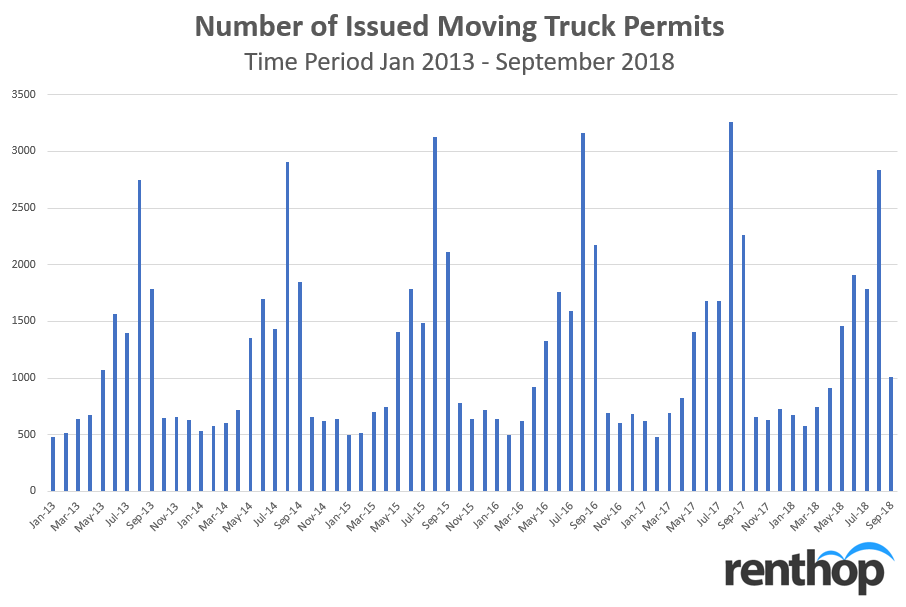
Looking at the chart displayed above, we see that August is a clear winner for the most issued permits for the years 2013 to 2017. Other months that show a higher than average number of issued moving truck permits are May, June, July, and September. Let’s take a closer look at the months with the highest number of issued moving truck permits.
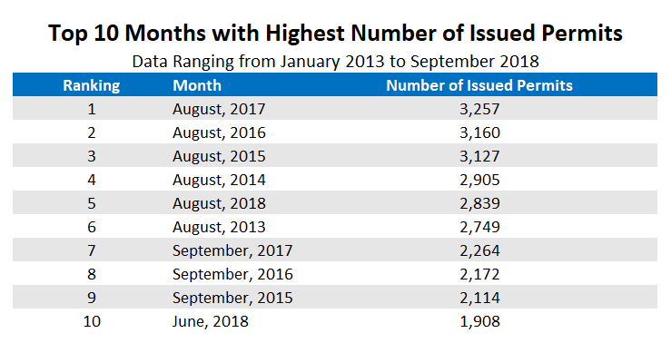
The table above takes a closer look at the number of expired moving truck permits all the way back from 2013 to 2018. August 2017 is the clear winner with 3,257 issued permits. Furthermore, we see that the month of August comes in on first place to sixth place as the month with the highest number of expired moving truck permits. This shows that there is a high correlation between issued permits for moving trucks and the move-in period for new and returning students. However, August 2018 is number five on the list this time around. Previously, we were seeing an increase in issued permits in August each year. However, when comparing August 2017, with 3,257 issued permits, and August 2018, with 2,839 issued permits, we see a decrease of 12.85% in issued permits. September 2018 didn’t even make the list of the top ten months with the highest number of issued permits. Does this mean Bostonians can look forward to a less chaotic move-in period this year?
So which areas are the worst to commute in around the move-in period? For you to know which area to avoid, we took a deeper look at the zip codes attached to the issued moving truck permits as well. Knowing which zip codes that are the busiest might help you to plan ahead, if you’re one of those that will be affected by the move-in period when commuting to work, the gym, etc. We ranked it by the top ten busiest zip codes based on the number of issued permits.
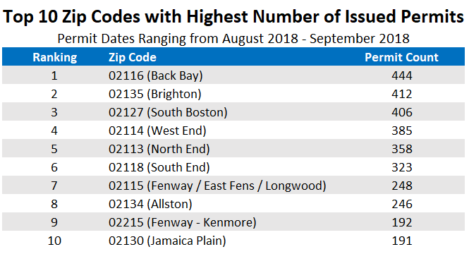
The zip code with the highest number of issued permits is 02116 (Back Bay) with a total of 444 issued permits from the time frame August to September. Following that we have zip code 02135 (Brighton). Boston College is located in Brighton, which could have something to do with the high number of permits for that specific zip code. We see that a lot of the zip codes with the highest number of issued permits are in popular neighborhoods for students to live. The zip code ranked as number ten is 02130 (Jamaica Plain).
Survival Guide: How to Dodge the Madness
1. Check when universities and schools have their move-in day
If you have a school or university near where you live you probably already know that there will be more traffic than usual around the move-in period. But exactly when is the move-in dates for your local university or school? It might be worth checking the academic calendar to ensure you mark the dates that your area will be busier than normal. Here are just a couple of move-in dates for Boston schools and universities that are coming up in the next couple of weeks, based on the academic calendar for 2018.
- Boston University: 8/29/18 – 9/03/18
- Northeastern University: 8/30/18 – 9/03/18
- Boston College: 8/22/18 – 8/24/18
- Emerson College: 8/27/18 – 9/2/18
- Suffolk University: 9/02/18
- Berklee College of Music: 8/29/18 – 9/1/18
2. Map out alternate routes by using the map
Check the embedded map to figure out alternative routes to the gym, the store, or work. Take a minute to map out some routes, other than your normal route, if you can see from the map that your normal route might be rather busy. No one wants to get stuck in the middle of a traffic jam or behind a big moving truck on a narrow road. Do some research on the route before heading out to save yourself from a headache.
3. Plan around potential delays
Despite all your best efforts and planning, there are some delays and annoyances that are going to be impossible to evade. Especially in a city as close quartered as most of Boston is, a single vehicle being out of place or stopped for too long can cause some major issues. As a result, you should give yourself more time each and every day to account for the potential delays. While you might miss out on the delays you planned for and be very early to work or class, that is better than not giving yourself that extra time and hitting a delay, making yourself very late.
4. Accept the fact and don’t panic or get angry
While this tip isn’t so much about helping you avoid the madness that is Boston Move-In Day, it can make it much more manageable for you. The fact is, there is a high chance of your commute or drive being disrupted in some way due to the moving. Instead of thinking you will get through without a hitch and then getting upset or angry when you get stopped, expect and accept the fact that it is likely to happen. Simply expecting to be disrupted by the madness will make it less bad when it occurs, and if it doesn’t, you will feel like you just hit the jackpot.
5. Take advantage of the chaos with “Allston Christmas”
While many will avoid this area at all costs, there are also those all deliberately look to go to these areas around move-in day. The reasoning for this is “Allston Christmas”. For those unfamiliar, Allston Christmas is the period around move-in day in which a ton of people are moving in and out of apartments. While most of their furniture will make it into a U-Haul or an apartment, there are always some just left on the street, free for anyone to take. So instead of treating this whole ordeal as a disturbance or a huge place to be avoided, treat it as an opportunity. There is a good chance you can find some pretty cool things simply laying on the sidewalk or in the street.
The post The Madness That is Boston Move-in Day 2018 appeared first on Real Estate Data & Research.
]]>The post Can Your Job Impact Where You Should Live? appeared first on Real Estate Data & Research.
]]>For this data study, we took a look at the cost of different areas in Boston, Chicago, Los Angeles, Miami, and New York City by looking at the median 1 bedroom price and the median 2 bedroom price per tenant and doing a price comparison by area and city to see potential savings by sharing an apartment over getting an apartment by yourself. We also, based on numbers from CareerCast and Forbes, compiled a list of jobs that they found to be the most in-demand jobs (2017), the toughest jobs to fill (2017), the best jobs, the highest paid jobs, etc, to give an idea of which job would fit the rent requirement of what area. From these lists, we found the median annual salary. Note that median annual salaries are not based on a city-specific level. The intent of the study was to provide insight to new graduates and/or people looking to move to a new city but aren’t sure which area to settle for.
Key Findings from the Study:
- Sharing a 2 bedroom apartment is, not surprisingly, financially smarter than getting a 1 bedroom apartment by yourself, especially right out of school.
- In terms of price savings when sharing a 2 bedroom apartment over getting a 1 bedroom apartment by yourself, Miami had the highest median price saving (38.89%), Boston ranked second (38.20%), New York City ranked third (37.97%), Chicago ranked fourth (37.00%), while Los Angeles ranked last (32.56%).
- Chicago was the most affordable city in terms of both the 1 bedroom median price ($1,285) and the 2 bedroom median price per tenant ($793.25) of the selected five cities.
- For New York City, the borough with the highest price savings when sharing a 2 bedroom apartment was Brooklyn. The top five biggest price savings for zip codes were all located in Brooklyn.
Go directly to a city or section: Boston | Chicago | Los Angeles | Miami | New York City | Comparison by City
How Much Should You Spend on Rent?
There is a rule that says you shouldn’t be spending more than 30% of your income on rent. Another way to look at it is that your annual household income should be 40 times the monthly rent to afford the apartment. This is a great rule to follow, as people who are looking to rent apartments, specifically in big cities, have probably come across the very common requirement of making 40 times the monthly rent. While we know many make the decision to bunk up with roommates instead of renting an entire apartment for yourself for financial reasons, the dream for most of us is to have an entire apartment for ourselves! But is that a reasonable dream fresh out of school? That could depend on the job and the area.
1 Bedroom vs 2 Bedroom Apartment Based on Your Salary
Like we just mentioned, it’s financially smarter to get a roommate to split the rent with than paying the full rent yourself. In bigger cities, the rent is usually higher, which leaves you with either getting a roommate or getting a really, really tiny studio apartment that could also qualify as a closet. By choosing to share a 2 bedroom apartment instead of getting a 1 bedroom by yourself, you can easily save a significant amount of money on rent. While having an apartment by yourself is the ultimate dream, it might not be the most reasonable dream, especially if you’re fresh out of college. We took a closer look at exactly how much you can save by choosing to live with a roommate instead of getting your own place.
Interactive Maps Show Where You Can Afford to Live Based on Your Job and Income
The interactive maps below show the costs of a 1 bedroom and a 2 bedroom apartment in Boston, Chicago, Los Angeles, Miami, and New York City. Furthermore, the maps show the median rent per zip code for the 1 bedroom apartment map and the median rent per tenant for the 2 bedroom apartment map. We used our own rental data to calculate the median asking rent and multiplied that by 40 to calculate the customary income requirement to rent an apartment. When comparing the median rent with the required income, this is what we found.
Boston
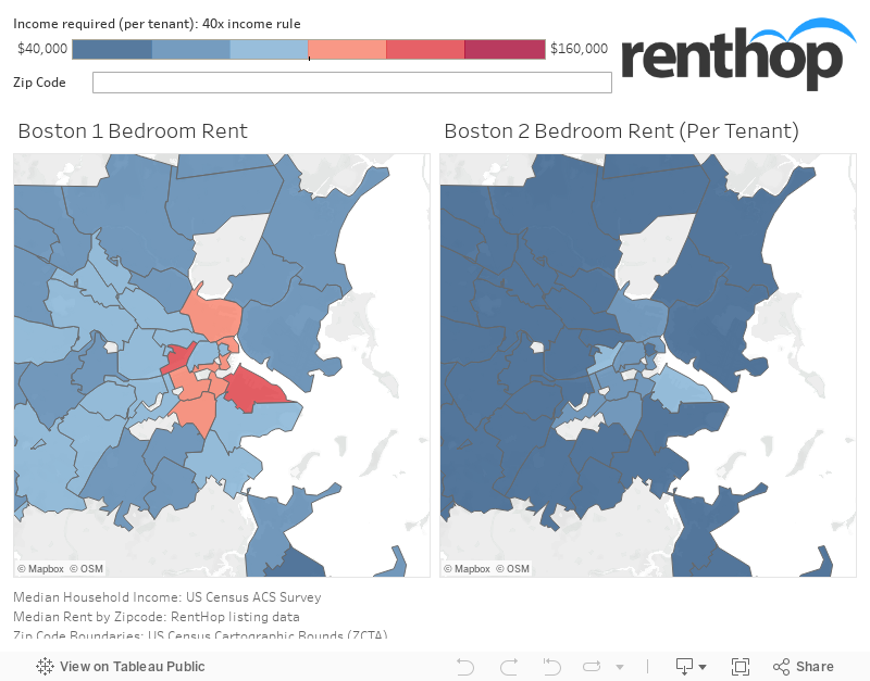
When looking at the maps above, it is easy to see which areas might in fact be more expensive than others when comparing the rent for a 1 bedroom apartment and a 2 bedroom apartment. The zip code for Seaport District (02210) requires an annual income of $123,840 to rent a 1 bedroom while the zip code for Kendall Square (02142) requires an annual income of $124,440. When comparing the median monthly price per tenant for a 2 bedroom for the same zip codes, we see a significant price saving. If you were to rent a 2 bedroom apartment in the zip code for Kendall Square (02142) it would only require you to have an annual income of $80,000, as the rent dropped from $3,111 to $2,000. That’s a significant price drop of 35.71%. For Seaport District (02210), you can save 29.51% by sharing a 2 bedroom apartment.
As an example of what kind of job you would need to have to secure an apartment, a 1 bedroom apartment in zip code 02109 (Downtown Boston) requires an annual income of $109,540, which could be suited for a tax manager with a median annual income of $115,869. When looking at the income requirement for a shared 2 bedroom, the number of professions that would qualify based on the 40 times the monthly rent rule inreases as the required annual income drops to $74,400.
These neighborhoods saw the biggest price savings by sharing a 2 bedroom over a 1 bedroom apartment
- Zip code 02121 (Washington Park): Rent drops from $1,725 to $900, which equals a price saving of 47.83%.
- Zip code 02472 (Watertown): Rent drops from $2,100 to $1,100, which equals a price saving of 47.62%.
- Zip code 02125 (Columbia Point): Rent drops from $2,200 to $1,163, which equals a price saving of $47.16%.
- Zip code 02150 (Lower Broadway): Rent drops from $1,700 to $930, which equals a price saving of 45.29%.
- Zip code 02476 (Arlington Center): Rent drops from $1,825 to $1,000, which equals a price saving of 45.21%.
Chicago

Compared to Boston, we are only seeing areas in blue, meaning Chicago is overall less expensive than Boston for both 1 bedroom and 2 bedroom apartments. We are also seeing the same trend as for Boston, where the areas closer to the city center are priced higher compared to other areas. The most expensive zip code for a 1 bedroom apartment is the zip code for Near West Side (60607), which would require an annual income of $90,000 to secure. Comparing those numbers with a 2 bedroom in the same area, rent drops from $2,250 per person to $1,350 per person, which equals a 40% price drop. Now, to secure the apartment, you and your roommate would need to have a annual income of $54,000 each. As an example, to secure a 1 bedroom apartment in Near West Side (60607), a job that would qualify based on the 40 times the rent rule is a Medical Service Manager with a median annual salary of $96,540. If you’re looking to save money, and share a 2 bedroom, the required annual income would be $54,000, suitable for a Biologist with a median annual salary of $62,290.
These neighborhoods saw the biggest price savings by sharing a 2 bedroom over a 1 bedroom apartment
- Zip code 60620 (Gresham): Rent drops from $838 to $438, which equals a price saving of 47.76%.
- Zip code 60202 (Evanston): Rent drops from $1,350 to $750, which equals a price saving of 44.44%.
- Zip code 60653 (North Kenwood): Rent drops from $1,299 to $725, which equals a price saving of 44.17%.
- Zip code 60644 (South Austin): Rent drops from $814 to $455, which equals a price saving of 44.09%.
- Zip code 60622 (Wicker Park): Rent drops from $1,600 to $900, which equals a price saving of 43.75%.
Los Angeles
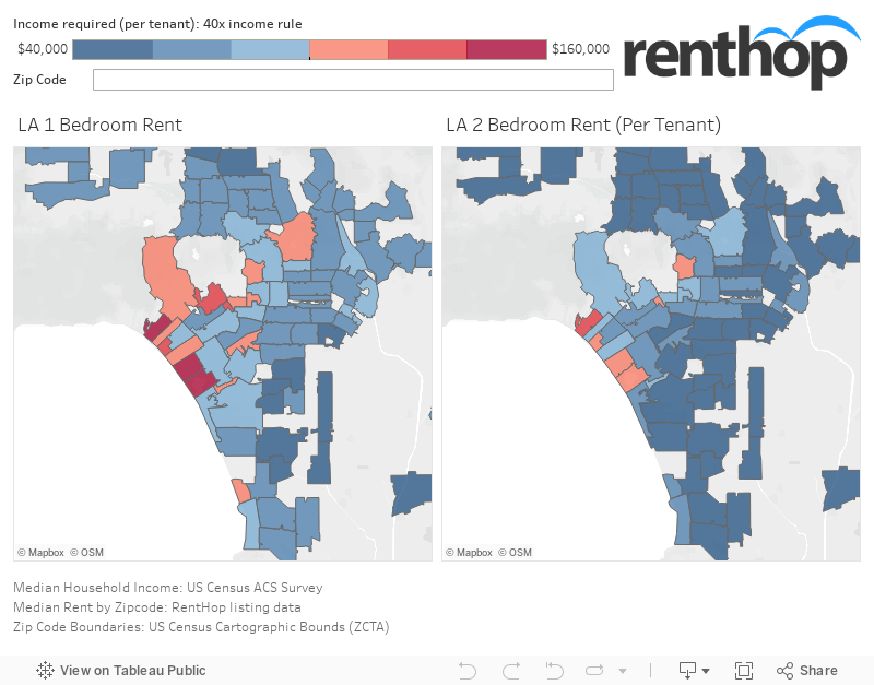
Looking at Los Angeles, we are now seeing a different story with more red areas than before. Los Angeles is known for being one of the more expensive cities in the U.S. so it’s not that surprising. Neither is the area that is the most expensive when it comes to a 1 bedroom apartment, which is the zip code for North of Montana (90402). The median price for a 1 bedroom apartment in North of Montana is a staggering $4,175, which would require an annual income of $167,000. So would it be cheaper to share a 2 bedroom apartment in the same area? Technically yes, but the price per tenant is still high with the rent now only being lowered to $3,150, which technically is a 24.55% price saving. The area would still require an annual income of $126,000, which is pretty high for young professionals. An example of a job that would qualify for a shared 2 bedroom apartment in North of Montana (90402) is a Podiatrist, with a median annual salary of $127,740.
These neighborhoods saw the biggest price savings by sharing a 2 bedroom over a 1 bedroom apartment
- Zip code 90640 (Montebello): Rent drops from $1,545 to $825, which equals a price saving of 46.60%.
- Zip code 91303 (Warner Center): Rent drops from $1,695 to $925, which equals a price saving of 45.43%.
- Zip code 91801 (Alhambra): Rent drops from $1,650 to $931, which equals a price saving of 43.56%.
- Zip code 91304 (Canoga Park): Rent drops from $1,545 to $875, which equals a price saving of 43.37%.
- Zip code 91030 (South Pasadena): Rent drops from $1,894 to $1,098, which equals a price saving of 42.05%.
Miami
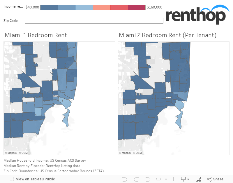
For Miami, we see that the maps look similar to Chicago, in regards to affordability. Both Miami and Chicago are less expensive for young professionals looking for an apartment compared to Boston and Los Angeles. Again we see that the more expensive areas are closer to Downtown Miami. For Miami, the most expensive zip code to get a 1 bedroom apartment in is Hollywood Hills (33021), with the median 1 bedroom price being $2,500. If you were to share a 2 bedroom apartment in the same area you will see a price saving of 40.00%, as the rent drops to $1,500.
If you are deadset on living in the zip code for Downtown Miami (33132) it would require an annual income of $74,750 to secure a 1 bedroom apartment. This would be good for a Civil Engineer. If you don’t mind sharing a 2 bedroom apartment in the same area, the required annual income would drop to $56,000, which would be suited for an Executive Assistant.
These neighborhoods saw the biggest price savings by sharing a 2 bedroom over a 1 bedroom apartment
- Zip code 33014 (Miami Lakes): Rent drops from $1,475 to $800, which equals a price saving of 45.76%.
- Zip code 33176 (Kendall): Rent drops from $1,369 to $750, which equals a price saving of 45.21%.
- Zip code 33317 (Plantation Green): Rent drops from $1,356 to $749, which equals a price saving of 44.79%.
- Zip code 33311 (Wilton Manors): Rent drops from $1,250 to $698, which equals a price saving of 44.20%.
- Zip code 33351 (Welleby): Rent drops from $1,250 to $700, which equals a price saving of $44.00%.
New York City
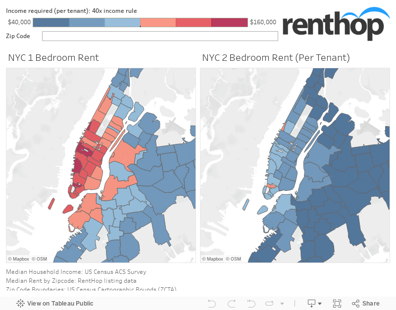
Last, but not least, we have New York City. A city which is notoriously known for its high rents, which is why the results of the maps above aren’t really that surprising. We see that Manhattan is pretty much covered in red, meaning it will require renters to have a high annual income to secure a 1 bedroom apartment by themselves in certain zip codes. We also see that parts of Brooklyn and Queens remain red, meaning they will also have a high requirement for securing a 1 bedroom apartment. When comparing the price of a 1 bedroom to the price of a 2 bedroom per tenant, the map is becoming more affordable to young professionals. It is safe to say, that unless you make an substantial amount of money right out of school, you have financial help, or you are looking to share a 1 bedroom apartment, your best bet is to share a 2 bedroom apartment when it comes to New York City. As an example, getting a 1 bedroom apartment in East Village (10003) would require an annual income of $124,000, which could be good for a Psychiatrist with a median annual income of $127,650. Sharing a 2 bedroom apartment in the same area would require an annual income of $78,000, which could be good for a Mechanical Engineer with a median annual salary of $85,880. Deciding to share a 2 bedroom apartment in the East Village could end up saving you 37.10% on rent.
These neighborhoods saw the biggest price savings by sharing a 2 bedroom over a 1 bedroom
- Zip code 11206 (East Williamsburg): Rent drops from $2,375 to $1,262, which equals a price saving of 46.85%.
- Zip code 11211 (Williamsburg): Rent drops from $2,915 to $1,600, which equals a price saving of 45.11%.
- Zip code 11233 (Bedford-Stuyvesant): Rent drops from $1,900 to $1,063, which equals a price saving of 44.08%.
- Zip code 11205 (Clinton Hill): Rent drops from $2,495 to $1,400, which equals a price saving of 43.89%.
- Zip code 11237 (Bushwick): Rent drops from $2,129 to $1,200, which equals a price saving of 43.62%.
Interactive Table Showing the Savings in Percentage by Zip Code and City
When comparing all five cities, certain cities, like Chicago, are more affordable when it comes to securing a 1 bedroom apartment by yourself. For other cities, not so much. However, the majority of us end up sharing an apartment right after graduating, to save money as living is not cheap. For an easy overview of how much you could end up saving by zip code, take a look at the interactive table below that shows 1 bedroom prices and 2 bedroom prices per tenant along with the price savings in percentage and the annual income requirement based on the 40 times income rule.
Guide on How Much You Could Be Making
Based on numbers from CareerCast and Forbes, we compiled a list of jobs that they found to be the most in-demand jobs (2017), the toughest jobs to fill (2017), the best jobs, the highest paid jobs, etc, to give an idea of which job would fit the rent requirement of what area. From these lists, we found the median annual salary. Note that median annual salaries are not based on a city-specific level and the list was only created to give an idea of what you can afford with what kind of income.
Comparison by City
Looking at the selected cities, Boston, Chicago, Los Angeles, Miami, and New York, we already know that some cities are notorious for having high rent prices. We wanted to make a comparison of which city is the more affordable option when it comes to securing a 1 bedroom apartment and which city was the most affordable option when it comes to sharing a 2 bedroom apartment. We also looked at the average price savings per city to compare which city might be the best option for new professionals.
Ranking 1 Bedroom Median Prices from most to least affordable by City
- Chicago ranks first with a median 1 bedroom price of $1,285.
- Miami ranks second with a median 1 bedroom price of $1,359.
- Los Angeles ranks third with a median 1 bedroom price of $1,800.
- Boston ranks fourth with a median 1 bedroom price of $1,990.
- New York City ranks fifth, and last, with a median 1 bedroom price of $2,120.
Ranking 2 Bedroom Median Prices (Per Tenant) from most to least affordable by City
- Chicago ranks first with a median 2 bedroom price per tenant of $793.
- Miami ranks second with a median 2 bedroom price per tenant of $825.
- Boston ranks third with a median 2 bedroom price per tenant of $1,169.
- Los Angeles is tied for last, with a median 2 bedroom price per tenant of $1,250.
- New York City is tied for last, with a median 2 bedroom price per tenant of $1,250.
The Biggest Median Price Savings by Sharing a 2 Bedroom by City
- Ranking first with a price saving of 38.89% is Miami.
- Ranking second with a price saving of 38.20% is Boston.
- Ranking third, with a price saving of 37.97%, is New York City.
- Ranking fourth, with a price saving of 37.00%, is Chicago.
- Ranking fifth and last, with a price saving of 32.56%, is Los Angeles.
What Does This Mean to You?
As a young professional, either moving to a new city to commence work or just moving out of your parents place, getting your first place is a special thing. And while we know getting an apartment by yourself is the goal, starting off by living with a roommate is not so bad. You save money and you get to make some great memories with your friends. However, if you’re deadset on only living by yourself, make sure it’s a place you can afford. Review the areas and which areas that fall within your budget. There is a reason why we suggest renters, and especially new renters, to follow the 40 times your monthly rent rule. Make sure your household income is 40 times the monthly rent or that you’re not spending more than 30% of your income on rent as there are plenty of other things you need to spend money on other than rent. If you are planning on moving to one of these five cities, or you’ve already moved but still looking for an apartment, take a look at the maps above to see where you could afford to live based on your annual income. While the maps are just a guideline, it could be a helpful one if you’re new to one of the five cities listed.
The post Can Your Job Impact Where You Should Live? appeared first on Real Estate Data & Research.
]]>The post Chicago’s Rat Complaints Continue to Grow appeared first on Real Estate Data & Research.
]]>Last year, we saw a total of 50,963 rat complaints. Compared to 2014 (32,855), the number of rat complaints in 2017 increased 55.1%. Furthermore, in the first half of 2018 (from January to June), there were already 13,753 rat complaints lodged to Chicago’s 311. We’ve collected a subset of data of 2017’s rat complaints made to Chicago’s 311 to find out more about which neighborhoods and locations have it the worst and if there have been areas with higher rat sightings over the years.
Here are the Key Findings from the Study:
- In 2017, Chicago tops the list with the most number of rat complaints compared among other cities including Boston, New York City and Washington DC (fig. 1).
- When comparing the number of complaints per 100,000 residents, Chicago topped the list with 1876.09 complaints per 100,000 residents (fig. 2).
- Logan Square, Englewood, and West Ridge are the top 3 complaint neighborhoods (fig. 3).
- Most of the neighborhoods with a higher concentration of rat complaints coincide with the neighborhoods with a higher concentration of dog poop!
- Neighborhoods in Downtown Chicago such as The Loop, Gold Coast, and River North have much fewer rat complaints than the other neighborhoods (fig. 3).
- Printers Row, Riverdale, and Oakland are the neighborhoods with the lowest volume of rat complaints (fig. 4).
- There seem to be a weak correlation between the rat complaint counts and median rents in Chicago (fig. 5).
- Top 3 rat complaint addresses include 6931 S Campbell Ave, followed by 1548 W Edgewater Ave, and 6225 N Kenmore Ave (fig. 6).
- From 2014 to 2017, there was an increase in the number of rat complaints with a surge in 2016 (fig. 7).
We first take a look at the number of rat complaints among the 4 major cities in 2017. Rat complaints consist of mice infestation, rat activity and rodent inspection and treatment in New York City, Chicago, Boston and Washington DC.
Rat Complaints by Cities, 2017
Figure 1
Comparing 311 Rat Complaints in 2017 by Major Cities
From the overview, among the cities, Chicago has the greatest number of total rat complaints all year round, followed by New York City, Washington DC and then Boston. The gap in the total number of rat complaints in 2017 between New York City and Chicago is significantly vast, with the difference in rat complaints between these cities ranging roughly between 56.5% to 66.1%.
While this comparison reveals that Chicago leads the number of rat complaints among the other cities, it does not take into account the population of each city. To rank fairly, we normalized complaints by city population according to the most recent Census data available. Hypothetically, cities with denser populations might have more complaints. This allows us to fairly compare one city to another because one would assume that a city with denser population will also have more complaints, and this will correct that.
Figure 2
Comparing 311 Rat Complaints in 2017 in Major Cities by Normalized Complaints
Rat complaints in 2017 by cities sorted in descending order according to complaints per 100,000 residents.
By calculating complaints per 100,000 residents, we’re surprised to find that as one of the most populous state, New York City actually ranks behind Chicago and the other cities in terms of the number of rat complaints. Chicago still tops the list as the city with the most number of complaints per 100,000 residents. However, Washington DC follows behind Chicago, followed by Boston and then New York City.
With a better sense of the number of rat complaints among these cities, we’re curious about which neighborhoods have the highest concentration of rat complaints. We’ve looked at the most recent data from 2017 and created an interactive map to visualize the trends by first geocoding the exact longitudes and latitudes of the incidents to their respective neighborhoods.
Which Chicago Neighborhoods had the Most Rat Complaints in 2017?
Figure 3
Chicago Rat Complaints 2017 Interactive Visualization by Neighborhoods (With Median Rents)
Full data for the number of rodent complaints in 2017 is sourced from the Chicago Data Portal site. Exact latitude-longitude coordinates at each incident location were geocoded to corresponding neighborhoods.
Median Rents are calculated using RentHop Data from January 2016 to March 2018. This year’s data includes complaints made from January 1, 2017 – December 31, 2017.
Hover over the map for more information on each neighborhood.
Figure 4
Comparison of Chicago Rat Complaints 2017 by Median Rents & Neighborhoods
Taking a look at the above map and table, we noticed Logan Square (2,448 complaints), Englewood (2,276 complaints) and West Ridge (2,167 complaints) all appear in the darkest red. These are the neighborhoods which have the highest volume of rat complaints. Several other neighborhoods also highlighted in dark red shades include Lake View (1,785 complaints), Washington Heights (1,560 complaints), Austin (1,455 complaints) and Clearing (1,435 complaints). All of these neighborhoods have the highest volume of rat complaints and counts of premises baited. On the other hand, the majority of the neighborhoods in downtown Chicago, such as the Loop, Streeterville, River North, and Gold Coast also had rat complaints but they are covered in much lighter shades of red.
An interesting finding is that neighborhoods with higher complaints coincide with the neighborhoods in which high concentrations of poop complaints. This is most likely due to the fact that rats are attracted by dog poop as a food source, especially in the city.
From the map, we also observed that the top 3 least rat-infested neighborhoods are Museum Campus (0 complaints), Millenium Park (1 complaint) and Greektown (2 complaints). However, these neighborhoods are more parks than residential areas. Looking at the top 3 least rat complaint residential neighborhoods, we find that they are Printers Row (3 complaints), Riverdale (8 complaints) and Oakland (11 complaints). 1-bedroom median rents in the neighborhoods with the highest number of complaints seem to lie within a moderate range between $900 to $1,500. Is it possible that neighborhoods with a lower number of rat complaints are those with higher median rents?
Association of Rat Complaints vs 1-Bedroom Median Rents
Figure 5
Chicago Rat Complaints vs Median Rents
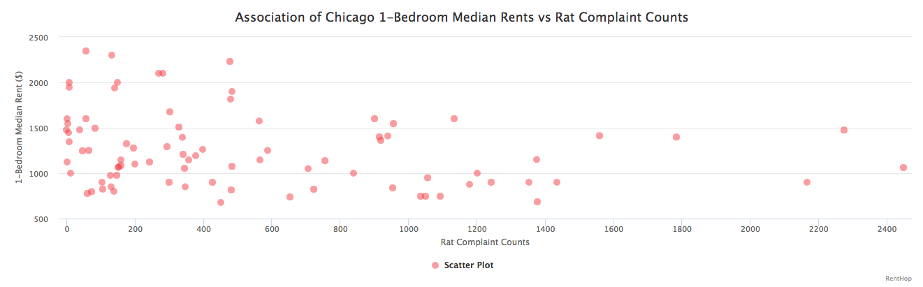
When looking at the plot of rat complaint counts versus median rents, with median rents as the independent variable, we can see a trend where neighborhoods with higher rat complaint counts are also the neighborhoods with lower 1-bedroom median rents. However, when measuring the correlation coefficient between median rents and rat complaint counts, we discovered that the variables follow a weak negative correlation with a value of -0.24. This indicates that the rat complaint counts and median rents might be associated, however, it is to be taken with a pinch of salt. Neighborhood amenities, distance from the L train stops and ease of accessibility to commute to downtown Chicago might also have an impact on the median rents.
Where Are the Exact Locations of the Most Complained Buildings?
Figure 6
Chicago Rat Complaints Top Addresses, 2017
Since rat complaints from the same address within the same day may point to the same rat incident in that location, it makes sense to group and look at unique complaints according to repeated calls from their respective addresses. The table above lists the most complained about addresses in 2017, sorted by unique complaint counts, accompanied by raw complaint counts. From the table, we see that the most notorious number of rat complaints came from 6931 S Campbell Ave (35 unique complaints), Lithuanian Plaza, followed by 1548 W Edgewater Ave (33 unique complaints), Edgewater, and then 6225 N Kenmore Ave (30 unique complaints), Edgewater Beach.
The number of rat complaints all over in Chicago is worrying, no wonder Chicago is touted as the “rattiest” city in the country. Most importantly, rat complaints have seen a spike, especially during the summer.
Have there been any changes in the number of rat complaints over the years?
We’ve also investigated the rat complaint counts over the years from Chicago’s 311 data from Chicago Data Portal over the years from 2014 to 2017.
Figure 7
Chicago Rat Complaints Yearly Comparison
The rat complaints in Chicago increase every year. In addition, we also discovered that there was a jump in the number of rat complaints from 2015 to 2016, likely due to milder winters and an increased awareness of the problem. The surge in rat complaints in 2016 has led to an increased amount of city efforts poured into decimating these vermin through dry ice.
Moreover, we also noticed that the rat complaints started soaring from April onwards till July, before dipping towards the end of the year in December, most probably due to seasonal changes such as milder winters and warmer summers which may have affected the rat activity level in the city.
What can I do to curb or avoid rat infestations?
If you frequently find yourself seeing these furry creatures scurrying around your building or neighborhood, you should first call 311 or visit the online portal for creating complaints, which allows you to make complaints, anonymously if you wish. An inspector from the Chicago HPD will come to check the building for violations, usually within a few days.
To further prevent these pests from populating in your area, remember to always securely tie and discard your garbage properly into a can with a lid. Rats love to thrive in places with food and leftovers. You wouldn’t want them to get access to such things so easily. In addition, you could also get rid of your garbage close to the garbage pickup truck’s arrival time at your building. This will significantly reduce the number of garbage bags left outside your building and it will also leave more space for any additional garbage the following day. Other than that, make sure that you make your living space as undesirable as possible even to deter even the most ambitious rats.
Regardless, be consistent. While these tips may seem easy to follow, but to practice them consistently requires consistent effort and commitment.
If you’re in the market for a new apartment or were just influenced to move because of this study, be sure to check out our extensive selection of Chicago Apartment for Rent.
The post Chicago’s Rat Complaints Continue to Grow appeared first on Real Estate Data & Research.
]]>The post Rats Continue to Thrive in New York City Especially During Summer appeared first on Real Estate Data & Research.
]]>An estimate of about 250,000 to millions of rats lived in the city in 2017. To put these numbers into perspective, New York City’s rats is equal to approximately 20% of the human population. The high number of rat populations in NYC poses a threat to humans. For being notorious for carrying diseases, these NYC rats certainly are a public nuisance. Over the years from 2014 to 2017, we saw an incremental increase in rodent complaints. Last year, we saw a total of 19,152 rodent complaints. That’s an increase of about 10% from 2016. In the first quarter of 2018, there were already 4,831 complaints made to the city about rodent sightings. Fret not, here at RentHop, we’ve collected a subset of data from 2014 to 2017 of rodent complaints made to NYC’s 311. We wanted to investigate the behaviors of rats based on the locations of rat sightings and tell you which neighborhoods have the most rodent complaints and which is the season when rodent complaints start ramping up in NYC.
Here are the key findings from the study:
- When comparing the number of complaints between all boroughs in 2017, Brooklyn tops the list with 7,253 complaints. When comparing the number complaints per square mile, Manhattan emerges at the top with 197.50 complaints per square mile (fig. 1)
- Bedford-Stuyvesant, Brooklyn; Harlem, Manhattan; and Upper West Side, Manhattan are the top 3 complaint neighborhoods (fig. 2)
- Surrounding neighborhoods around Bedford-Stuyvesant (including Bushwick, Williamsburg, Crown Heights) and Harlem (including Washington Heights) also reflect high numbers of rodent complaints (fig. 2)
- While there is no association between 1-bedroom median rents and complaints about rat sightings, complaints are generally less common where median rents are higher (fig. 4)
- Brooklyn leads as the borough with the most number of unique rodent complaint counts based on top rodent complaint addresses, with 1800 Popham Avenue, 407 Lincoln Place, and 95 Eastern Parkway having the highest unique rodent complaint counts most likely due to proximity to Prospect Park (fig. 5)
- From 2014 to 2017, 2017 sets the record for the highest number of rodent complaints overall and rodent complaints have seen significant increases each year (fig. 6)
- From 2014 to 2017, rodent complaints spike in summer and dip during winter (fig. 6)
New York City Rodent Complaints by Neighborhoods, 2017
To begin, we looked at the rodent complaints data for each of the boroughs in New York City. Below you can see the total number of complaints in each borough in 2017. Rodent complaints consist of primarily rat sightings.
Among these boroughs, Brooklyn has the greatest number of total rodent complaints, followed by Manhattan and then the Bronx. However, this comparison does not consider the land size of each borough. By calculating the number of rodent complaints per square mile, the story changes.
Figure 1
Comparing 311 Rodent Complaints in 2017 by Borough
Rodent complaints in 2017 by borough sorted in descending order according to complaints per square mile.
While Brooklyn has the greatest number of rodent complaints among the boroughs, Manhattan actually leads the number of rodent complaints per square mile among all 5 boroughs in New York City. As for Queens, the largest borough in New York City, the number of complaints per square mile is actually low for its land size. Among smaller boroughs such as the Bronx and Staten Island, with the Bronx being slightly larger, we see that the Bronx has more complaints per square mile.
Now that we have a better sense of the number of rat complaints among these boroughs, we can explore how the rodent complaints vary by neighborhoods. We’ve looked at the most recent data from 2017 and created an interactive map to visualize the trends by first geocoding the exact longitudes and latitudes of the incidents to their respective neighborhoods.
The Concentration of Rodent Complaints in NYC
Figure 2
NYC Rodent Complaints 2017 Interactive Visualization by Neighborhoods (With Median Rents)
Full Data for the number of rodent complaints in 2017 is sourced from the NYC OpenData site. Exact latitude-longitude coordinates at each incident location were geocoded to corresponding neighborhoods.
Median Rents are calculated using RentHop Data for the past 12 months.This year’s data includes complaints made from January 1, 2017 – December 31, 2017.
Hover over the map for more information on each neighborhood.
Figure 3
Comparison of NYC Rodent Complaints 2017 by Median Rents, Neighborhoods and Boroughs
Taking a look at the above map and table, we noticed Bedford Stuyvesant (1,265 complaints), Harlem (865 complaints), and Upper West Side (731 complaints) all appear in the darkest orange, which represents the neighborhoods with the most complaints in 2017. There appears to be no association between these neighborhoods since median rents range from about $2,000 to $2,950, which is neither very high nor very low. From the map, we also observed that other neighborhoods in the vicinity also had high numbers of rodent complaints, for instance, Bushwick (612 complaints), Williamsburg (509 complaints), Crown Heights (596 complaints) near Bedford Stuyvesant, and Washington Heights (420 complaints) near Harlem. Median rents in these neighborhoods with the highest number of complaints seem to be within the same range. Is it possible that neighborhoods which see a lower number of rodent complaints are those with higher median rents and vice versa?
Association of Rodent Complaints vs 1-Bedroom Median Rents
Figure 4
Rodent Complaints vs Median Rents
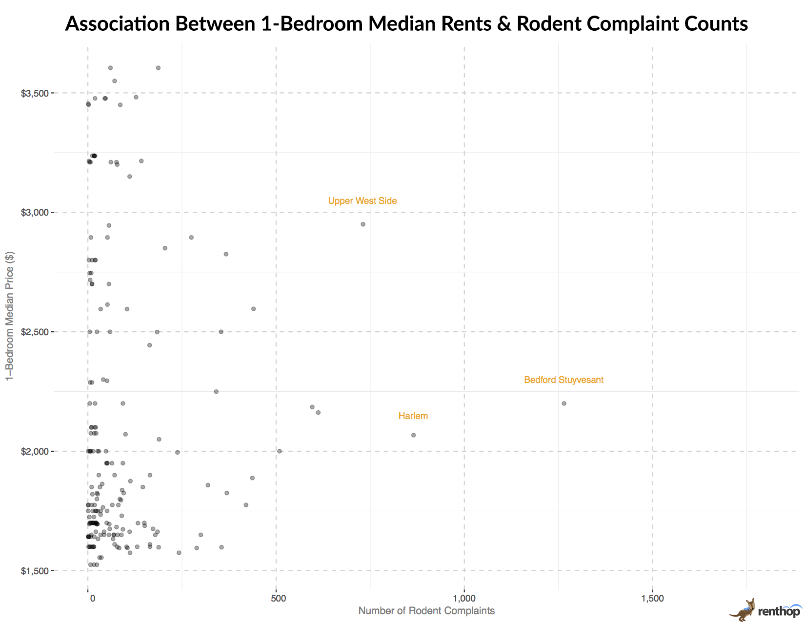
The graph shows the relationship between 1-bedroom median rents and rodent complaints by neighborhood. Between 1-bedroom median rents and the number of rodent complaints, we find that there are no associations.
Complaint data for January 1, 2017 – December 31st, 2017. Median rents data is for all of 2017 via RentHop’s listing database.
When looking at the plot of rodent complaints versus median rents, with median rents as the independent variable, we can see clustering of high numbers of complaints where rents are falling somewhere in between the extremities of very high or very low rents. As labeled on the plot in orange, Bedford Stuyvesant, Upper West Side, and Harlem stood out the most in terms of the number of rodent complaints among other neighborhoods. Complaints are less common where rents are higher. We don’t see any neighborhoods with high rents and high complaints.
Where Are the Exact Locations of the Most Complained Buildings?
Figure 5
NYC Rodent Complaints Top Addresses, 2017
Since rodent complaints from the same address within the same day may point to the same rodent incident in that location, it makes sense to group and look at unique complaints according to repeated calls from their respective addresses. The table above lists the most complained about addresses in 2017, sorted by unique complaint counts, accompanied by raw complaint counts. Within the top 10 most complained addresses, we find that Brooklyn held the most number of spots with 6 addresses, followed by Manhattan with 2 addresses, and Queens and the Bronx with 1 address each. From the table, we also see that the most notorious number of rodent complaints came from 1800 Popham Avenue (29 unique complaints), Morris Heights, the Bronx, followed by 407 Lincoln Place (16 unique complaints), Prospect Heights, Brooklyn and then 43 Sheffield Place (15 unique complaints), Cypress Hills, Brooklyn. As a long-standing problem over the years (2014 to 2017), 95 Eastern Parkway, Prospect Heights, Brooklyn, in particular, tops the list with the most number of raw rodent complaint counts overall of 192 complaints.
The number of rodent complaints in Brooklyn is quite troubling. Could it be that there are more trash and leftovers left out on the streets by establishments or buildings in the area, or is it the vicinity of the parks which have allowed rats to thrive? To find out, we looked at the exact locations of these addresses.
We find that most of these locations are either located within walking distances to parks or are situated in the midst of various establishments and shops. For instance, 407 Lincoln Place is situated about 400 ft away from Prospect Park and is surrounded by many other shops around the building. 95 Eastern Parkway, notorious for its huge influx of complaints, is also situated about 200 ft away from Prospect Park. It might be possible that the rats thrive and appear frequently in these locations due to close vicinity to the park, which allows them to burrow for shelters.
Do More Rats Appear During a Particular Season in NYC?
Now that we know where exactly rodent complaints are mostly concentrated, we find ourselves questioning if rodent complaint counts change accordingly with the seasons in NYC. Perhaps rodent complaints reflect the activity level of rats during different seasons? Are there more rat sightings during summer because rats are more active during summer and fewer rat sightings during winter? With those questions in mind, we looked at the rodent complaints data over the years from 2014 to 2017 and compared them by seasons and years.
Figure 6
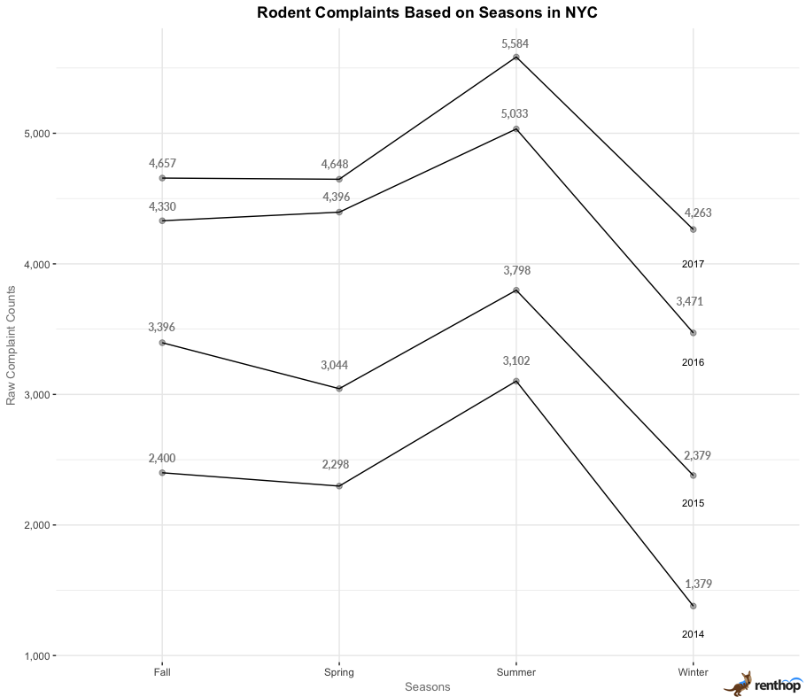
Seasons are defined as Fall (September to November), Winter (December, January, February), Spring (March, April, May), Summer (June, July, August), Winter (December, January, February) according to the Weather Facts NYC.
From the chart, we see:
- The highest number of complaints overall in 2017
- Rodent complaints peaked during summer from 2014 to 2017
- Rodent complaints are the lowest during winter from 2014 to 2017
Why do rodent complaints peak at summer and then drop to their lowest in winter? It might be highly possible that rat populations spike in summer as new rat pups are weaned in spring and in late summer or early fall. Rats are known for being more aggressive in finding food and preparing themselves for winter during the summer season through the means of stockpiling and nesting. We’re not surprised now that the Pizza Rat is back for another slice of pizza and appearance at this time of the year following its first viral appearance carrying a slice of pizza down a staircase at East Village’s 1st Avenue station on the L line in 2015.
What can I do to curb or avoid rodent infestations?
If you frequently find yourself seeing these furry creatures scurrying around your building or neighborhood, you should first call 311 or visit the online portal for creating complaints, which allows you to make complaints, anonymously if you wish. An inspector from the NYC HPD will come to check the building for violations, usually within a few days.
To further prevent these pests from populating in your area, remember to always securely tie and discard your garbage properly into a can with a lid. Rats love to thrive in places with food and leftovers. You wouldn’t want them to get access to such things so easily. In addition, you could also get rid of your garbage close to the garbage pickup truck’s arrival time at your building. This will significantly reduce the number of garbage bags left outside your building and it will also leave more space for any additional garbage the following day.
Regardless, be consistent. While these tips may seem easy to follow, but to practice them consistently requires consistent effort and commitment.
If you’re in the market for a new apartment or were just influenced to move because of this study, be sure to check out our extensive selection of New York City apartments for rent.
Resources Used
“No one knows exactly how many rats live in New York City — here’s why it’s so complicated
“, Business Insider, http://www.businessinsider.com/new-york-city-rat-population-is-hard-to-measure-2017-8
A subset of “311 Service Requests from 2010-Present”, NYC Open Data, https://data.cityofnewyork.us/Social-Services/rodent_complaints/tim7-qyp8/data
The post Rats Continue to Thrive in New York City Especially During Summer appeared first on Real Estate Data & Research.
]]>The post Save Up To $440 Per Month By Renting A Little Further From Downtown Chicago appeared first on Real Estate Data & Research.
]]>Key Findings from the Study:
- A consistent trend of declining median rents per month as the distance from the city center increases
- Among the neighborhoods nearest to the city center, renters can expect a major price drop of $440 in median rent per month just 200 m north of Chicago Avenue in Near North Side
- Among the neighborhoods furthest from the city center, renters can expect a significant drop of $287.50 in median rent per month 400 m away from W Devon Avenue in Rogers Park
- A decrease in median rent averaging of about $151.67 can be observed across boundaries separating neighborhoods Andersonville-Edgewater, Lincoln Park-Lake View, and Wrightwood Neighbors-Sheffield Neighbors and Lincoln Park
Overall Trend of Chicago Neighborhoods (North to South)
You can use the interactive column chart to observe the median rent behavior across the city from North (Rogers Park) to South (Near North Side). You can also scroll or adjust the scrollbar at the bottom of the chart to zoom into a specific region.
An overview of the general trend of the median rents of apartments across distances of 200 m interval follows a gentle increasing slope towards the city center. Of course, it doesn’t come as a surprise to us that rent prices around the city center are higher than in neighborhoods at further distances due to greater accessibility, convenience, proximity to entertainment, and other various reasons.
We’ve heard about the oversupply of apartments in Chicago’s downtown rental market, and the proposed Tribune Tower project which will soon add even more units to the already overcrowded space in the downtown area. While Downtown Chicago is not the main focus of this study, we seek to investigate if there are any trends in median rents across various distances from the neighborhood boundaries along North Side towards Downtown Chicago.
Navigation: Chicago Ave | W Devon Ave | W Bryn Mawr Ave | W Diversey Pkwy | W Fullerton Ave
Chicago Ave
Our findings showed that apartment median rents decrease from south of Chicago Ave to north of the avenue, with median rents dropping the most 200 m north of Chicago Ave, by about $440 per month.
Located north and east of the Chicago River and bounded by Lake Michigan to its east, Near North Side is an affluent downtown community area. River North is a neighborhood within Near North Side and it is also known to be a happening, urban neighborhood – the city center’s art and nightlife scene, with many new workspaces for designers and programmers and new high-end condos. It’s home to many art galleries along the River North Art District, such as the famous Addington Gallery and Driehaus Museum.
Here, we learn from the plot below that the trend of 1-bedroom median rents follows a gentle decline from south to north of Chicago Avenue.
![]()
The region between 290 m to 600 m (highlighted in the grey) above Chicago Ave indicates a fewer number of apartments, which coincides with the Cabrini-Green neighborhood.
The Cabrini-Green Homes used to house about 15,000 residents at its peak. However, over the years, the rise of crime and gang violence activities created unfavorable living conditions for its residents. This eventually led to the demolition of high-rise buildings, with the last demolition carried out in 2011. In our study on the effect of crime on rent prices, we have discovered that crime is negatively correlated with rent prices. It might be possible that the activities in the Cabrini-Green neighborhood might have caused the change in the median rents across the neighborhoods.
![]()
From the chart, we observe a downward trend of apartment rent prices from River North to Near North Side. A significant price drop of $440 is seen 200 m north of Chicago Avenue. Renters can expect to enjoy more price savings moving further north of the avenue. At the same time, the rise of crime and violence activities in the Cabrini-Green neighborhood might also be another factor to consider about as well.
W Devon Ave
Our findings indicated that median rents decrease from south of W Devon Ave to north of the avenue, with a significant drop of $287.50 just 400 m north of W Devon Ave.
![]()
Both located on the city’s far north side, Rogers Park and Edgewater provide affordable single-family homes as compared to more expensive apartments further down in the North Side. The vicinity of Loyola University in Rogers Park and the attractive potential of these neighborhoods have drawn investors to develop the neighborhood, such as some of the recent renovation efforts in some of the buildings bought by Spirit Bascom Ventures including the 160-unit Sheridan Court at 6807 N. Sheridan Road and The Edison at 5200 N. Sheridan. But we also see a downward trend in median rents across W Devon Ave, with Edgewater generally having higher median rents than Rogers Park.
Edgewater is located further south and nearer to the city center. For young professionals and students searching for cheaper rents while still being able to commute to the city, Edgewater offers a relatively affordable option with a greater ease of convenience accessibility by the CTA Red Line as compared to Rogers Park on the far north end. Besides, sitting by the side of the lake shore, Edgewater provides a picturesque view of Lake Michigan.
![]()
From the chart above, it is clear that there is a declining trend of 1-bedroom apartment rents apart from the anomaly of the higher rents at 200 m north of W Devon Ave. We see a price decrease of $287.50 just 400 m north of W Devon Ave. The lower number of apartment listings at 0 m to 300 m north of W Devon Ave as evident on the scatter plot could have resulted in higher rental prices in the region.
W Bryn Mawr Ave
Our findings show a general decline in rent prices from south to north of W Bryn Mawr Ave, with a $167.50 drop in median rents 200 m north of W Bryn Mawr Ave.
![]()
We observe that there is a sharp drop in median rents of 1-bedroom apartments across W Bryn Mawr Ave. Andersonville is a popular neighborhood tucked inside of the Edgewater neighborhood. It’s centered along Clark Street, famously known as the “restaurant strip”. On the other hand, Andersonville is a commercial historic district known to be home to independent, locally owned businesses and its lack of national chains.
![]()
From the chart above, we see a general trend of declining rent prices from south to north of W Bryn Mawr Ave, with a prominent drop in median rents by about $167.50 at 200 m north of W Bryn Mawr Ave.
W Diversey Pkwy
Our findings revealed a price drop of $130 just 200 m north of W Diversey Pkwy.
![]()
Here, we learn that rent prices north of W Diversey Pkwy is generally lower than the south. Both Lake View and Lincoln Park are fairly accessible by CTA’s ‘L’ line public transit, and they’re close to downtown Chicago. It’s no secret that Lake View is a vibrant, youthful and urban neighborhood with many attractions and amenities including restaurants, bars and the Wrigley Field which is famous for hosting the Cubs games. While the CTA Red, Brown and Purple lines serve Lake View, the neighborhood doesn’t offer convenient access to Chicago’s expressway grid, with lengthier commute times to downtown Chicago.
On the other hand, Lincoln Park might pose as a more accessible option to the city center. It’s known to be a rich neighborhood lined with picturesque streets. Not only that, with CTA brown, red and purple lines serving the neighborhood, residents in this area can expect easier access and shorter commute times to anywhere in the city. Another factor could be that the DePaul University is located within Lincoln Park, which may have commanded higher rental prices in the neighborhood, which might further explain the drift in prices across the parkway.
![]()
Across W Diversey Pkwy, we found that median rents drop by $130 per month at 200 m north of the parkway before remaining relatively stable from 200 m to 600 m.
W Fullerton Ave
We observed a price drop of $157.50 per month at 200 m south of W Fullerton Ave.
![]()
We see that the rent prices fall towards W Fullerton Ave before picking up again north of the avenue.
![]()
The trend of rent prices decreasing towards W Fullerton Ave is also apparent from the chart above. We observe a drop in median rents 200 m south of the avenue, by about $157.50. It is highly likely that the price drop is influenced by the vicinity of DePaul University in the Lincoln Park neighborhood. Apartments in the same space as the university would experience a higher level of noise and street activity. Another reason might be the fact that the apartments surrounding the university being more affordable for university students who are looking for off-campus housing while being near their school.
What does this mean for renters?
From the data, we see that median rents decrease as the distance from the city center rises. Our analysis has also revealed that by renting apartments 200 m north of Chicago Ave in Near North Side, renters can save a significant amount of about $440 per month. In neighborhoods further away from the city center, such as Lincoln Park and Lake View, renters can also save about $130 per month by moving 200 m north of W Diversey Pkwy in Lake View. While apartments further away from the city center exhibit a trend of lower median rents, the accessibility to Chicago’s train system is also another factor to consider as it may come as a tradeoff to some renters. With just the CTA Red and Purple Lines serving neighborhoods such as Rogers Park and Edgewater, renters should anticipate the possibility of having alternative means of transportation should they choose to live in neighborhoods further away from the city center. On the other hand, renters should also take into account the safety level of their neighborhoods and carry out research on neighborhood crime and safety.
Methodology
The data used in this analysis is derived from RentHop’s listings from January 2016 to March 2018. Listings with the same address are de-duplicated into a single point as they suggest apartments are in the same building. *Note: As data points are sparse in some regions of the plots, the median prices are aggregated by 200 m intervals to provide a better picture of the pricing trends.
The post Save Up To $440 Per Month By Renting A Little Further From Downtown Chicago appeared first on Real Estate Data & Research.
]]>The post Moving 2 Blocks Outside Of Your Current Neighborhood Could Save You A Lot In Rent appeared first on Real Estate Data & Research.
]]>Key findings:
- On average, renters can save more from renting non-walkup building apartments across East 96th Street, West 72nd Street, Houston Street and Lower 3rd Avenue as compared to walk-up building apartments.
- Non-walkup and walk-up building apartments exhibit contrasting pricing behaviors across street boundaries such as East 14th Street and Houston Street. On the north of East 14th Street and Houston Street, non-walkup building apartments are more affordable whereas, on the south of the streets, walk-up building apartments are found to be more affordable.
- Our analysis reveals that the most significant price savings of $1,350 and $381.25 from renting non-walkup and walk-up building apartments are roughly 2 blocks north (160 m) from East 96th St respectively.
- Across Lower 3rd Avenue, prices decline gradually from the west to east side of the boundary. For non-walkup building apartments, a major price saving of $995 per block is observed moving towards the east side of the boundary.
- In Brooklyn, those living around the Broadway boundary could save up to $300 by moving to a walk-up apartment 3 blocks west of Broadway.
- Residents of Queens can save about $250 by moving to a walk-up apartment 160 m to 320 m south of 36th Avenue.
Navigation: East 96th St | West 72nd St | East 73rd St | West 125th St | East 14th St | Houston St | Lower 3rd Av | Metropolitan Av | Classon Av | Broadway | Parkside Av | 36th Av
The visuals below plot median prices of 1-bedroom apartments as a function of distance to each street and avenue in the uptown, midtown, and downtown regions of Manhattan. We also define non-walkup building apartments as buildings with either elevators or a doorman. The median price differences reflect how much the rental prices drop across each of the boundaries. For further clarity, we approximate each block of a street to be roughly 80 meters.
Manhattan
Price savings across E 96th St: Median prices of non-walkup and walk-up building apartments drop sharply 160 m (2 blocks) north of E 96th St by about $1,350 and $381.25 respectively.
Neighborhoods: East Harlem (North), Carnegie Hill, UES, Yorkville (South)
Median prices of 1-bedroom apartments in East Harlem are generally lower than other neighborhoods to its south. While it holds true, we discover that 1-bedroom median apartment prices continue to rise north of E 96th St before dropping after a few blocks.
To better understand the effects of distance from the street boundary on the median price of different types of apartments, we first break down the apartment types into 2 categories – non-walkup and walk-up building apartments before plotting the median prices of 1-bedroom apartments for each category as a function of distance from E 96th St.
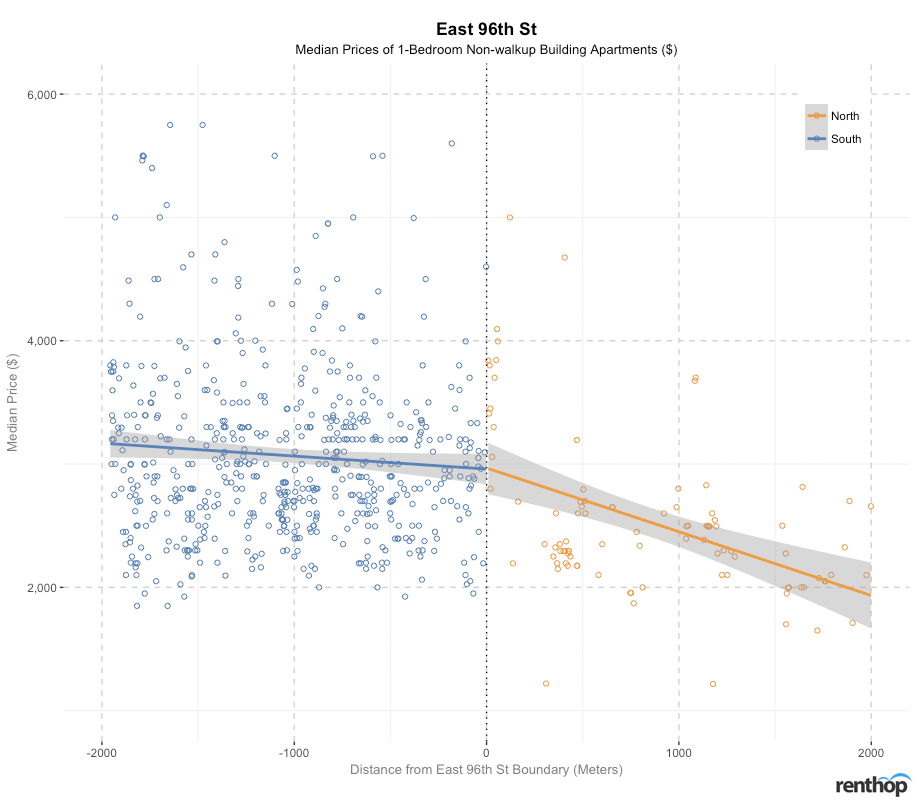
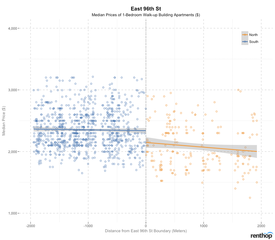
Although median prices of 1-bedroom apartments are generally lower on the north of E 96th St, non-walkup building apartments are more expensive at E 96th St and north of E 96th St. For walk-up building apartments, median prices are slightly more affordable north of E 96th St, with 8.5%-15.3% difference between the north and south E 96th boundary. This leads us to question if the real East Harlem demarcation line has shifted towards the north?
After a closer look at 1-bedroom median prices north and south of E 96th St, we can confirm our hypothesis – median prices of both non-walkup and walk-up building apartments drop most drastically north of E 96th to around 160 m. The median price of non-walkup building apartments declines significantly by $1,350 from $3,700 to $2,350 while the median price of walk-up building apartments declines by a smaller margin of $381.25 from $2,100 to $1,718.75. Thereafter, the median price of both types of building apartments remain relatively stable.

The likely reason of the rise of non-walkup building apartments north of E 96th St could be attributed to the advancements in gentrification in the East Harlem neighborhood since the 1980s, particularly along the second and third avenues. In 2005, East Harlem released a new wave of luxury condos and Co-Ops along the 1st avenue from 96th St. In the more recent news, on 30 October 2017, the East Harlem Rezoning Proposal was approved by the NYC City Council, with focus on developing the area. With the development of these new residential buildings and public housing projects comes hefty rental price tags on the apartments. This process of gentrification rapidly changes the neighborhood and spurs growth in prices.
Beyond gentrification, the opening of the 2nd Avenue subway station has further increased the convenience and accessibility to get to East Harlem by Q Broadway Express trains, which further increased the housing value within the area. In 2016, East Harlem was also featured in New York Times as one of New York’s next hot neighborhoods, with emphasis on more affordable luxury housing as compared to a couple of blocks down in Upper East Side, where costs are about 8.5%-22.2% higher.
And with all that, it is no wonder that the East Harlem demarcation line is now softer and more blurred. Also, if you’re a renter on a budget, you could reap a significant price-differential of 36.5% by choosing to rent a non-walkup building apartment 2 blocks of streets north of E 96th St.
Price savings across W 72nd St: A small fall of about $195 for non-walkup building apartments 160 m (2 blocks) north of W 72nd St. Prices continue to fall 320 m north of the street before increasing.
Neighborhoods: Upper West Side (North), Lincoln Square (South)
Neighborhood-wise, 1-bedroom apartment prices south of W 72nd St (Lincoln Square) are higher than north of W 72nd St (UWS). While UWS has always been known to be a wealthy, upscale neighborhood, Lincoln Square now emerges with higher rent prices than UWS.
Lincoln Square is a neighborhood with numerous great schools and cultural amenities. It doesn’t come as a surprise to us that Lincoln Square is highly demanded, with its rental prices being relatively higher than UWS. Situated at the southern tip of UWS, Lincoln Square is also near the city center, which makes it central and accessible to many locations, including Central Park and Columbus Circle. The commute time to the city center is also shorter. Moreover, the neighborhood is also overflowing with great restaurants, art galleries, parks, cafes and other neighborhood amenities, which adds value to the location.
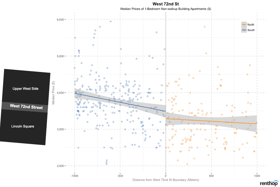
Across the 25th to 75th percentiles, non-walkup building apartments are 11.9%-16.7% more expensive south of W 72nd St while walk-up building apartments are 3.7% more expensive north of W 72nd St.
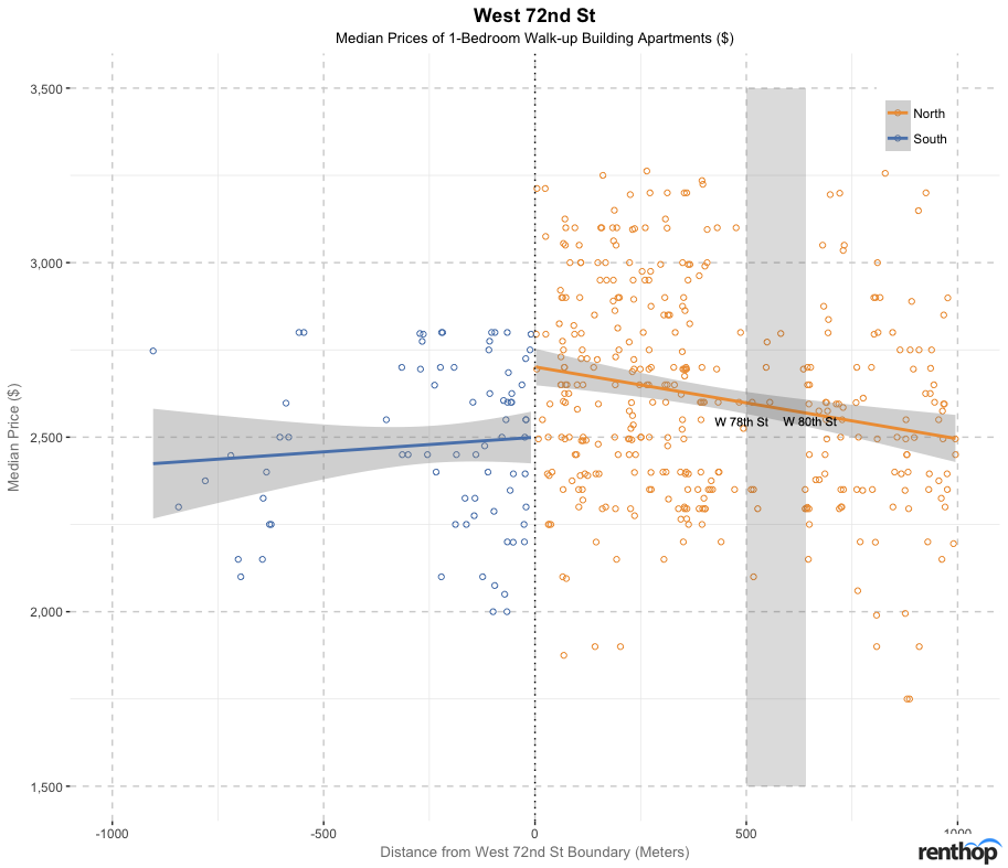
A close-up investigation of the walk-up building apartments reveals that walk-up building apartments are sparser between 500 m and 640 m to the north of W 72nd St (to be exact, the region spans from W 78th St to W 80th St), with median prices falling below $3,000. This region juxtaposes the American Museum of Natural History, which lies to its right, and explains why the area consists of mostly more expensive non-walkup building apartments instead.
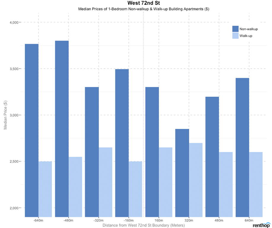
Non-walkup building apartments are generally more affordable north of W 72nd St and walk-up building apartments generally more affordable south of W 72nd St. There is also a price saving of $195 (from $3,495 to $3,300) for non-walkup building apartments 160 m north of W 72nd St. Prices of non-walkup building apartments continue to drop till 320 m before increasing again.
Price savings across E 73rd St: No significant price savings but prices of apartments south of the street are generally more expensive.
Neighborhoods: Upper East Side (North), Lenox Hill (South)
The trend of rental prices across E 73rd St is similar to that of W 72nd St, where renting a 1-bedroom apartment north of E 73rd St is relatively more affordable as compared to renting an apartment south of E 73rd St in Lenox Hill. A continuous decrease in median rental price is observed from the trend lines on the plot moving from south to north of E 73rd St.
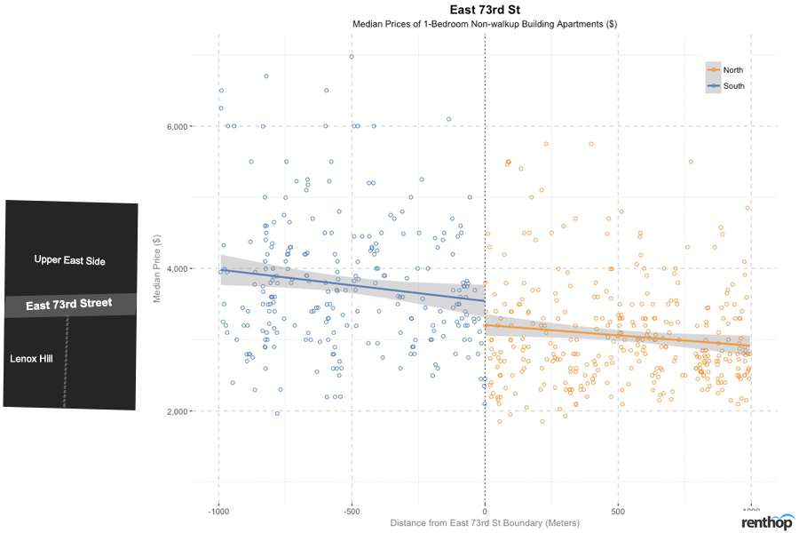
As we take into account of the percentile difference across the street, across non-walkup building apartments, moving south of E 73rd St to the Lenox Hill neighborhood would cost you 17.2% to 19.6% more than north of E 73rd St. Across the walk-up apartments, there is less variation in prices. Moving south of E 73rd St to the Lenox Hill neighborhood would cost you 2.1% to 4.0% more than north of E 73rd St.
Despite being in the vicinity of UES, why is it more expensive to live in Lenox Hill than UES? As mentioned earlier, with the opening of the 2nd Avenue subway station with the Q line in 2017, it has become more accessible and convenient to get to the UES region and crowded subway stations around the other stations are no longer as much of a problem as it used to be. Furthermore, more destination buildings including new condo buildings, upscale, prime buildings with higher prices and a wider range of amenities have been built in Lenox Hill in the more recent years, adding more value to its apartment prices and jacking up the rental price within the region.
We also note that there are no significant price savings across E 73rd St from both directions. However, we can confirm that the median prices of non-walkup building apartments south of E 73rd St generally experience a steady increase as we move further south from the street boundary, whereas the median prices of non-walkup building apartments generally experience a steady decline from 240 m north of E 73rd St.
Price savings across W 125th St: Inconclusive due to sparse data points. However, apartments south of W 125th St command a higher price as an effect of being located in the vicinity of a college town.
Neighborhoods: Manhattanville (North), Morningside Heights (South)
Apartments south of W 125th St are generally much more expensive than apartments north of W 125th St, including non-walkup building and walk-up building apartments. Our data reveal that the jump in prices of building apartments ranges from 29.4%-34.6% whereas the price differences of walk-up building apartments ranges between 23.1%-27.6% across W 125th St to the south.
However, we take into account that the data points used in our analysis of W 125th St were sparse to fully draw a definite conclusion about the exact price savings across W 125th St. With Morningside Heights (south of W 125th St) known to be a prominent college town, home to Columbia University (highlighted in grey), Barnard College and several smaller schools, the apartments in Morningside Heights commands a price premium associated with high-quality schools in the vicinity.
Price savings across E 14th St: A price saving of about $205 per block north of E 14th St for non-walkup building apartments and a price saving of about $240 per block south of E 14th St for walk-up building apartments. Thereafter, prices fluctuate in both north and south directions.
Neighborhoods: Gramercy Park, Stuyvesant Peter Cooper Village (North), East Village, Alphabet City (South)
14th St is no doubt a major crosstown and shopping location in the heart of Manhattan. We first investigated if there were any trends observed across 14th St and found out that while no general patterns are observed north and south of 14th St and W 14th St, there is a contrasting difference in pricing behavior between non-walkup and walk-up building apartments across E 14th St.
 The median prices of non-walkup building apartments south of E 14th St are more expensive than those on its north, but the presence of walk-up building apartments, on the contrary, are denser and more expensive north of E 14th St by about 6.2% to 10.9%, which contributes to the overall higher rental prices across all apartment types north of E 14th St.
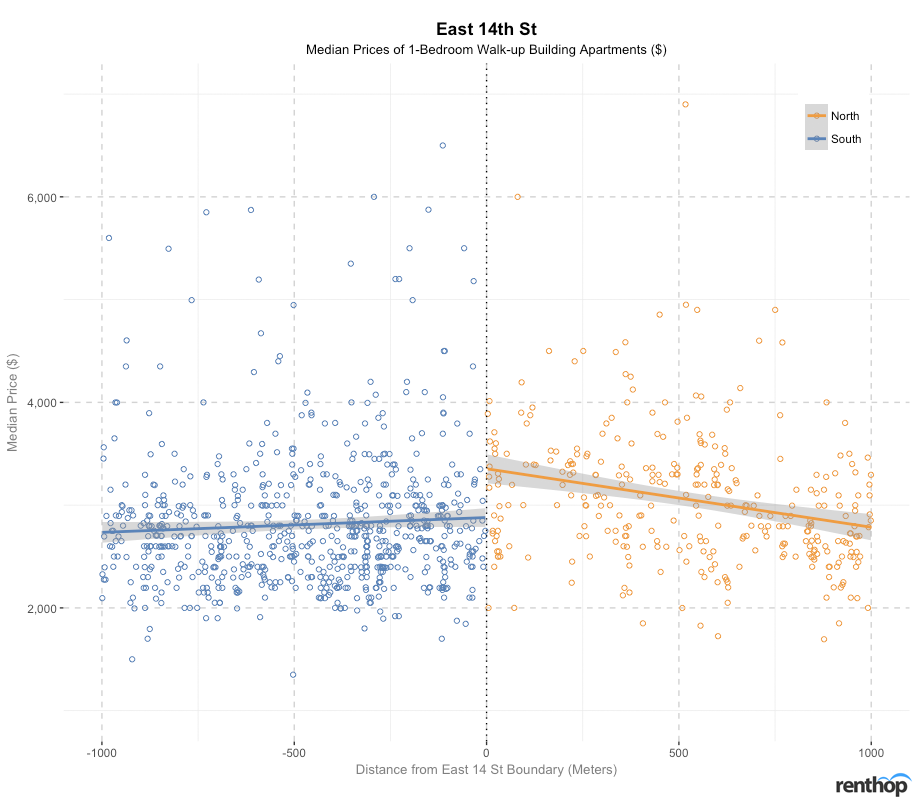
A contrasting pricing trend between the different apartment types across E 14th St leads us to believe that market forces are at play here. The effects of the rental price patterns can be traced back to the purchase deal of Stuy Town for $5.3 billion by Blackstone and Ivanhoe Cambridge back in 2015. As part of a binding agreement with the city, these firms have agreed to keep about 5,000 units of non-walkup building apartments affordable till 2035 for middle to low-income families. We believe this may be the reason why the median prices of non-walkup building apartments north of E 14th St, especially in the Stuy Town area, are more affordable than south of the street boundary.
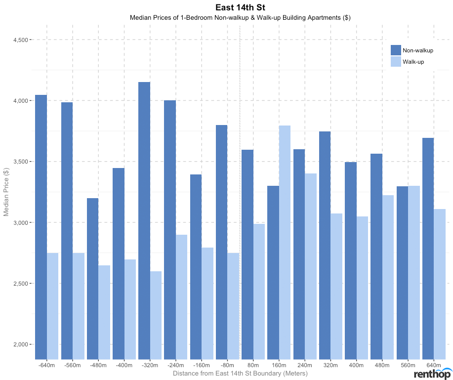
Across E 14th St, we notice a price saving of about $205 per block (from $3,800 to $3,595) north of E 14th St for non-walkup building apartments and a price saving of about $240 per block (from $2,990 to $2,750) south of E 14th St for walk-up building apartments. Thereafter, median prices of non-walkup and walk-up building apartments fluctuate. Generally speaking, non-walkup building apartments are more affordable on the north of E 14th St while walk-up apartments are more affordable on the south of E 14th St.
Price savings across Houston St: A significant price saving of about $477.50 per block and $200 per block for non-walkup and walk-up building apartments 1 block north of Houston St respectively. Non-walkup building apartments are also found to be more affordable north of Houston St.
Neighborhoods: West Village, Greenwich Village, NoHo, Bowery, East Village, Alphabet City (North), Hudson Square, SoHo, NoLita, Lower East Side (South)
As a center of action in downtown Manhattan, Houston Street spans across the full width of Manhattan. A cursory glance at the data of Houston St would lead you into believing that apartments north of Houston St are generally more expensive than the ones south, with about 1.5%-5.5% difference in prices across the boundary. This is not exactly the case.
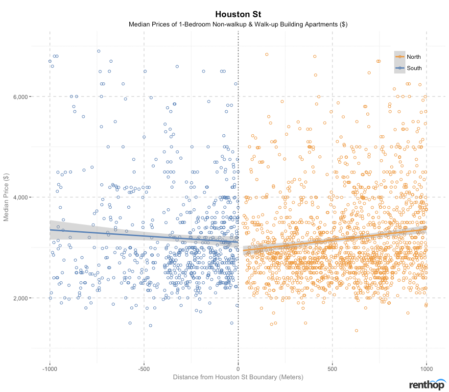
After taking a closer look at each of the apartment types, we noticed that Houston St shares a similar trend with Stuy Town with regards to non-walkup building apartments, where apartments north of Houston St are more affordable than apartments south of Houston St. We also noticed that non-walkup building apartments become sparser between the distance of about 250 m and 625 m north of Houston St, which coincides with the location of New York University and Washington Square Park.
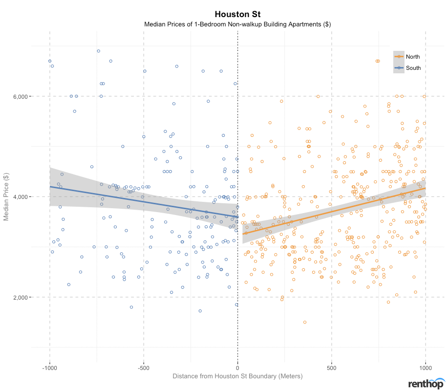
On the contrary, walk-up building apartments south of Houston St generally have lower median prices than north of Houston St, with the difference ranging from a small margin of 1.9%-6.8%.
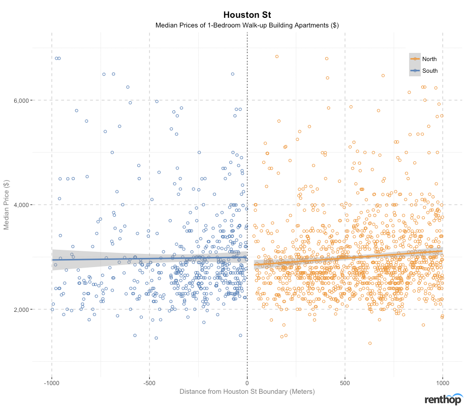
As walk-up building apartments are more common than building apartments in these few neighborhoods (namely, West Village, Greenwich Village, NoHo, Bowery, East Village, Alphabet City, Hudson Square, SoHo, NoLita and Lower East Side), the overall trend in rental prices is more heavily influenced by the pricing trend of walk-up building apartments. For non-walkup building apartments, there is a difference of 16.1%-19.0% across Houston St. There is also a larger number of apartments north of Houston St than south of the street. The sparse presence of apartments south of Houston St could be traced to being within the vicinity of SoHo in Lower Manhattan, where the neighborhood is more of a shopping destination.
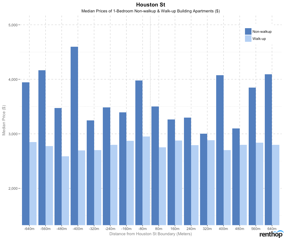
Around the Houston St boundary, we see a price saving of about $477.50 (from $3,977.50 to $3,500) for non-walkup building apartments. Moving further north of the street, median prices of non-walkup building apartments decline gradually to 320 m before fluctuations set in. However, moving south of Houston St, median prices of walk-up building apartments experience a gentle decline to 480 m.
Price savings across Lower 3rd Avenue: Moving east, there is a major price saving of $995 per block for non-walkup building apartments and $50 per block for walk-up building apartments. A gradual decline in prices of apartments is also observed from west to east of the boundary.
Neighborhoods: Greenwich Village, NoHo, NoLita, Little Italy (West), East Village, Bowery (East)
An overview of all apartments across Lower 3rd Avenue indicates that apartments to the west of Lower 3rd Avenue are more expensive than the apartments to its east.
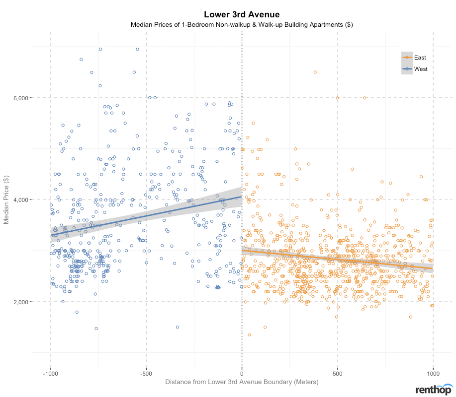
For non-walkup building apartments, 1-bedroom apartment prices generally increase towards the Lower 3rd Avenue boundary from east and west side of the boundary. Across Lower 3rd Avenue, the difference ranges between 22.5%-27.1%. A steeper increase in price is also observed from the east side of the boundary. To the east of Lower 3rd Avenue (Alphabet City), we also observe that non-walkup building apartments are sparser as compared the contiguous neighborhood to its west, where East Village is located.
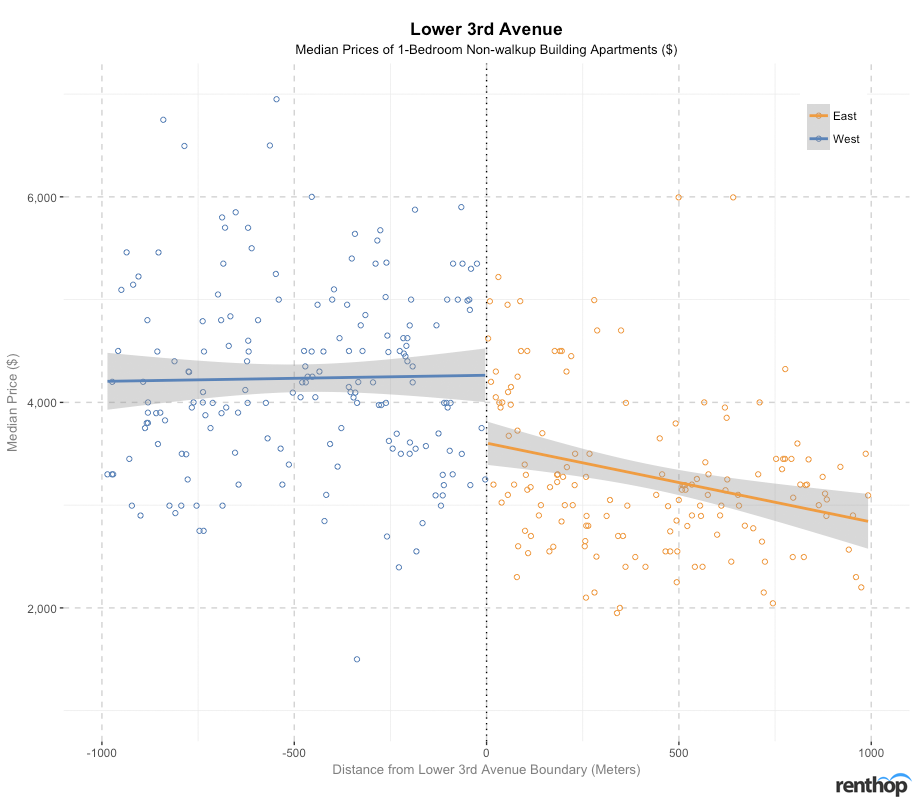
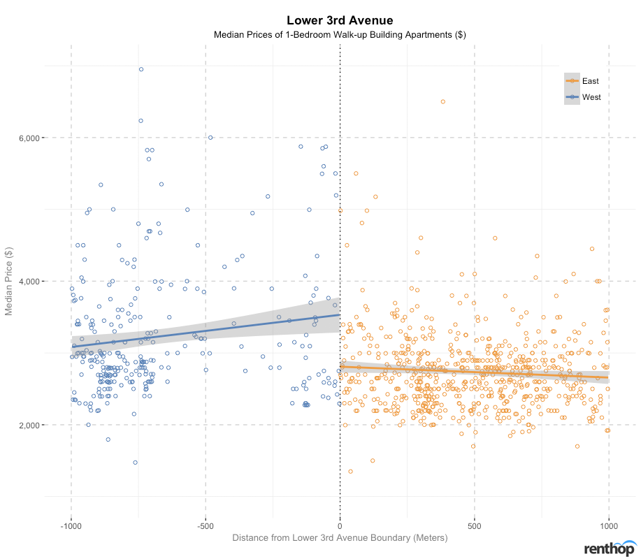
While 1-bedroom walk-up building apartment prices on the west side of Lower 3rd Avenue increases towards the boundary as well, the apartment prices to the east of Lower 3rd Avenue do not experience as steep of an increase in prices as non-walkup building apartments.
We also notice a gap in the number of walk-up building apartments to the west of Lower 3rd Avenue, particularly in the region between 300 m and 800 m, which coincides with the location where New York University and Washington Square Park is located.
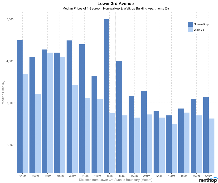
We can also confirm that the median prices of both non-walkup and walk-up building apartments decline from the west to the east of Lower 3rd Avenue, with a major price saving of $995 (from $4,995 to $4,000) for non-walkup buildings and a price saving of $50 (from $2,750 to $2,700) for walk-up buildings.
The table below summarises the differences in median prices across different streets based on percentiles for the 2 categories of apartments.
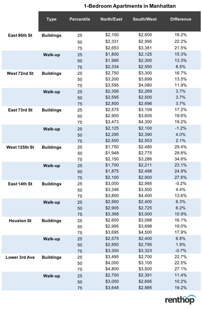
We will now move on to investigate the effects of median 1-bedroom walk-up building apartment prices across different streets and avenue boundaries in Brooklyn and Queens.
Brooklyn
Price savings across Metropolitan Avenue: No significant price savings across Metropolitan Avenue. There is only a very slight variation in prices between Williamsburg and East Williamsburg.
Neighborhoods: Williamsburg (North), East Williamsburg (South)
Median prices of walk-up building apartments decrease from the south-east to north-west of Metropolitan Avenue. However, if we zoom into the pricing behavior at the boundary, median prices of these apartments are slightly higher on the north-west of Metropolitan Avenue.
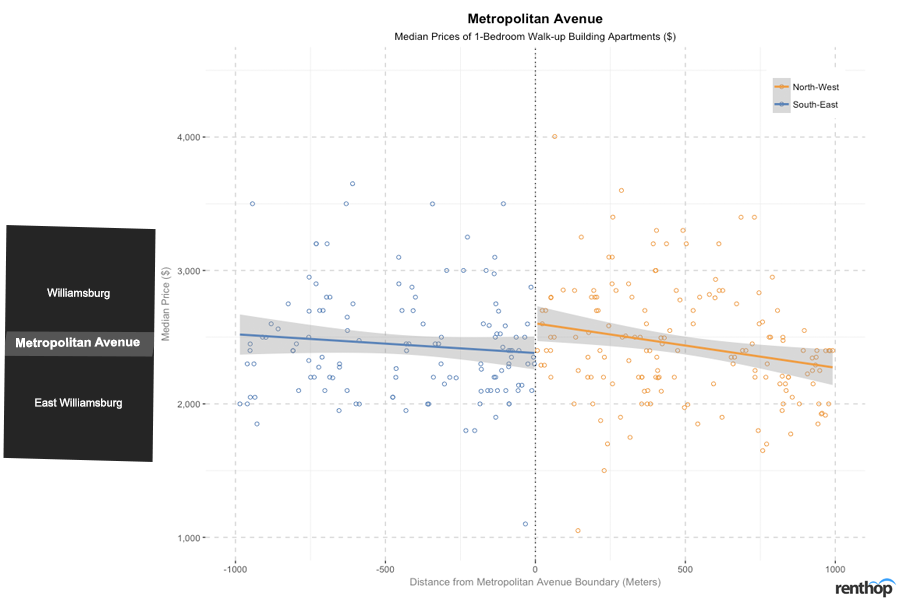
Since the 1980s, Williamsburg has been one of Brooklyn’s gentrification capitals. Being within the vicinity of Williamsburg, East Williamsburg is almost like an extension of Williamsburg. As a neighborhood on its own, East Williamsburg is turning into an up-and-coming neighborhood. Like Williamsburg, East Williamsburg offers a variety of hipster and trendy spots for leisure and dining.
However, compared to Williamsburg, East Williamsburg is less industrial and more residential, and offers a more affordable pricing option, by about 20.0%-31.4%.
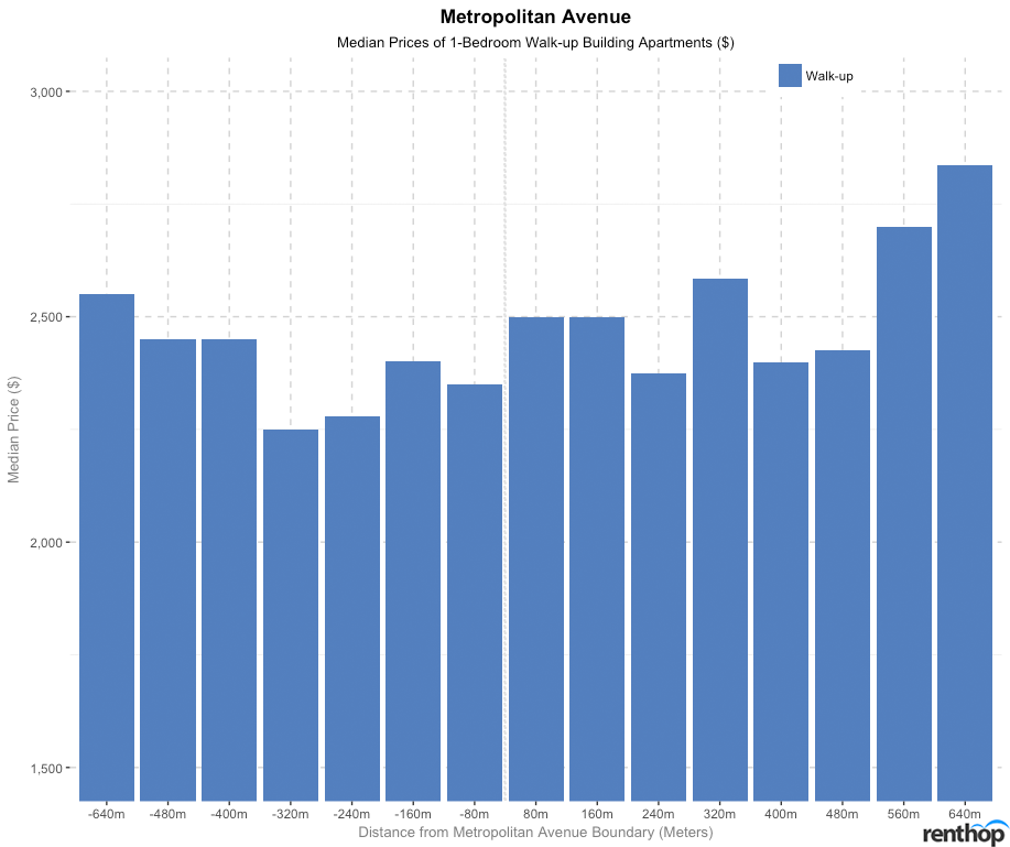
With a more detailed investigation of how prices differ from each individual block away from Metropolitan Avenue, we noticed that median prices of walk-up building apartments increase only very slightly from south to north, with negligible variation in prices overall, further confirming the fact that East Williamsburg is fast becoming an extension of Williamsburg.
Price savings across Classon Avenue: No significant price savings across Classon Avenue but median prices of walk-up building apartments to the west of the boundary are more expensive.
Neighborhoods: Clinton Hill, Prospect Heights, Prospect Park (West), Bedford-Stuyvesant, Crown Heights, Prospect Lefferts (East)
Median prices of 1-bedroom walk-up building apartments are more expensive on the west of Classon Avenue than to its east, with prices increasing towards the Classon Avenue boundary from the west and decreasing after Classon Avenue boundary to its east.
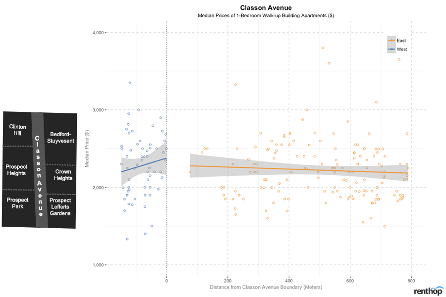
Neighborhoods including Bedford-Stuyvesant, Crown Heights and Prospect Lefferts, found on the east side of Classon Avenue have seen gentrification efforts in the recent years, with these neighborhoods coming up with new cafes, restaurants, bakeries, boutiques, galleries and wine bars, along with beautiful yet inexpensive brownstones. At the same time, new buildings and condos have also developed in the Prospect Heights region, which contributed to the rise in median prices in the area.
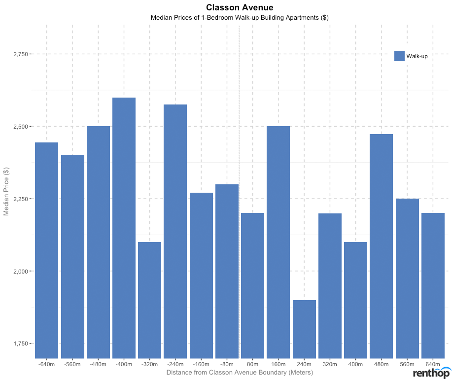
While there is not much variation in prices around the Classon Avenue boundary, walk-up apartments on the far west of Classon Avenue does indeed have higher median prices as compared to the east of Classon Avenue.
Price savings across Broadway: No significant price savings across Broadway, with both Bedford-Stuyvesant and Bushwick stepping up their gentrification efforts. However, a significant difference of $300 (from $2,150 to $1,850) is observed at 240 m (3 blocks) west of Broadway.
Neighborhoods: Bedford-Stuyvesant (West), Bushwick (East)
The general prices on both directions of Broadway differ only by a small margin of about 1.3%-4.3%, with walk-up building apartment prices increasing from the west to east side of the boundary.
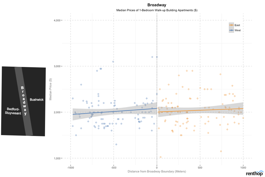
The two neighborhoods separated by this boundary have gone through similar changes. Gentrification of both Bed-Stuy and Bushwick began in the early 2000s. However, in the recent years, Bushwick has become a more popular neighborhood and well-known for its hipster art galleries, restaurants, and cafes.
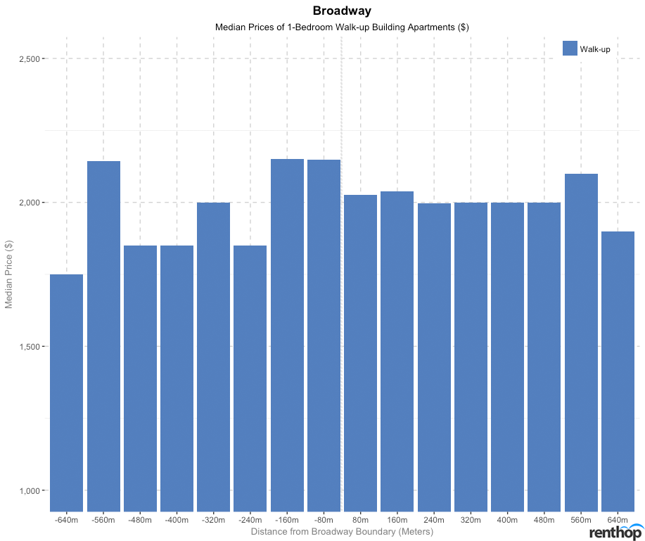
Generally, median prices of walk-up apartments are higher towards the east of Broadway than the west. A price saving of about $300 is also observed at 240 m (3 blocks) west of Broadway for walk-up apartments.
Price savings across Parkside Avenue: A price saving of $515 is found across Parkside Avenue 160 m to the north. Walk-up apartment buildings to the north are generally more expensive.
Neighborhoods: Windsor Terrace, Prospect Park, Prospect Lefferts (North), Kensington, Flatbush (South)
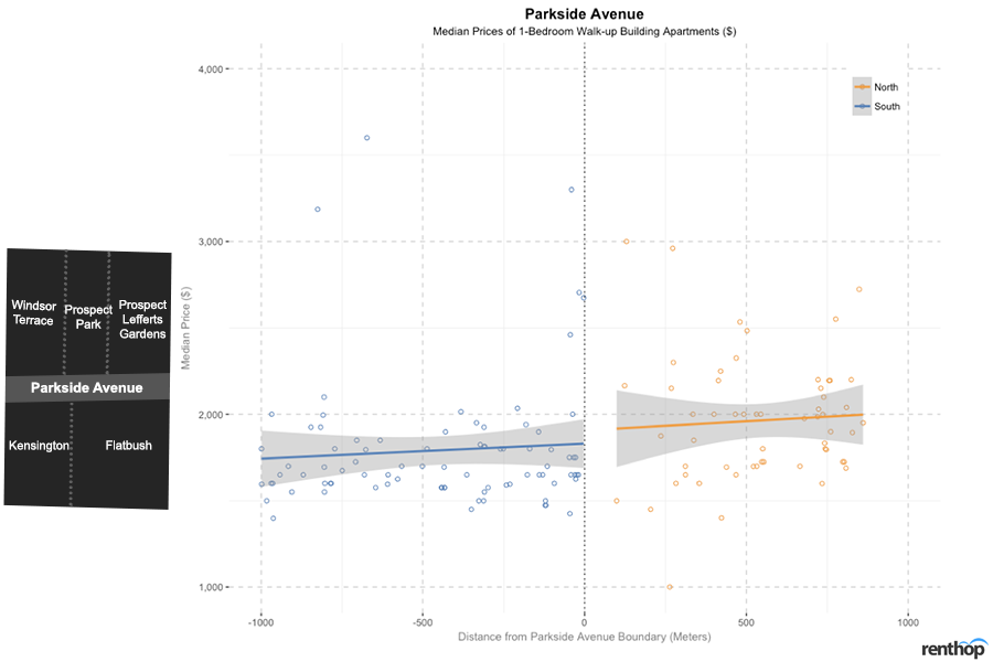
Median prices of walk-up building apartments north of Parkside Avenue are generally higher than those on the south side. However, the differences in median prices across the boundary are only about 3.0%-8.9%. The more affordable apartment options within the area are located in Windsor Terrace, Prospect Park, and Prospect Lefferts. Comparing neighborhoods across Parkside Avenue, Prospect Park to its north is the most expensive neighborhood, with a median price of $2,653. If you’re looking for even more affordable options, consider neighborhoods south of Parkside Avenue – Kensington and Flatbush.
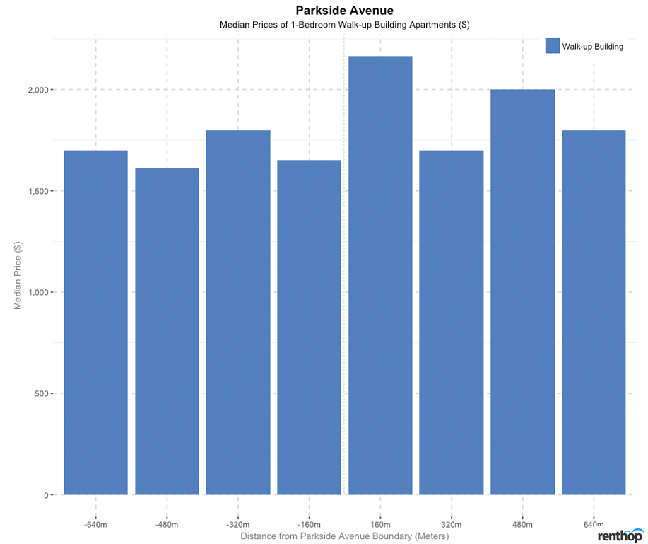
There is little variation in median prices of apartments, but we notice that at 160 m, median prices of walk-up building apartments increase by $515 at 160 m to the north of Parkside Avenue. However, because we are comparing all three neighborhoods, Windsor Terrace, Prospect Park, and Prospect Lefferts Gardens, at once, it is difficult to draw a conclusion as to whether the price difference applies to all apartments north of Parkside Avenue. We can only find out how the median price changes from Prospect Park towards its surrounding neighborhoods.
Queens
Price savings across 36th Avenue: No significant price savings across 36th Avenue, but there is a difference of about $250 (from $1,800 to $1,550) 320 m (roughly 4 blocks) south of 36th Avenue.
Neighborhoods: Astoria (North), Long Island City (South)
There are various distinctions between Astoria and Long Island City. Generally, we notice that prices of apartments south of 36th Avenue decreases towards the boundary but increases north of 36th Avenue.
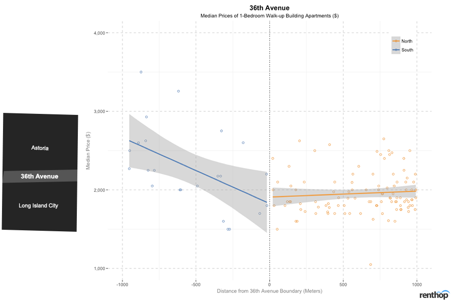
With affordability as a basis of comparison, Astoria is considerably more affordable than Long Island City, as there are more high-rises with views of the city across East River in Long Island as an effect of the rezoning of Long Island City in 2001. However, Astoria is also rapidly gentrifying in the recent years, which results in only a slight difference in prices.
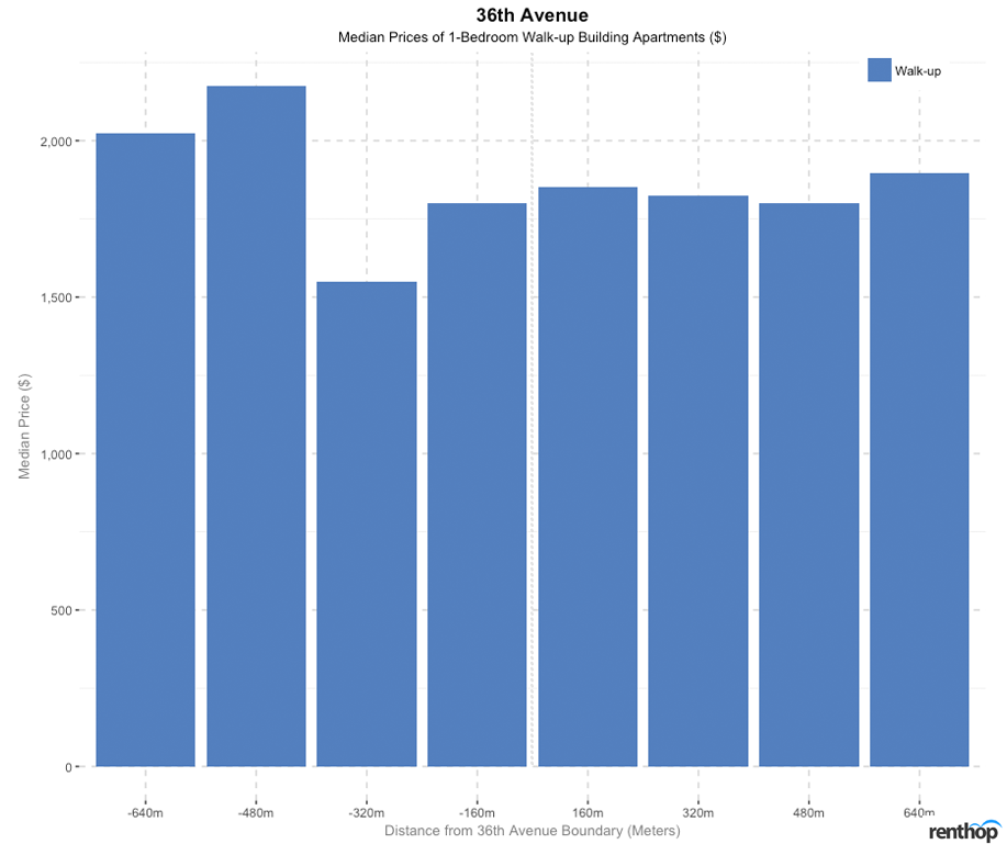
While there are no price savings observed around the 36th Avenue street boundary, however, we noticed an anomaly where the median price of walk-up apartments drops by about $250 from 160 m to 320 m south of 36th Avenue.
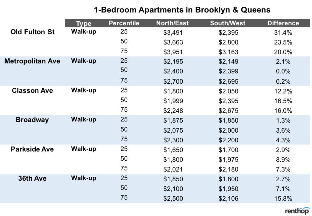
Conclusion
Our study has revealed that choosing to rent a 1-bedroom apartment across some street boundaries, such as East 96th Street, West 72nd Street, East 14th Street, Houston Street will provide renters with significant price savings. On the other hand, we have also discovered that the gentrification efforts in East Harlem have shifted the boundary slightly to the north by about 160 m and narrowed the gap of prices of 1-bedroom walk-up building apartments between Williamsburg and East Williamsburg across Metropolitan Avenue.
Methodology
The data used in this analysis is derived from RentHop’s listings from August 2017 to January 2018. Listings with the same address are de-duplicated into a single point as they suggest apartments are in the same building. *Note: As data points are sparse in some regions of the plots, the median prices are aggregated by 160 m intervals to provide a better picture of the pricing trends.
The post Moving 2 Blocks Outside Of Your Current Neighborhood Could Save You A Lot In Rent appeared first on Real Estate Data & Research.
]]>