The post RentHop Rental Report Q4 2021: Rents Are Up, Renters Are Back, Inventory Is Low appeared first on Real Estate Data & Research.
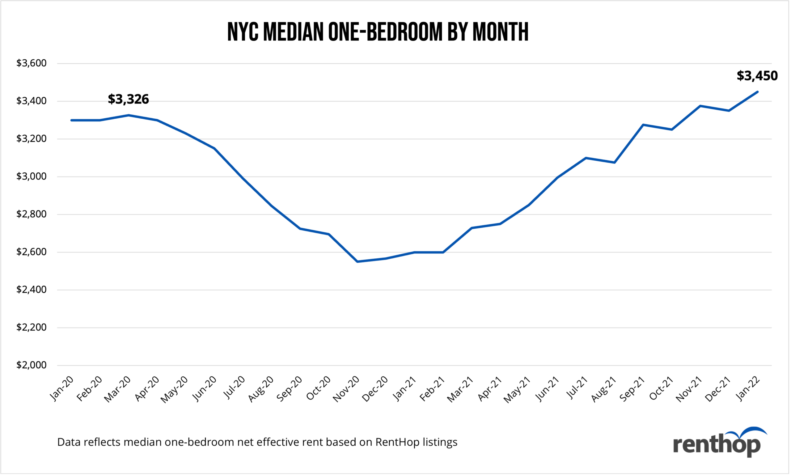
]]>As people flock back into New York, rent costs have also started to reflect this and are soaring back up to pre-pandemic levels. Rental inventory in the city also hit all-time lows meaning rental supply is not where it has been in the past.
According to the RentHop Rental Report this quarter:
- The median one-bedroom rent currently sits at $3,450, 3.73% higher than in March 2020, right before the pandemic hit New York.
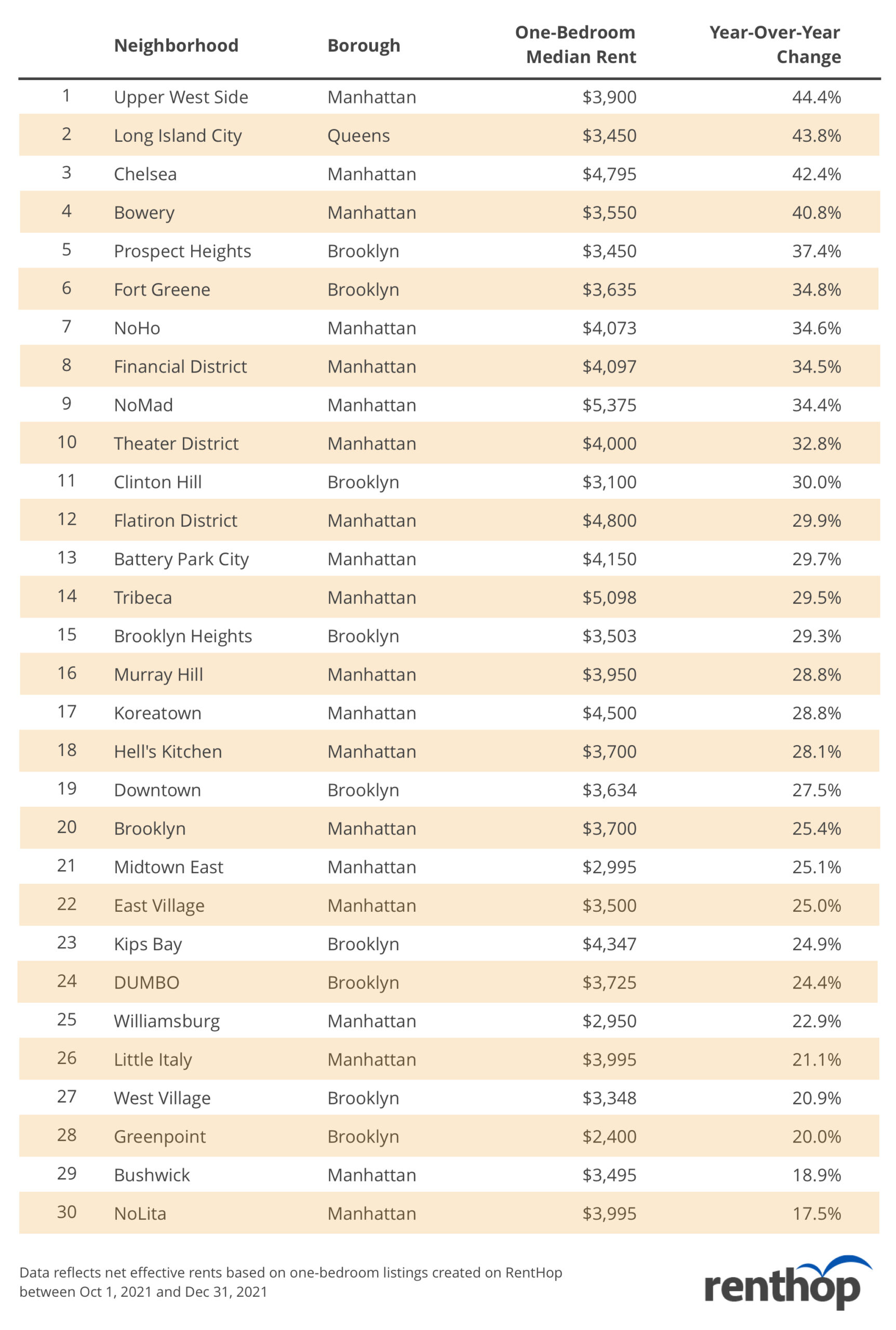
- Manhattan neighborhoods with the most drastic increases in rental prices were Upper West Side ($3,900, YoY +44.4%) and Chelsea ($4,795, YoY +42.4%).
- In Brooklyn and Queens, the neighborhoods that saw the biggest price changes in each borough were Prospect Heights ($3,450, YoY +37.4%) and Long Island City ($3,900, YoY +43.8%)
- Neighborhoods with the most inquiries this quarter were Greenwich Village, NoLita, SoHo, West Village, and NoHo. Back in Q1 2021, these same areas experienced drastic rent reductions as landlords offered concessions to fill vacancies.
- Limited inventory due to renters finishing out their leases with lower than average market rates from pandemic concessions will begin to end. However, this will result in more renters flooding the market. We expect to see an even higher increase in rental prices as landlords work to make up for losses over the pandemic due to concessions and the rental eviction pause.
NYC rental market has surpassed the pre-pandemic levels
Manhattan Market
Now that special pandemic offers and concessions are mostly gone, neighborhoods with large luxury rental apartments saw a big jump in rent. Overall, rents in historically expensive neighborhoods are back to pre-pandemic levels.
Neighborhoods that have seen the largest increase in median one-bedroom net effective rent are:
- Upper West Side ($3,900, YoY +44.4%)
- Chelsea ($4,795, YoY +42.4%)
- Bowery ($3,550, YoY +40.8%)
- NoHo ($4,073, YoY +34.6%)
- Financial District ($4,097, YoY +34.5%)
Brooklyn Market
Major Brooklyn neighborhoods are becoming more expensive as demand soared. Many Manhattan dwellers migrated to the Brooklyn borough in search of larger apartments, outdoor spaces, and more amenities. Similar to Manhattan, rents in areas with no-fee rental buildings jumped over 20% year-over-year as landlords raised rates and no longer offered concessions. There was also a large presence of new high-rise developments as well as commercial construction that was finished in Downtown Brooklyn, which drove up prices in the surrounding areas.
Neighborhoods seeing the largest increase in median one-bedroom net effective rent are:
- Prospect Heights: $3,450, YoY +37.4%)
- Fort Greene ($3,635, YoY +34.8%
- Clinton Hill ($3,100, YoY +30.0%)
- Brooklyn Heights ($3,503, YoY +29.3%)
- Downtown Brooklyn ($3,634, YoY +27.5%)
Queens Market
Long Island City saw the largest hike across Queens in the last year. The allure of a finished waterfront and accessibility to new businesses and Manhattan no doubt influenced the migration to the neighborhood.
Demand wise, renter inquiries shot up in Middle Village (YoY +631%), Woodhaven (YoY 265%), Ozone Park (YoY +130%), Briarwood (YoY +114%), and Rego Park (YoY +113%).
Neighborhoods seeing the largest increase in median one-bedroom net effective rent are:
- Long Island City ($3,900, YoY 43.8%)
- Ridgewood ($2,007, YoY +11.5%)
- Astoria ($2,095, YoY +10.6%)
- Forest Hills ($2,050, YoY +7.5%)
- Rego Park ($1,950, YoY +5.4%)
Rents Jumped in these Neighborhoods
Manhattan neighborhoods saw more drastic increases possibly due to migration induced by the pandemic and the inflow of residents trying to rent apartments at a cheaper rate. Manhattan also has more rental buildings than any other boroughs that offered concessions or OP.
Most Popular NYC Neighborhoods by Lead Generation and How Competitive They Are
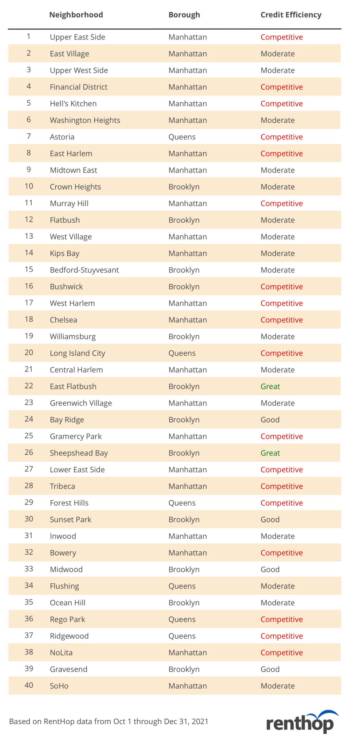
Top Growing Neighborhoods
Demand for full apartments in Manhattan has gone up significantly as people flock back to the city and look to move to easily accessible neighborhoods that saw the most transition during the pandemic. Neighborhoods that saw the biggest spikes in inquiries include Greenwich Village, NoLita, SoHo, West Village, and NoHo. Meanwhile, leads were up 196% in Brownsville, Brooklyn.
Top Declining Neighborhoods
Certain neighborhoods in outer boroughs experienced declines in terms of renter interest, for example, inquiries dropped 89.4% in Corona, Queens. Other neighborhoods experiencing lower lead volumes this past quarter compared to last year include Rockaway Beach (Queens), Far Rockaway (Queens), Roosevelt Island, Clinton Hill (Brooklyn), Ridgewood (Queens), and Red Hook (Brooklyn). This also may be due to the record low rental inventory across the board.
Methodology
Released on a quarterly basis, the RentHop Rental Report analyzes the NYC rental market using the platform’s rental listings and traffic data. The lead volume, most inquired apartment type, and year-over-year changes are determined based on inquiries sent by renters visiting the RentHop site. The median asking rent is calculated using all listings created between October 1, 2021, and December 31, 2021, across all apartment types, whereas median 1BR rent is calculated using only one-bedroom listings created during the same time period. Please email press@renthop.com for a detailed report covering all NYC neighborhoods. Note that, unlike other RentHop studies that analyze and summarize data using the Neighborhood Tabulation Areas, the RentHop Rental Report adopts a more granular neighborhood shapefile for the analysis, which is consistent with the listing search criteria on the consumer side.
The post RentHop Rental Report Q4 2021: Rents Are Up, Renters Are Back, Inventory Is Low appeared first on Real Estate Data & Research.
]]>The post Rents Drop at 60% of Washington DC Metro Stops, Including Metro Center and Nationals Ballpark appeared first on Real Estate Data & Research.
]]>
Washington DC’s Metrorail has seen a lot of changes in recent months. Service hours were extended to midnight, wait times between rides have decreased and fares were reduced to serve lower-income workers.
It’s all part of an effort to draw riders back to public transit. Normally, Metrorail would serve more than 600,000 customers a day. That number plummeted during the Covid-19 pandemic, which saw most commuters stay home to comply with social distancing measures.
Even as pandemic restrictions ease, riders have signaled they plan to continue cutting back on commuting and, as a result, rents are dropping.
Prior to the pandemic, Metro proximity was one of the first things renters considered when searching for an apartment. And the closer you were to a metro stop, the more expensive your apartment is.
That’s not necessarily the case anymore.
RentHop data scientist Shane Lee mapped out rental prices for one-bedroom apartments by Metrorail stop. Here’s what she discovered for the period of March 1, 2021 to May 31, 2021:
- Rents decreased at 55 out of 91 stops across all train lines.
- That’s 60% of the stops we tracked.
- Rents increased at just 32 stops, but showed no change at 4 stops
- Median 1BR rent dipped 12.74% around Farragut North — a short walk from The Drake where prices dropped 12.3% year-over-year
- Median 1BR rent slid more than 12.97% around the Rosslyn stop near the Blue, Orange, and Silver lines.
- That’s close to 1121 Arlington Blvd., a condo building with units for sale that saw prices drop -10.3%
RentHop also whipped up an interactive map showing all rents, stops, and YoY price fluctuations:
<
The top 10 biggest rent drops on one-bedroom apartments occurred at the following stops:
- Navy Yard/Nationals Ballpark — Green ($1,875; -13.79%)
- Archives-Navy Memorial — Green, Yellow ($2,175; -13%)
- Rosslyn — Blue, Orange ($1,950; -12.97%)
- Farragut North — Red ($2,042; -12.74%)
- Judiciary Sq. — Red ($2,190; -12.36%)
- Metro Center — Red, Blue, Orange, Silver ($2,150; -12.16%)
- McPherson Sq. — Blue, Orange, Silver ($2,100; -12.13%)
- Federal Center SW — Blue, Orange, Silver ($2,250; -11..76%)
- L’Enfant Plaza — Green, Yellow, Orange, Blue, Silver ($2,225; -11%)
- Eastern Market — Blue, Orange, Silver ($1,980; -10%)
With this in mind, apartment hunters would be wise to check RentHop for listings in and around these area — especially the Farragut North stop. The Drake (pictured below) over at 1355 17th Street, for example, saw a median 1BR rent drop of over 12.7% year-over-year, offers luxury apartments in Dupont Circle.
Of the 32 stops where rent increased, these were the top 5 stops that saw the largest uptick:
- West Hyattsville — Green, Yellow ($1,372.50; +5.58%)
- Georgia Ave. Petworth — Green, Yellow ($1,727; +4.41%)
- Naylor Road — Green ($1,200; +4.35%)
- Braddock Road — Blue, Yellow ($1,825; +4.29%)
- Branch Ave. — Green ($1,765; +3.82%)
Ride the Metro to Savings
Would you travel an extra stop to save a couple hundred dollars? How about for over $1000? RentHop dug deep into the data for the best single stop rent savings and found some very useful results.
The list below represents the largest price drops between a single stop. Sometimes this is because the stops are in different neighborhoods, rents fell at one stop, prices soared at the other, or all of the above. It’s also possible that apartments near a particular stop aren’t apples-to-apples with the apartments just one stop away. We may have left some out due to miles-long stretches between stops.
Turn your commute into extra cash at these stops:
- Save $1,200 by moving to Minnesota Ave. ($1,050) from Federal Center SW ($2,250) – Orange Line
- Save $422.50 by leaving Rosslyn ($1,697) for Addison Road ($1,274.50) – Blue/Orange/Silver Line
- Save $375 between Ronald Reagan Washington National Airport ($2,000) and Van Dorn St. ($1,625) – Blue/Yellow Line
Tell Your Friends! Here’s A Condensed Map for Easy Sharing

Methodology
To calculate the median rent for the map above, we used RentHop’s rental data for one-bedroom apartments from March 1 through May 31 2020 & 2021 as well as WMATA GIS data for Metrorail stops from OpenData DC. To get accurate prices near the Metro stops, we looked first at non-duplicated listings within half a mile of a WMATA stop and if there were 20 unique data points we calculated the median. If not, the radius from the stop was increased and the data was resampled to ensure enough unique listings were used when calculating the median.
What Does This Mean for You?
Finding an apartment in Washington D.C. isn’t easy. Deciding where to live and starting your search is probably the most difficult step. By giving you as much information about the market as possible, RentHop hopes to point you in the right direction. Maps like this are just one of the data-backed insights we offer. All of our Washington DC apartments for rent are ranked using available data to ensure that renters always see the best quality apartments.
The post Rents Drop at 60% of Washington DC Metro Stops, Including Metro Center and Nationals Ballpark appeared first on Real Estate Data & Research.
]]>The post NYC 1BR Rents Are Dropping At Most Major MTA Stops appeared first on Real Estate Data & Research.
]]>
New Yorkers living in one-bedroom apartments may be able to save some money should they decide to renew their lease.
That’s according to RentHop data scientist Shane Lee who mapped out rental prices for one-bedroom apartments by subway stop. Here’s what she discovered for the period of Jan. 1, 2021 and March 31, 2021:
- Rents decreased at 418 out of 473 stops across all train lines.
- That’s 88% of the stops we tracked.
- Rents increased at just 35 stops in the past year.
- Median rent dipped 23% around Lincoln Center — a short walk from the AMSTRDM where one-bedroom prices dropped over 20% year-over-year (scroll down for more info).
- Median rent slid more than 21% at two Delacey St./Essex St. stops near the F, J, M and Z lines.
- That’s close to The Adele — 310 E 2nd Street, New York, NY 10009 — which is currently offering 2 months free on a 12-month lease.
RentHop also whipped up an interactive map showing all rents, stops, and YoY price fluctuations:
The top 5 biggest rent drops on one-bedroom apartments occurred at the following stops:
- 66th St./Lincoln Center — 1/2 trains ($3,100; YoY -23%)
- Delancey St./Essex St. — F train ($2,495; YoY -21.9%)
- 81st St. — A/B/C trains ($2,500; YoY -21.8%)
- Forest Ave. — M train ($1,800; YoY -21.7%)
- Delancey St./Essex St. — J/M/Z ($2,500; YoY -21.3%)
With this in mind, apartment hunters would be wise to check RentHop for listings in and around this area — especially the 66th St. stop in Manhattan. The AMSTRDM (pictured below) over at 166 West 75th Street, for example, saw a median 1BR rent dropped over 20% year-over-year, has no-fee apartments and offers up to 3 months free.
Of the 35 stops where rent increased, these were the top 5 stops that saw the largest uptick:
- 167th St. — B/D trains ($1,795; YoY 5.6%)
- 238th St. — 1 train; $1,890 (YoY 5.2%)
- Far Rockaway/Mott Ave. — A train ($1,673; YoY 4.6%)
- New Lots Ave. — 3/4 trains ($1,724 YoY 4.5%)
- 183rd St and Fordham Rd. — 4 train ($1,775; YoY 4.4%)
RentHop also discovered that 20 subway stops in Manhattan experienced no rent change. So if you’re landlord won’t cut you a break on the heels of the Covid-19 pandemic, consider these options:
Apartments located around the 34th Street-Herald Square stop — a major transportation hub with B/D/F/M/N/Q/R/W trains — have rents that hover $3,200 a month, giving it a year-over-year decrease of 13.5%.
Over in Union Square, near 14th Street – where the 4/5/6 trains are in close proximity to the N/Q/R/W — rents saw a year-over-year decrease of more than 20%.
Median 1BR Rents at Major NYC Subway Hubs
- Bowling Green — 4/5 trains ($3,100; YoY -17.6%)
- Times Sq. – 42nd St. — 1/2/3 trains ($3,036; YoY -15.7%)
- Grand Central — 4/5/6 trains ($3,040; YoY -15.6%)
- Fulton St. — 2/3 trains ($3,250; YoY -15.3%)
- Fulton St. — A/C trains ($3,250; YoY -14.9%)
- Fulton St. — 4/5 trains ($3,250; YoY -14.5%)
The trend isn’t exclusive to Manhattan. Many stops in Brooklyn — including hotspots Williamsburg and Bushwick — also saw rents drop for one-bedroom apartments:
- Bedford Ave. — L train stop ($3,097; YoY -13.6%)
- Metropolitan Ave. — G train ($3,000, YoY -13.8 percent)
- Central Ave. – M train ($2,000 YoY -18.4 percent)
- Jay St./Metrotech — A/C/F ($3,162; YoY -11.3%)
- Atlantic Ave./Barclay’s Center — 2/3/4/5 ($2,850; YoY -14.8%)
Methodology
To calculate the median net effective rents for the map above, we used RentHop’s rental data for one-bedroom apartments from Jan 1 through March 31, 2020 & 2021, MTA Lines and Stops data, and GIS data for subway stops compiled by CUNY – Baruch College.
To get accurate prices near the subway stops, we surveyed at least 50 non-duplicated rental listings within half a mile of a subway stop and then calculated the median rents. If there were less than 50 non-duplicated listings, we expanded the distance to 1 mile of a subway stop.
Outside of New York, we illustrated a similar trend. Last month, RentHop reported that one-bedrooms near the Boston T also saw significant rent drops.
Tell Your Friends! Here’s A Condensed Map for Easy Sharing

The post NYC 1BR Rents Are Dropping At Most Major MTA Stops appeared first on Real Estate Data & Research.
]]>The post Live Near the T? Boston 1BR Rents Plummet At 105 Stops appeared first on Real Estate Data & Research.
]]>
Boston’s rapid transit system saw a drastic drop in ridership during the Covid-19 pandemic, and it currently faces a projected budget deficit of up to $600 million for 2021. Social distancing precautions are still in place as folks continue to work from home, and eschew the T. As a result, close proximity to a train station to ease a work commute isn’t the must-have for apartment hunters that it used to be.
However, there’s a silver lining.
Single renters in Beantown are seeing new — and cheaper — one-bedroom leases drawn up at just about every subway stop along the Green, Red, Orange, and Blue lines.
RentHop data scientist Shane Lee recently crunched the numbers to map out median rents by each T train stop. Here’s what she discovered:
- Rents decreased at 105 stops across all train lines.
- That’s 87% of Boston’s train stops.
- Rents increased at just 11 stops in the past year.
- 5 stops experienced no change.
- Median rent dipped 25% at Government Center (Blue) — a five minute walk from 1 Devonshire Place, a luxury building that’s now 22% cheaper (with 2 months of free rent).
- Median rent slid roughly 24% at both the State (Blue, Orange) and Park Street (Green, Red) stops.
- The trend also resulted in a 16% rent drop near Fenway Park (Green).
Peruse Our Interactive T Map For All Stops With Respective Rents and YoY Fluctuations
To calculate the median rent for the map above, we used RentHop rental data for one-bedroom apartments from December 2020 through March 2021 and from December 2019 through March 2020, as well as Massachusetts Bay Transportation Authority (MBTA) GIS data for T stops from Mass.gov.
To get accurate prices near the subway stops, we looked first at non-duplicated listings within 0.62 miles of an MBTA stop. If there were 50 unique data points we calculated the median. If not, the radius from the stop was increased to 1.2 miles and the data was resampled to ensure enough unique listings were used when calculating the median.
Ride the Train to Savings
Would you travel an extra stop to save $800? Normally, Greater Boston is one of the most expensive rental markets in the U.S., but on the heels of the pandemic, the scenario has changed. Median rent near Tufts Medical Center, for example, typically climbs. This year, the MBTA stop saw a decline of more than 21% from the previous year with a median rent of $2,650. And that’s not even the steepest drop. The list below represents the largest price disparities between each stop.
The Biggest Rent Drops On One-Bedroom Apartments
- Government Center — Blue Line: $2,500, YoY -25%
- State — Blue, Orange: $2,526, YoY -24.7%
- Park Street — Green, Red: $2,552, YoY -24.5%
- Haymarket — Green, Orange: $2,505, YoY -23.5%
- Bowdoin — Blue: $2,500, YoY -$23.2%
According to our previous Boston report, 88 stops experienced rent growth. This time, only 11 stops experienced rent growth. Below are some neighborhoods that bucked the trend.
These Stops Saw The Biggest Rent Hikes
- Shawmut — Red: $2,175, YoY 5.5%
- Quincy Adams — Red: $1,950, YoY 4.9%
- Waban — Green: $1,822, YoY 4.1%
- Wonderland — Blue: $1,852, YoY 2.9%
- Newton Centre — Green: $2,100, YoY 2.4%
Like the transit systems in New York City and Chicago, thousands of Bostonian commuters still rely on the MBTA to zip across the city. But if you want to turn your commute into extra cash, consider the following:
Turn your commute into extra cash at these stops
- Save $640 between Aquarium ($2,740) and Maverick ($2,100) – Blue Line
- Save $810 between Wellington ($2,485) and Malden Center ($1,675) – Orange Line
Tell Your Friends! Here’s A Condensed Map for Easy Sharing

What Does This Mean for You?
Finding an apartment in any city can be daunting, while deciding where to live and starting your search can be the most difficult step. By giving you as much information about the market as possible, RentHop wants to point you in the right direction. This map is just one of the countless data-backed insights we offer. All of our Boston rentals are ranked using available data to ensure that you always see the best quality apartments.
The post Live Near the T? Boston 1BR Rents Plummet At 105 Stops appeared first on Real Estate Data & Research.
]]>