Back in July, our sister site RealtyHop took a look at the presidential candidates’ filed fundraising numbers for the second quarter. We then stated, by looking at the numbers (and numbers don’t lie), that based on the fundraising numbers only five of the Democratic presidential candidates truly had a shot. As the fundraising numbers for the third quarter has now been released, we can take another close look to see if the trend has changed.
The previous study analyzed individual donations in the 30 most populous U.S. cities. This time around we took a deeper look at the individual donations on a region, city, and zip code level, including the Bay Area. We chose specifically to rank zip codes by unique donor counts instead of dollar amounts, as we feel this better represents how many people support each candidate.
Our key findings this quarter include:
- Bernie Sanders took the lead in terms of unique documented donors, leading in 63 zip codes. Second we have Donald Trump who leads in 47 zip codes with Kamala Harris taking the lead in 31 zip codes. [Fundraising Map]
- Harris leads the race in 64 zip codes in terms of amount raised. Trump comes in second, taking the lead in 36 zip codes, while Sanders takes the lead in 28 zip codes in total.
- As of September 30th, Sanders had 4,581 unique donors in the Bay Area. Kamala Harris ended up with 4,498 unique donors, while Elizabeth Warren received donations from3,781 unique donors.
- Elizabeth Warren saw an impressive 161% surge in the number of unique donors after the first democratic debate while the number of unique donors contributed to Bernie Sanders’ campaign went up by 95%. [Figure 1]
- While Mayor Pete Buttigieg and Senator Harris both had a great start in the Bay Area early in the game, they were both outpaced by Senator Sanders starting June. Vice President Biden, on the other hand, has consistently recorded below-average unique donations since April despite being the early front-runner in the polls. [Figure 2]
Which Candidate Does Your Neighbor Support?
The interactive map below highlights the Bay Area and its zip codes. More detailed, the map shows where each zip code stands, politically, and which presidential candidate is the frontrunner in each zip code. By clicking on the zip code or selecting from the drop-down menu, you will get more information on which candidate is the front runner and which candidate raised the most money in donations in that specific zip code. For a more detailed analysis of how each candidate is doing in the same zip code, view the corresponding interactive line graph above the map.
From the interactive map above, we see that the percentage donor share for the Bay Area is almost completely democratic donations. Bernie Sanders took the lead in terms of unique donors, leading in 63 zip codes. Second, we have Donald Trump who leads the unique donor count in 47 zip codes with Kamala Harris taking the lead in 31 zip codes. When we look at the amount raised instead of unique donors, we see the same top three but reordered. Now, however, Harris leads the race in 64 zip codes in terms of the amount raised. Trump comes in second, taking the lead in 36 zip codes, while Sanders takes the lead in 28 zip codes in total.
When taking a closer look at the corresponding interactive line graph above the map, we see that Bernie Sanders is in the lead in terms of the total number of unique donors. As of September 30th, Sanders had 4,581 unique donors in the Bay Area. Kamala Harris ended up with 4,498 unique donors, while Elizabeth Warren attracted 3,781 unique donors.
It’s important to note that the colors approach the data from a different angle. Blue zip codes are zip codes where the aggregated number of unique donors of all 19 Democratic candidates is higher than the number of unique donors contributed to Donald Trump’s campaign, and red zip codes are areas where Donald Trump alone attracted more unique donors than all 19 Democratic candidates combined. As of Q3 2019, the Bay Area is with the Democrats, with only 2 red zip codes (donor share >70%) and 2 light red zip codes (donor share >55% and <70%), but Trump still managed to attract over 2,600 unique donors across the entire Bay Area.
Steady Race for Harris While Warren and Sanders saw Jumps in Donations
Following the fundraising data is a good way to get insight into where each candidate stands in the rase as donations equal support. Instead of tracking the dollar amount raised by each candidate, we analyze the unique donor count, as it better represents the number of individual voters each candidate attracts. We’ve therefore put together a line graph that shows each candidate’s progress.
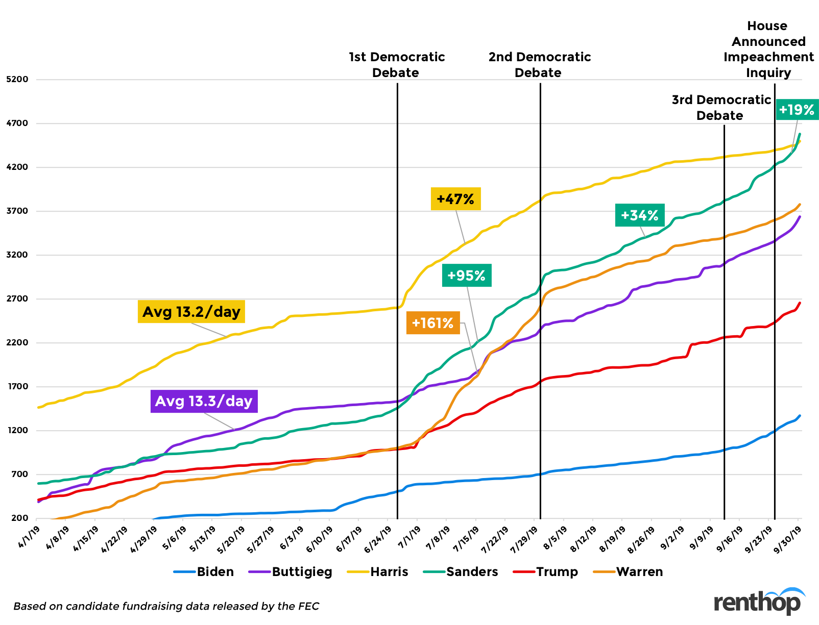
Above we see the timeline for each candidate and their donation progress from April to the end of September. Harris gained momentum early on in the Bay Area, bringing in on average 13.2 unique donations each day, and she then saw a big jump in the number of unique donors after the first democratic debate, by 47%. Other candidates with a big surge in unique donor counts after the first democratic debate were Warren and Sanders. Senator Warren saw an impressive 161% surge in the number of unique donors after the first democratic debate while Bernie Sanders jumped in donations by 95%. Sanders also saw another surge in unique donors after the second democratic debate by 34% and another increase after the House announced the impeachment inquiry by 19%.
Donald Trump, meanwhile, has seen a consistent inflow of unique donations since April, but nothing as major as the Harris, Warren, Sanders, or Buttigieg. This is not surprising as all eyes are on the Democratic Primary now. However, the dynamic will most likely change once we get closer to the General election. What’s interesting, though, is that the amount of support Trump received actually went up after the whistle-blower complaint came out.
The Top Five – Who Outperformed and Who Faltered?
The interactive chart below compares the top five democratic candidates to the average number of unique donors amongst the group.
As one can see, Bernie Sanders has recorded an incredible shift in momentum. In April, Sanders clocked -20% in terms of unique donors compared to the average, by June he jumped to an impressive 49% above average, and in September he surged to the lead with 69% above average, beating Warren who had an impressive 72% above average in July.
Joe Biden consistently recorded below-average unique donations since April, dropping to his lowest point of -87% below average in July. He gathered some momentum in September, however, when he was only -18% below average in terms of unique donations compared to the average, but Biden has yet to see any above-average numbers. Presidential candidate Harris went from having strong numbers in April and May to plummeting in September with -59% below average unique donations. Mayor Pete Buttigieg had a steady start with above-average numbers but had dropped in June and July before he saw an increase in unique donor count above average by +11% in August and +26% in September.
Unique Donor Leaderboard – Bay Area
We thought we would break down the donations by area in addition to zip codes to better understand residents’ views. You can also select the areas from the drop-down menu on the map to learn more.
- Bay Area: Sanders, 4,581 unique donors – Highest number of unique donors from zip code 94110 (143 unique donors)
- Berkley: Warren, 425 unique donors – Highest number of unique donors from zip code 94705 (85 unique donors)
- San Francisco: Buttigieg, 1,498 unique donors – Highest number of unique donors from zip code 94114 (251 unique donors)
- Fremont: Trump, 75 unique donors – Highest number of unique donors from zip code 94539 (23 unique donors)
- Oakland: Sanders, 589 unique donors – Highest number of unique donors from zip code 94611 (92 unique donors)
- Palo Alto: Buttigieg, 178 unique donors – Highest number of unique donors from zip code 94301 (98 unique donors)
Methodology
The campaign donations data was retrieved from the FEC, and the Bay Area zip code shapefile was retrieved from the Data SF portal. To calculate unique donors, we combed through tens of thousands of campaign donations, looking at donor names, committees, receipt dates, and 5-digit zip codes. We then grouped donations from the same name and zip code together and analyzed the data by zip code and candidate.


