Next Stop – Higher Rent Prices
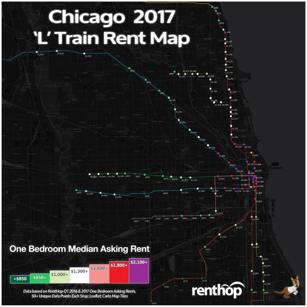
Chicago’s CTA ‘L’ train system is an essential part of many Chicagoan’s lives. With around 800,000 riders each weekday, it eases traffic congestion and improves the lives of every Chicagoan, even the ones that don’t ride it. It should be no surprise then, that it is one of the first things that people consider when looking to rent an apartment. Close proximity to the right trains means shorter commutes, saving money on transportation, and more time to spend doing what you love. Since RentHop’s data scientists love maps and rental data, they’ve mapped out rental prices by subway stop to assist in your apartment hunting endeavors.
Brand New Buildings Drive Rents Higher
- The newly opened ‘Vantage’ building at 150 Forest Ave adds hundreds of new Loop-priced luxury apartments in Oak Park, driving up the median price at the ‘Harlem/Lake’ and ‘Oak Park’ – Green Line stops by around 15%
- The ‘NEXT’ building at 347 W Chestnut St has prices soaring in the Near North by the Purple & Brown Line – ‘Chicago Ave’ stop by over 11%
- The new units at the ‘Marquee at Block 37’ building at 25 W Randolph St is contributing to a 14.8% increase in asking rents in the North Loop, closest to the ‘Lake St’ – Red Line station
You can use the interactive map to see the current one bedroom rent prices as well as how prices have changed since last year. You can also scroll down for an easy to share version of this map.
The Interactive Map Below Shows Chicago Rents by ‘L’ Train Stop
In order to calculate the median rent for the map above, we used our RentHop rental data for one bedroom apartments from the first quarter of 2017 and GIS data for subway stops from data.cityofchicago.org. To get accurate prices near the subway stops, we looked first at non-duplicated listings within one eighth of a mile (660 feet) of a subway stop and if there were at least 50 unique data points we calculated the median. If not, the radius from the subway stop was increased and the data was resampled to ensure enough unique listings were used when calculating the median. One eighth of a mile was the most common distance used.
Where Does the Train of Rising Rents Stop?
This year, we’ve seen a variety of rising and dropping prices across the city, with a majority of stops seeing increases. The increases can be chalked up to the widespread new development lately, with luxury units popping up in Oak Park, The Near North side, and in The Loop. Rent prices are up on Pilsen apartments and Woodlawn apartments as well, with prices being much cheaper than those closer to the schools UIC and UofC, respectively.
Many parts of the city have seen rents stabilize or drop, like in the West Loop and much of the Near West Side. Longtime luxury areas are softening a little as new units flood the market, meaning there are some good deals for savvy shoppers. Below, we’ve compiled a list of the stops with the largest price pops and drops between Quarter 1 2016 and Quarter 1 2017.
These L stops saw the biggest rent pops on one bedroom apartments
- Green Line – Harlem/Lake – (+15.3%) $1,524
- Red Line – Lake St – (-14.8%) $2,225
- Green Line – Oak Park – (+14.4%) $1,545
- Green Line – Cottage Grove – (+11.5%) $1,254
- Purple & Brown Line – Chicago Ave – (+11.1%) $2,150
- Pink Line – 18th St – (+9.2%) $1,269.50
These L stops saw dropping rents
- Pink Line – Polk – (-8.6%) $1,787
- Blue Line – Illinois Medical District – (-8.5%) $1,785
- Brown, Orange, Purple, Pink Line – Washington/Wells – (-7.9%) $2,265
- Blue Line – Clinton – (-7.9%) $2,090
- Brown, Green, Orange, Pink, Purple Line – Randolph/Wabash – (-7.7%) $2,125
Time or Money?
Would you travel a few extra stops to save some extra dough? How about for $500? We scanned the map for the best single stop rent savings and found some really surprising results.
The list below represents the largest price disparities between a single stop. This could be because they are on the edge of a business development district, rents dropped at one stop, prices soared at the other, both, or all of the above. It’s also possible that the typical one-bedroom apartment near one stop is very different from an apartment a stop away. Some stops are also considerably further apart, such as between Ashland and California Avenues on the Green Line.
Turn your commute into extra cash at these stops
- Save $926 on the long stretch from Ashland Ave ($2,051) to California Ave ($1,125) – Green line
- Save $755 by hiking past Cermak-Chinatown ($1,794) to Sox-35th St ($1,039) – Red Line
- Save $517 between Polk St ($1,787) and 18th St ($1,270) – Pink Line
- Save $390 between Ill. Medical Ctr. ($1,785) and Western Ave ($1,395) – Blue Line (Forest Park)
- Save $366 between Grand Ave ($2,275) and Chicago Ave ($1,906) – Red line
- Save $312 between Division St ($1,890) and Damen Ave ($1,578) – Blue Line (O’Hare)
There’s a Condensed Map for Easy Sharing

What Does This All Mean For You?
Finding an apartment in Chicago is hard. Deciding where to live and starting your search is probably the most difficult step. By giving you as much information about the market as possible, RentHop hopes to point you in the right direction. This map is just one of the data-backed insights we offer. All of our Chicago apartment listings are ranked using available data to ensure that renters always see the best quality apartments.


