Rents are Going up in the Windy City
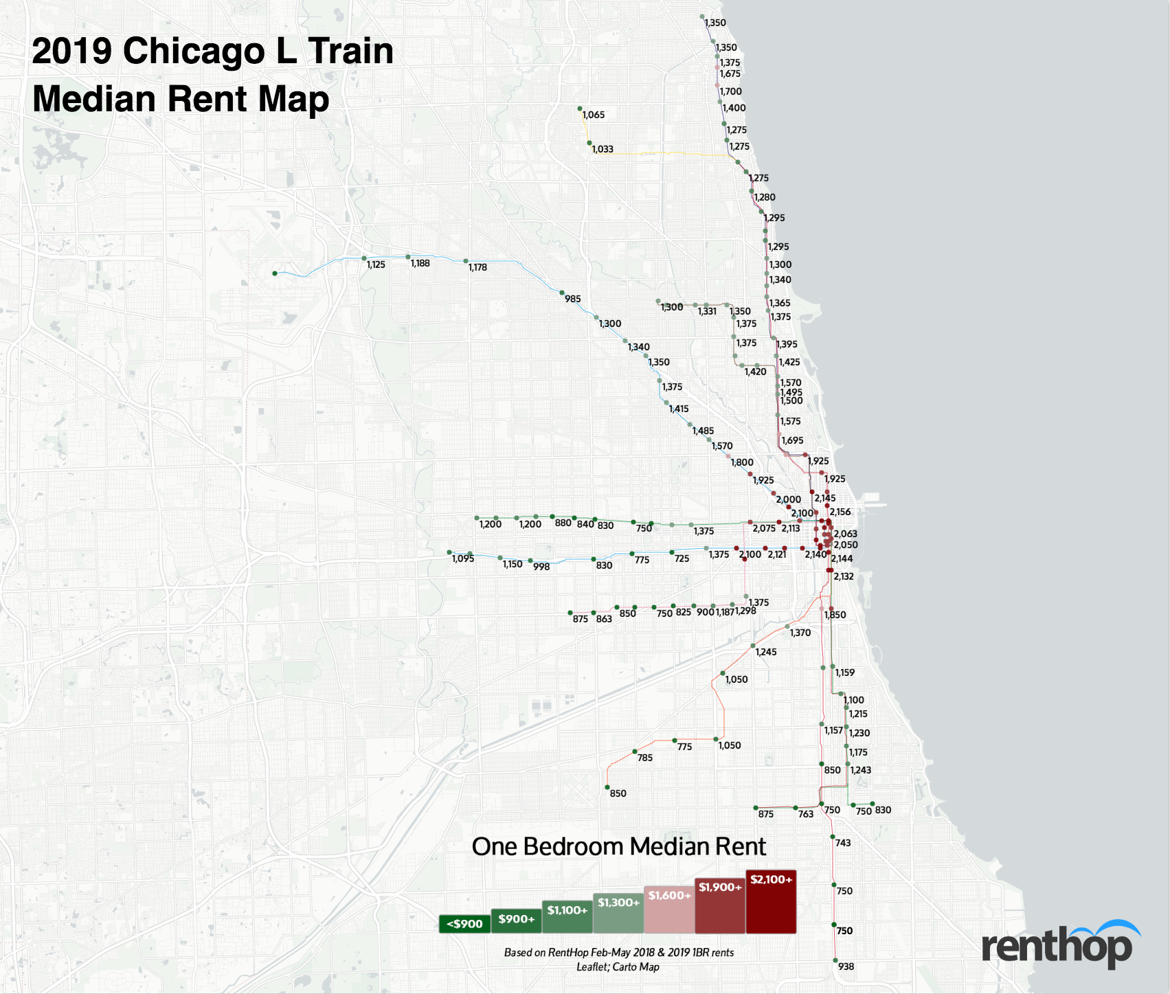
The Chicago “L” is the fourth largest heavy rail rapid transit system in the U.S. As an essential part of most Chicagoans’ lives, the L system serves on average 780,000 riders each weekday. We at RentHop, therefore, believe that it is our duty to map out the rental data by the L train stop every year to assist in your apartment hunting endeavors.
Our key findings this year include:
- Overall, one-bedroom median rent in Chicago went up 3.7% from 2018 to 2019.
- Rents increased at 114 stops and fell at 24 stops. 7 stops experienced no change in the past year.
- The biggest saving is on the Orange line this year. Renters can save around $762 by moving one stop south, from Roosevelt ($2,132) to Halsted ($1,370).
Our Interactive T Map Displays All Stops With Respective Rents and YoY Fluctuations
To calculate the median rent for the map above, we used RentHop rental data for one-bedroom apartments from February to May 2018 and 2019, as well as CTA GIS data from the City of Chicago. To get accurate prices near the subway stops, we looked first at non-duplicated listings within 0.62 miles of a CTA stop and if there were 50 unique data points we calculated the median. If not, the radius from the stop was increased to 1.2 miles and the data was resampled to ensure enough unique listings were used when calculating the median. O’Hare on the Blue line is the only stop where we didn’t have enough listings this year.
Ride the Train to Savings
Would you travel an extra stop to save a couple hundred dollars? How about for $700? The list below represents the largest price disparities between each stop. This could be because the stops on the edge of a neighborhood and rents dropped at one stop while prices soared at the other, or all of the above. It is also possible that the typical one-bedroom apartment near one stop is very different from an apartment just one stop away.
After a lackluster year, the Chicago metro area finally regained its momentum in 2019. As demand continues to absorb the inventory, 114 stops experienced year-over-year rent growth this year – that’s more than 75% of the train stops! Downtown Chicago remains to be one of the most expensive neighborhoods in the metro area, with median rents above $2,000 at most stops.
These stops saw the biggest rent drops on one-bedroom apartments
- Chicago – Blue Line: $2,000, YoY -7.1%
- Oakton-Skokie – Yellow Line: $1,032, YoY -5.4%
- Cottage Grove – Green Line: $830, YoY -5.1%
- 95th/Dan Ryan – Red Line: $938, YoY -3.8%
- Grand – Blue Line: $2,100, YoY -3.4%
These stops saw some of the biggest rent hikes
- Indiana – Green Line: $1,100, YoY 8.6%
- Pulaski – Pink/Purple Line: $800, YoY 8.5%
- Loyola – Red Line: $1,295, YoY 8.3%
- 43rd – Green Line: $1,215, YoY 7.8%
- Polk – Pink Line: $2,100, YoY 7.7%
Turn your commute into extra cash at these stops
- Save $762 between Roosevelt ($2,132) and Halsted ($1,370) – Orange Line
- Save $726 between Cermak-McCormick Place ($1,921) and 35th-Bronzeville-IIT ($1,159) – Green Line
- Save $725 between Illinois Medical District ($2,100) and Western ($1,375) – Blue Line
- Save $725 between Polk ($2,100) and 18th ($1,375) – Pink Line
- Save $700 between Ashland ($2,075) and California ($1,375) – Green Line
- Save $700 between Cermak-Chinatown ($1,850) and Sox-35th ($1,150) – Red Line
Love Our Map? There is a Condensed Map for Easy Sharing

What Does This Mean for You?
Finding an apartment in Chicago is hard. Deciding where to live and starting your search is probably the most difficult step. By giving you as much information about the market as possible, RentHop hopes to point you in the right direction. This map is just one of the data-backed insights we offer. All of our Chicago apartment listings are ranked using available data to ensure that renters always see the best quality apartments.


